↓ Skip to Main Content
Cyberchimps Logo

Main Navigation

  • Templates
  • Features
  • Plugins
    • Responsive Plus
    • Starter Templates
    • Addons for Elementor
    • Responsive Blocks
  • Go Pro
  • Blog
  • Pricing
  • Login

Installations & Updates

1
  • How to Install and Activate the Responsive Blocks Addons (RBA) Plugin?

General

2
  • Pattern Importer
  • Responsive Gutenberg Blocks Library- Introduction

Blocks

49
  • Feature Grid
  • Progress Bar – Responsive Blocks
  • Accordion Block
  • Video Popup
  • WP Search
  • Tabs
  • Taxonomy List
  • Team
  • Testimonial
  • Testimonial Slider – Responsive Blocks
  • Post And Page Grid
  • Section
  • Shape Divider
  • Social Share
  • Spacer
  • Table Of Contents – Gutenberg Blocks
  • Info Block
  • Inline Notice Block
  • Instagram Feed
  • Masonry
  • Multi Buttons
  • Portfolio – Responsive Blocks
  • Post Carousel – Responsive Blocks
  • Post Timeline
  • Pricing List
  • Pricing Table – Responsive Blocks
  • Flip Box
  • Google Map – Responsive Blocks
  • Icon List
  • Image Boxes
  • Image Hotspot – Responsive Blocks
  • Image Slider – Responsive Blocks
  • Count Down
  • Count Up
  • Divider – Gutenberg Blocks
  • Expand/Show More
  • Card
  • Content Timeline
  • Popup Block
  • Image Block
  • Contact Form 7 Styler – Responsive Blocks
  • Advanced Column
  • Advanced Heading
  • Advanced Text
  • Anchor Block
  • Blockquote
  • Call/Mail Button
  • Call To Action – Responsive Blocks
  • Form Block 
View Categories
  • Home
  • Docs
  • Responsive Blocks
  • Blocks
  • Form Block 

Form Block 

The Responsive Blocks Addon offers a Form Block; a tool designed to help you create elegant and functional forms on your WordPress website, all without the need for any programming skills.

With this, you can collect information from visitors, such as their names, email addresses, and other details.

How to Use the Form Block?  #

Install the Responsive Blocks Addon to use the form block. In your WordPress dashboard, navigate to the page where you want to add the form.

From the Responsive Blocks library, select the Form widget to add a form to the editor.
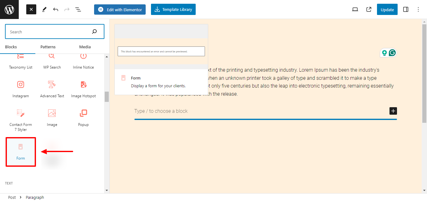
Add Form Widget

You can also add the form block by typing “/form” on the editor and selecting the Form block from the suggestions.
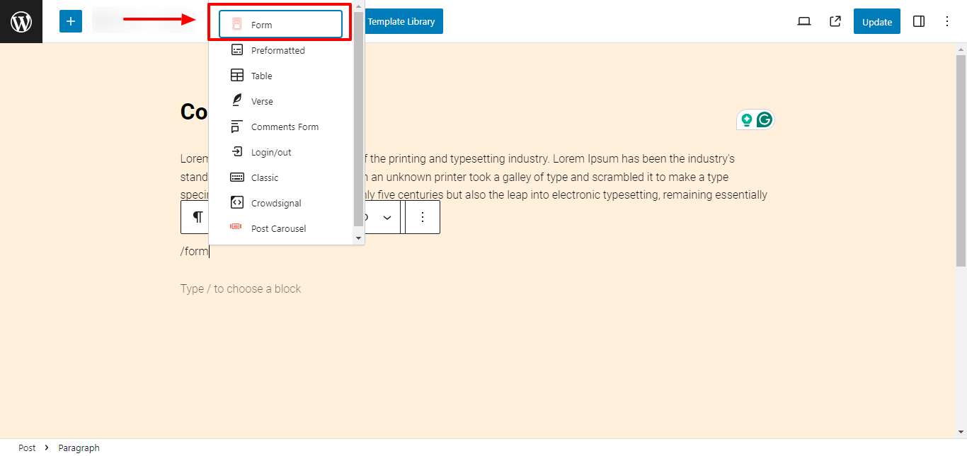
Type /form to add the widget

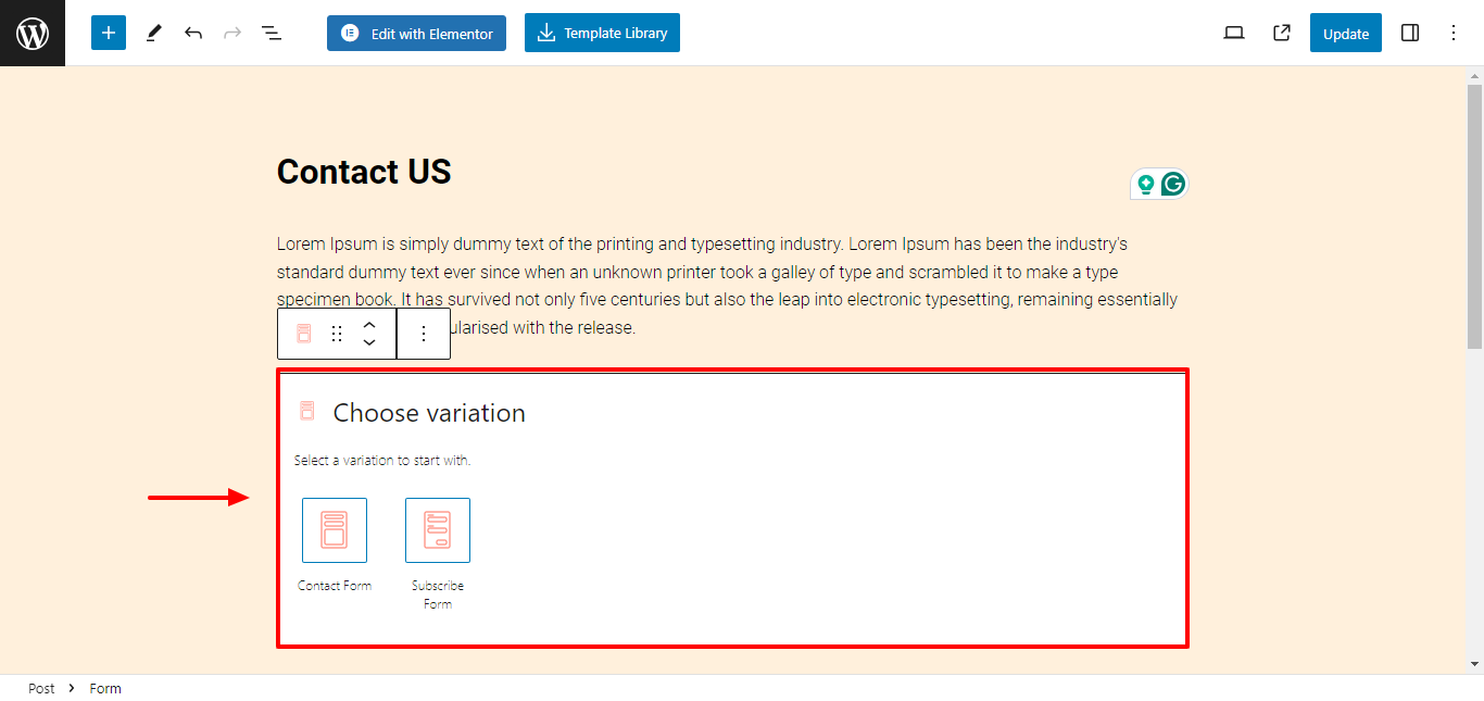
You can start by choosing a form variation from the preset options available in the form block.

  1. Contact Form
  2. Subscribe Form
Choose variation

Once you select the form preset, a form will be pasted on the editor.

1. Contact Form #
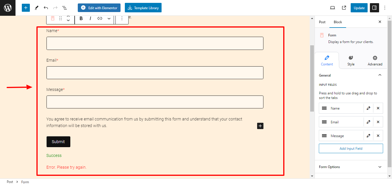
Contact Form

Easily add and customize a pre-built contact form for your website, allowing users to inquire about products or services, ask questions, or provide feedback.

2. Subscribe Form #
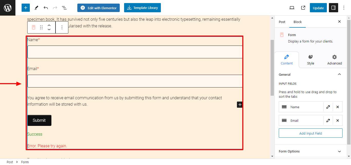
Subscribe Form

.

Get a custom subscription form for your website in one click. Use this form block to build and expand your email subscriber list for newsletters, updates, and promotional content.

Content Settings in Form Block #

Responsive Blocks provides you with multiple formatting settings to easily customize the contents of your form.

1. General Settings #
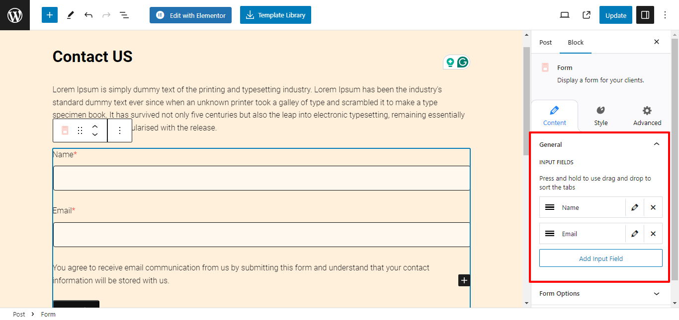
General Settings

Input Fields: Add, remove, or arrange custom fields to your form. You can click on the edit button to customize the field container individually.

2. Form Options #
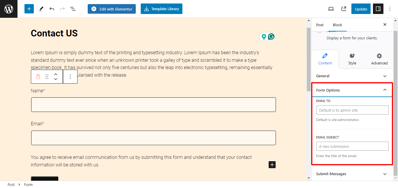
Form Options
  • Email to: Enter the default email address to see responses collected from the form.
  • Email Subject: Enter the title of the email.

3. Submit Messages #
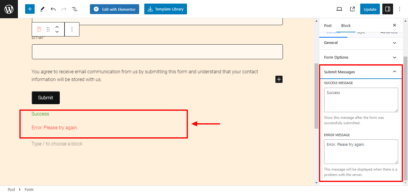
Submit Messages
  • Success Message: Enter the message to show after the form is successfully submitted.
  • Error Message: Enter the message to display when there is a problem with the server.

Style Settings in Popup Block #

Select the form and click on the Styles tab to begin formatting. Responsive Block Addon offers the following customization options:

1. Labels #
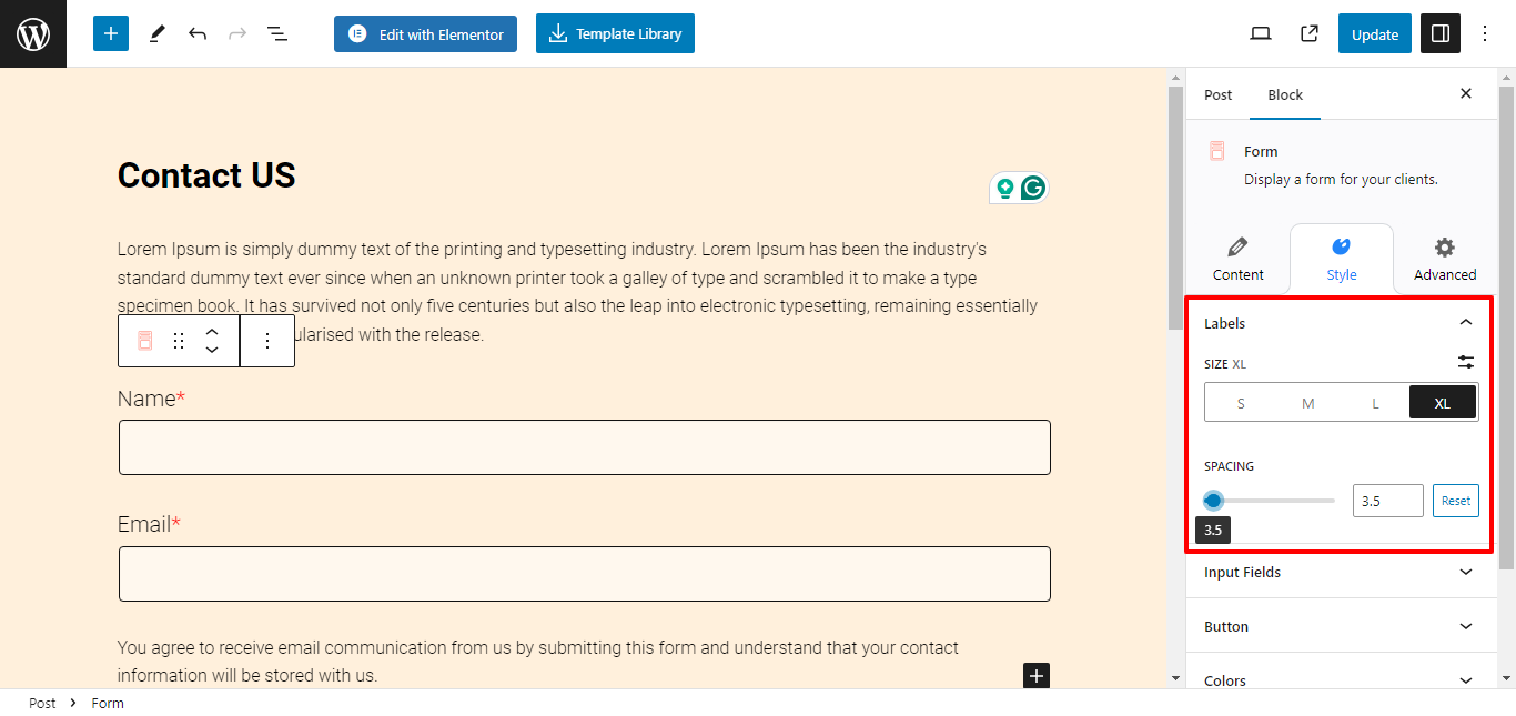
Labels
  • Size: Select the size for your labels
  • Spacing: Use the slider to adjust spacing.

2. Input Fields #
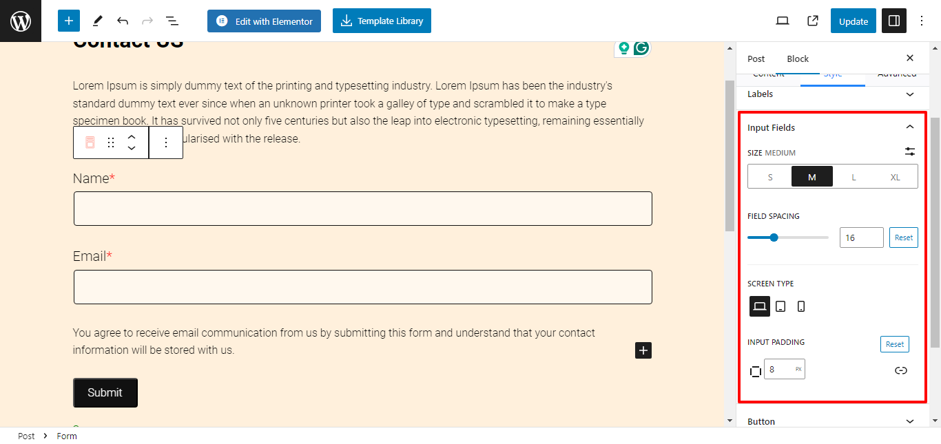
Input Fields
  • Size: Select the size for your labels
  • Spacing: Use the slider to adjust spacing.
  • Screen type: Select screen type to customize responsiveness.
  • Input Padding: Use the slider to add custom padding to the input field box.

3. Button #
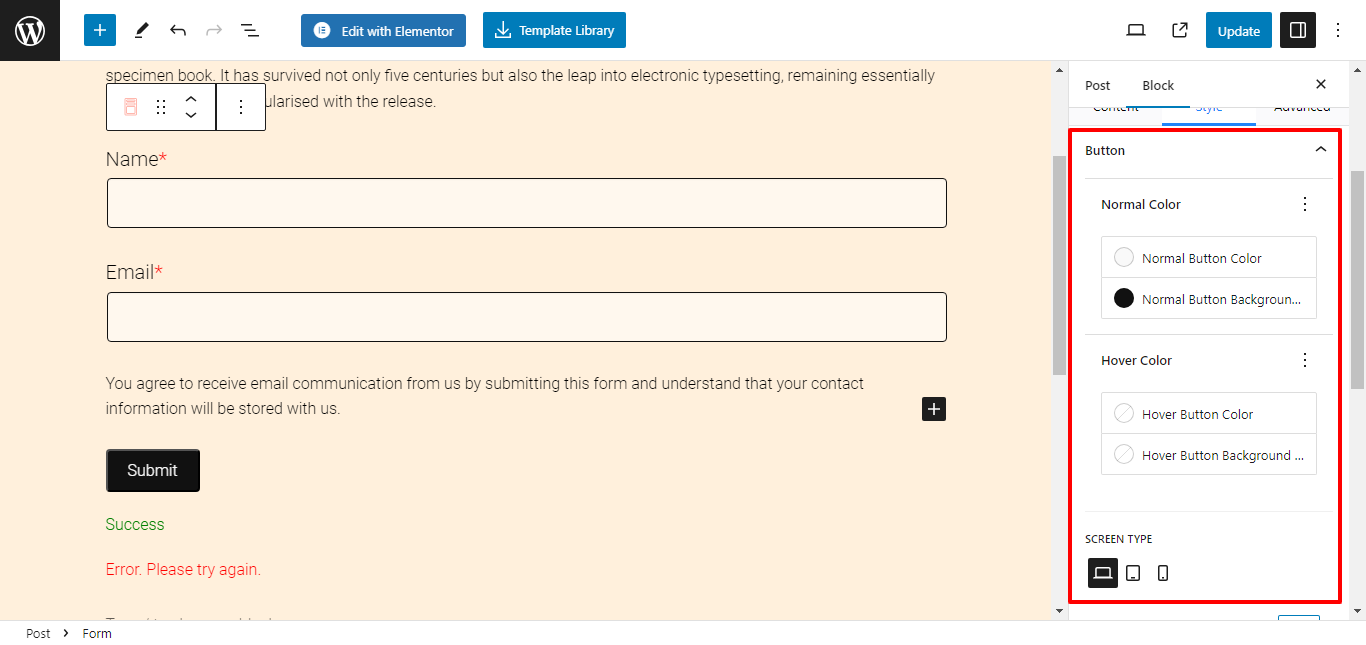
Button
  • Normal Color: Choose button color and button background color.
  • Hover Color: Choose button color and button background color when hover.
  • Button Padding: Adjust the padding for the button.
  • Button Border Radius: Customize the button border-radius.
  • Button Alignment:  Select the button alignment.

4. Colors #
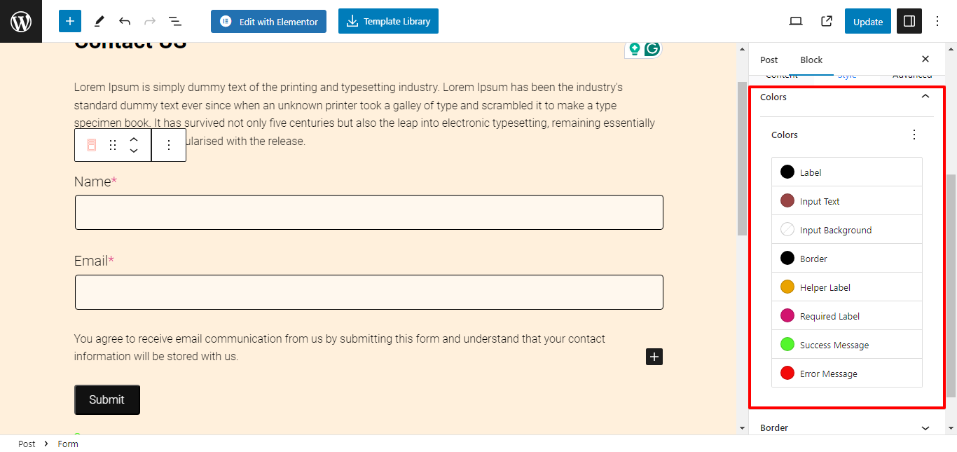
Colors
  • Color: Customize color for the label, input text, input background, border, helper label, required label, success message, and error message.

5. Border #

  • Border Width: Use the slider to select a custom border width.
  • Border Radius: Use the slider to select a custom border-radius.

6. Help and Submit Messages #

  • Helper Text Size: Select custom help text size.
  • Success/Error Message Size: Select custom success/error text size.

Field Settings #
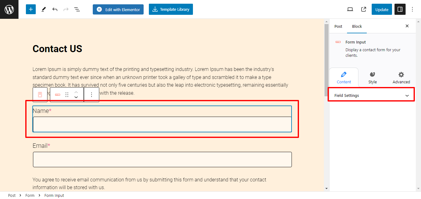
Field Settings

Field settings are displayed only when you select an individual field. You get complete customization options to tailor your form according to your needs.

1. Content Settings #
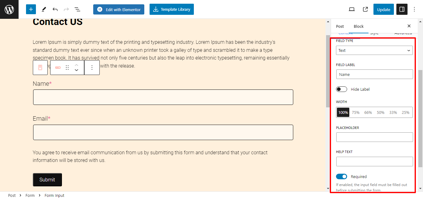
Content Settings
  • Field Type: You can choose any field type, like text, text area, email, URL, number, date, or checkbox. 
  • Field Label: Enter a custom field name or use the toggle button to hide the label name.
  • Placeholder: Enter placeholder text for the container.
  • Help Text: Enter the text to be displayed when hovered.
  • Default Value: Enter the default value for the field container.

2. Style Settings #
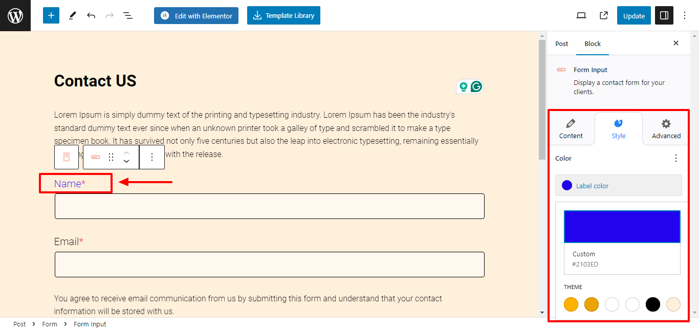
Style Settings
  • Label Color: Select a custom color for your label name.

Your form is now formatted as per your preferences. 

Forms serve as useful tools for collecting user data, lead generation, customer feedback, or subscription sign-ups. Use the Form block and effortlessly create and customize forms as per your preferences.

Get Responsive Blocks Addon Plugin for Your Website Today! #

Updated on February 26, 2025

What are your Feelings

  • Happy
  • Normal
  • Sad
Share This Article :
  • Facebook
  • X
  • LinkedIn
  • Pinterest
Call To Action – Responsive Blocks

Powered by BetterDocs

Leave a Reply Cancel reply

Your email address will not be published. Required fields are marked *

*

*

Table of Contents
  • How to Use the Form Block? 
    • 1. Contact Form
    • 2. Subscribe Form
  • Content Settings in Form Block
    • 1. General Settings
    • 2. Form Options
    • 3. Submit Messages
  • Style Settings in Popup Block
    • 1. Labels
    • 2. Input Fields
    • 3. Button
    • 4. Colors
    • 5. Border
    • 6. Help and Submit Messages
  • Field Settings
    • 1. Content Settings
    • 2. Style Settings
    • Get Responsive Blocks Addon Plugin for Your Website Today!

Our Products

Responsive Paid Plan

Responsive Addons for Elementor

Starter Templates

Responsive Blocks

WP Legal Pages

WP Adcenter

GDPR Cookie Consent

Powered by Responsive WordPress theme

RESOURCES

Responsive Platform

Learn Elementor

Download Free Theme

Brand Assets

Testimonials

Compare Astra/Kadence

TrustPilot

CCPA

Video Tutorials

FEATURES

WooCommerce

Header Footer Builder

Company

About

Pricing

Blog

Affiliate Program

Contact Us

Terms of Service

GDPR Privacy Policy

GDPR Cookie Policy

Support

Login

What’s New

Documentation

Request Support

Video Tutorials

Refund Policy

Service

Discount Coupon

Bug Bounty Program

Copyright © 2010-2025 CyberChimps  

Top
  • Constructive Blocks
    • Advanced Heading Block
    • Section Block
    • Advanced Columns Block
    • Pricing List Block
    • Pricing Table Block
    • Flip Box Block
    • Info Block
    • Image Slider Block
    • Post and Page Grid Block
    • Post Carousel Block
    • Icon List Block
    • Table of Content
    • Team Block
    • Shape Divider Block
    • Masonry Block
    • Portfolio Block
    • Accordion Block
    • Divider Block
    • Video Popup Block
    • Card Block
    • Spacer Block
    • Google Map Block
    • Block Quote
    • Expand
    • Image Hotspot
    • Instagram Feed Block
    • Image Boxes Block
    • Testimonial Block
    • Advanced Text Block
    • Testimonial Slider Block
    • Feature Grid Block
    • Inline Notice Block
    • WP Search Block
    • Social Share Block
    • Tabs Block
    • Progress Bar Block
    • Call/Mail Button
    • Anchor Block
    • Gutenberg Image Block – Responsive Block
    • Contact Form 7 Styler
  • Timelines
    • Count Up
    • Gutenberg Countdown Block
    • Content Timeline
    • Post Timeline Block
  • CRO
    • Multi Buttons Blocks
    • Call To Action Block