The Responsive Addons for Elementor (RAE) Menu Cart widget allows you to display the cart icon on the website.
Content #
Menu Icon #
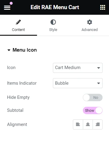
- 1.Icon: Select the cart icon.
- 2.Items Indicator: Select an indicator to show the number of elements in the cart. Choose from Bubble, plain option, or choose not to display this option.
- 3.Hide Empty: If an indicator option is selected you can opt to hide that indicator when there are no products in the cart.
- 4.Subtotal: Enable this option to display subtotal along with the cart icon.
- 5.Alignment: Select alignment for the menu icon.
Style #
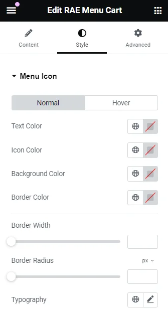
Menu Icon #
- 1.Text Color: Select text Color & Opacity for normal and hover behavior of the menu icon.
- 2.Icon Color: Select icon Color & Opacity for normal and hover behavior of the menu icon.
- 3.Background Color: Select background Color & Opacity for normal and hover behavior of the menu icon.
- 4.Border Color: Select border Color & Opacity for normal and hover behavior of the menu icon.
- 5.Border Width: Provide width for top, right, bottom, left side of the menu icon border.
- 6.Border Radius: Radius for the menu icon border.
- 7.Typography: Select typography options as font-family, size, weight, transform, style, decoration, line-height, letter-spacing.
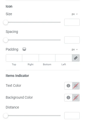
- 8.Icon: Size: Select the size of the icon. spacing: Select the spacing for the icon. padding: Select the padding for the icon.
- 9.Items Indicator:
- Text Color: Select text Color & Opacity for normal and hover behavior of the items indicator.
- Background Color: Select background Color & Opacity for normal and hover behavior of the items indicator.
- Distance: Select distance of items indicator from the cart icon.
Cart #
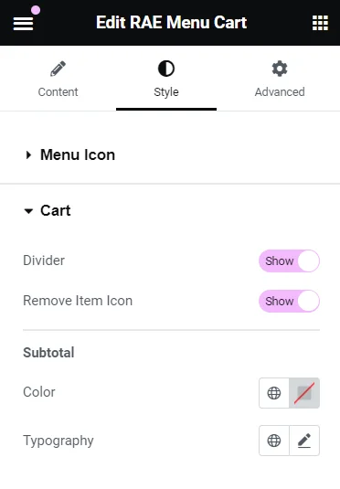
- 1.Divider: Show or hide the divider.
- 2.Remove Item icon: Choose to display or hide the remove item icon.
- 3.Subtotal: Color: Select Color & Opacity of the subtotal. Typography: Select typography options as font-family, size, weight, transform, style, decoration, line-height, letter-spacing.
Products #
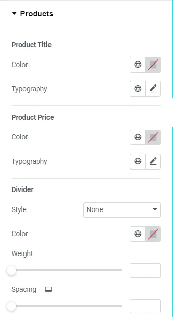
- 1.Product Title: Color: Select the Color & Opacity of the product title. Typography: Select typography options as font-family, size, weight, transform, style, decoration, line-height, letter-spacing.
- 2.Product Price: Color: Select the Color & Opacity of the product price. Typography: Select typography options as font-family, size, weight, transform, style, decoration, line-height, letter-spacing.
- 3.Divider: Style: Select style for the divider. Color: Select the Color & Opacity of the divider. Weight: Weight of the divider. Spacing: Spacing around the divider.
Buttons #
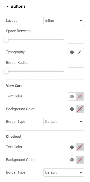
- 1.Layout: Select button layout as inline or stacked.
- 2.Space Between: Provide space between the buttons.
- 3.Typography: Select typography options as font-family, size, weight, transform, style, decoration, line-height, letter-spacing.
- 4.Border Radius: Radius for the button border.
- 5.View Cart: Text Color: Select the text color for the view cart button. Background Color: Select the text color for the view cart button. Border Type: Select a border type for the button.
- 6.Checkout: Text Color: Select the text color for the checkout button. Background Color: Select the text color for the checkout button. Border Type: Select a border type for the checkout button.


