The Reviews displays a sliding carousel of user reviews.

Content #
Slides #
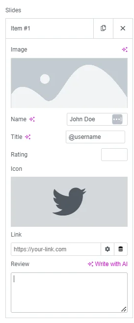
Items
Shows a list of all the items in the slide. You can drag and drop them to change their order. Click on the Add Item button to add another item to the list.
- Image – Upload or choose the reviewer’s image.
- Name – Enter the reviewer’s name.
- Title – Enter the reviewer’s job title.
- Rating – Assign a numerical rating, from 0.0 to 5.0.
- Icon – Choose the type of icon to use (Font Awesome or Unicode).
- Link – Link the review to a URL.
- Review – Enter the text of the review.
There are some common options available for all slides as well:
- Slides Per View – Select the number of slides to show at one time (1 to 10).
- Slides to Scroll – Select how many slides to scroll per swipe (1 to 10).
- Width – Set the width of the carousel, in percentage or pixels.
Additional Options: #
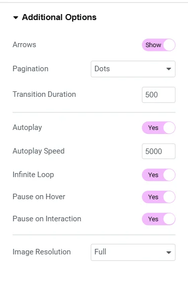
- Arrows – Show or hide the navigation arrows.
- Pagination – Select the carousel pagination style (None, Dots, Fraction, or Progress).
- Transition Duration – Set the time between slide movements (in milliseconds).
- Autoplay – Enable or disable autoplay for the carousel.
- Autoplay Speed – Set the speed at which the carousel slides (in milliseconds).
- Infinite Loop – Enable or disable infinite sliding for the carousel.
- Pause on Interaction – Enable to pause autoplay when the carousel is hovered over or clicked.
- Image Size – Set the size of the image (from thumbnail to full, or custom size).
Style #
Slides #
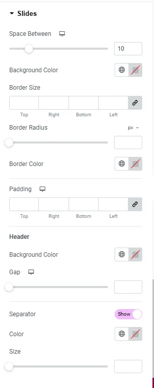
- Space Between – Control the space between review items.
- Background Color – Choose the background color for the review card.
- Border Size – Set the thickness of the border around the review card.
- Border Radius – Set the border radius to control corner roundness.
- Border Color – Choose a color for the border.
- Padding – Set the padding inside the border of the review card’s box.
Header
- Background Color – Choose the background color for the review card’s header.
- Gap – Control the space between the header and the review text.
- Separator – Choose to show or hide the separator line between the header and the review text.
- Color – Choose the color of the separator line.
- Size – Set the height of the separator line.
Text #
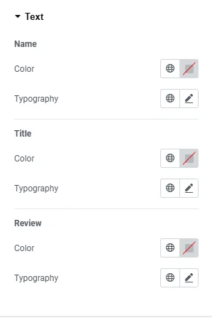
Name / Title / Review
- Color: Choose the color of the Name/Title/Review.
- Typography: Change the typography options for the Name/Title/Review.
Image #
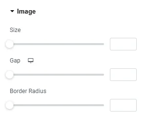
- Image Size – Adjust the size of the reviewer’s image.
- Image Gap – Control the space between the image and the reviewer’s profile information.
- Border Radius – Set the border-radius to control the corner roundness of the image.
Icon #
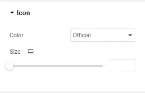
- Color – Set the color of the social icon. Choose either the official color of the social network or set a custom color.
- Size – Adjust the size of the social icon.
Rating #
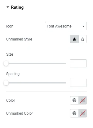
- Icon – Choose the type of icon to use (Font Awesome or Unicode).
- Unmarked Style – Choose Solid or Outline for unmarked icons.
- Size – Set the size of the rating stars.
- Spacing – Adjust the amount of space between each star.
- Color – Choose the color of the rating stars.
- Unmarked Color – Choose the color of the unmarked portion of the stars.
Navigation #
Arrows / Pagination
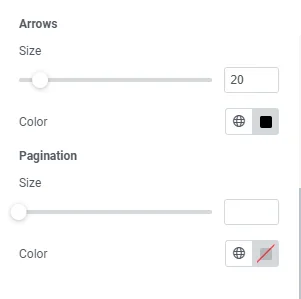
- Size – Adjust the size of the navigation arrows.
- Color – Choose the color of the navigation arrows.


