Responsive Addons for Elementor (RAE) Timeline is a very useful widget that allows the user to show the timeline for any particular things such as order tracking, course roadmap, etc.

Content #
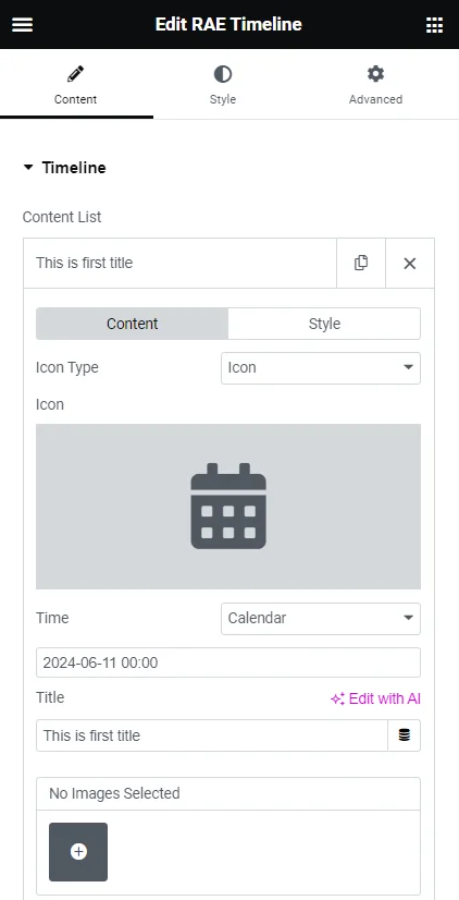
Timeline #
- Gallery – Allows you to add images to the gallery to showcase them on the item’s content body.
- Icon Type – Select whether to display an icon or image on the timeline tree for that item.
- Image/Icon – You can add an icon or image for that item to display on the timeline tree.
- Time – select the input method(calendar or text) for the time. The field below could be a calendar to set the date and time, or it could be a text field to manually enter the date and time.
- Title – Add the title for the item.
Icon Type – Allows the user to select whether to display an icon or image on the timeline tree for that item.
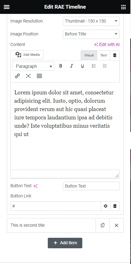
- Image Size – Select the image size for images in the gallery.
- Image Position – Set the gallery images’ position within the item’s content body. The images’ position could be set before the title or after the main content.
- Content – You can add the item content through a WYSIWYG editor.
- Button Text – Allows you to add the text for the item’ button. If the field is left empty then the button will not be displayed.
- Button Link – Easily add the link for the button.
Style Tab #
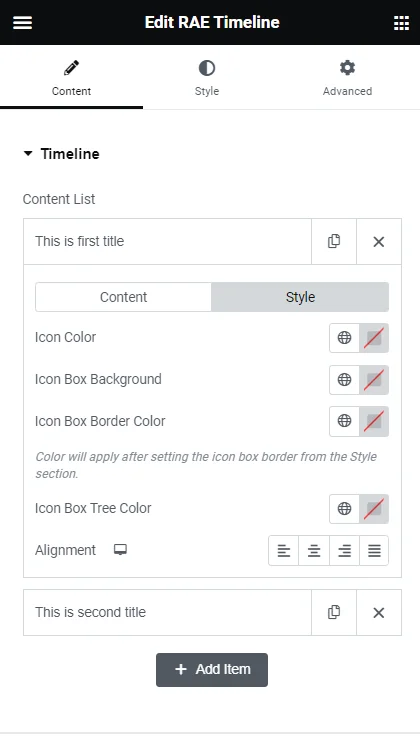
- Icon Box Background – Allows the user to set the background color for that particular item’s icon.
- Icon Box Border Color – Allows the user to set the border color for that particular item’s icon. Border Color will be applied after setting the border from Style > Icon Box > Border Type and Border Width.
- Icon Box Tree Color – Allows the user to set the color for the timeline tree of that particular item.
- Alignment – Allows the user to set the alignment of the overall content within the item box.
Settings #
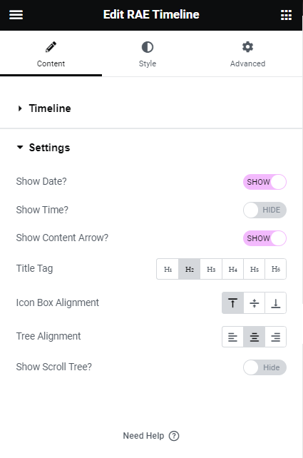
- Show Date? – Allows the user to show/hide the date of the timeline items.
- Show Time? – Allows the user to show/hide the time of the timeline items.
- Show Content Arrow? – Allows the user to show/hide the arrow of the item boxes.
- Title Tag – Allows the user to choose a particular tag for the title of the timeline items.
- Icon Box Alignment – Allows the user to set the vertical alignment for the icon box of the timeline items.
- Tree Alignment – Allows the user to set the horizontal alignment for the timeline tree.
- Show Scroll Tree? – Allows the user to show/hide the scroll tree animation effect.
- Background Type – Allows the user to set the background type of the scroll tree, available types are classic and gradient.
Style #
Content Box #
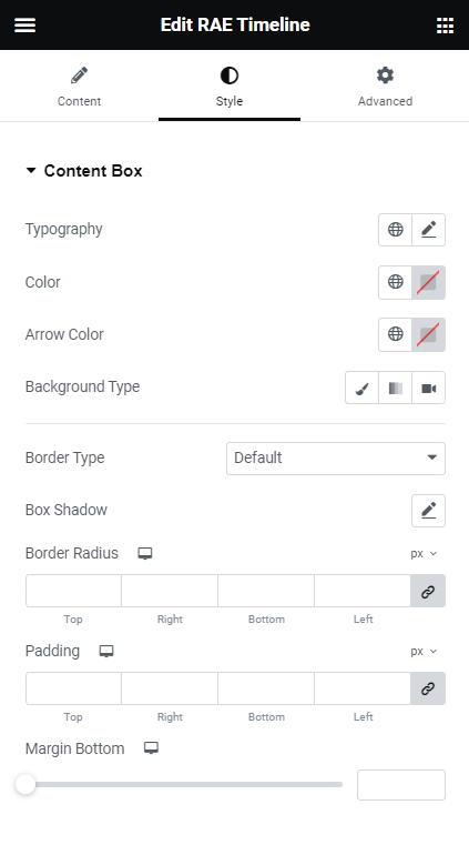
- Typography – Allows the user to set the typography for the Content Box.
- Color – Allows the user to set the color for Content Box text.
- Arrow Color – Allows the user to set the color for the Content Box arrow.
- Background Type – Allows the user to set the background styles for the Content Box using background type controls.
- Border Type – Allows the user to set the border styles for the Content Box.
- Box Shadow – Allows the user to set the box shadow for the Content Box.
- Border Radius – Allows the user to set the border radius for the Content Box.
- Padding – Allows the user to set the padding for the Content Box.
- Margin Bottom – Allows the user to set the margin bottom for the Content Box.
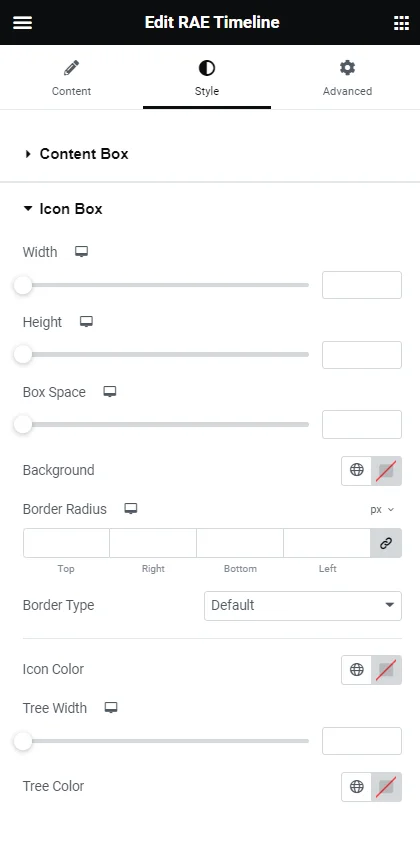
Icon Box #

- Width – Allows the user to set the width of the icon box for all items.
- Height – Allows the user to set the height of the icon box for all items.
- Box Space – Allows the user to set the spacing between the timeline tree and the content box.
- Tree Space – Allows the user to set the spacing between the timeline tree and the widget’s edge. This setting will be available if Tree Alignment is set to either Left or Right.
- Background – Allows the user to set the background color of the icon for all the items.
- Border Radius – Allows the user to set the border radius of the icon for all items.
- Border Type – Allows the user to set the border styles for the Icon Box for all items.
- Icon Color – Allows the user to set the icon color for all the items.
- Tree Width – Allows the user to set the timeline tree width.
- Tree Color – Allows the user to set the timeline tree color.
Title #
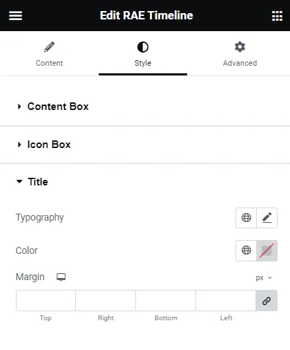

This section consists of three controls Typography, Color, and Margin for the title of all items.
Time & Date Typography #
These controls for date and time will be available based on the Show Date? and Show Time? Controls.

This section consists of three controls Typography, Color, and Margin for the date and time of all items.
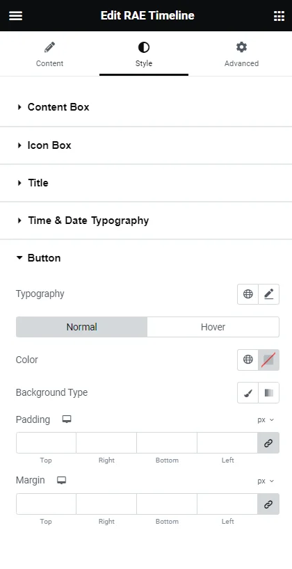
Button #


- Typography – Allows the user to set the typography for the button text.
The following two controls will be displayed for both the Normal state and Hover state:
- Color – Allows the user to set the color of the button text.
- Background Type – Allows the user to set the background styles for the button.
- Padding – Allows the user to set the padding for the button.
- Margin – Allows the user to set the margin for the button.


