Do you want to add a post carousel to your Elementor website?
If you want to make your website more engaging, adding a post carousel is a great idea. A post carousel displays your posts in a sliding format, grabbing the attention of your viewers.
They look nice and are great for introducing visitors to more content on your website.
This article will walk you through the steps for adding a free post carousel to your Elementor website.
What is the Elementor Post Carousel Widget?
A post carousel widget displays multiple blog posts in rotational order on your Elementor website. Instead of displaying articles in a list, this widget displays them in a slideshow.
Further, it makes it easier for visitors to see your posts, making your website look more professional and engaging, thereby enhancing user experience.
Moreover, you can place the widget anywhere on your site to improve its design. Depending on your preference, it can include posts, pages, and floating buttons.
Things You’ll Need for Adding Post Carousel in Elementor
You must install two plugins to add post carousel to your Elementor website.
1. Elementor Website Builder
Elementor is a popular drag-and-drop website builder for WordPress. It allows users to create custom web pages without any need to code. With Elementor, you can design everything from headers and footers to the entire website.
In Elementor, you can choose a template or build an entire website independently. It offers many widgets, such as image galleries, sliders, and forms, which you can customize according to the design.
Elementor is a user-friendly platform designed for both beginners and experts. Beginners find it easy to use, while experts appreciate its advanced design capabilities.
2. Responsive Addons for Elementor
Responsive Addons for Elementor is a WordPress plugin that offers free Elementor widgets. You will need to install this plugin because Elementor offers limited free widgets.
The plugin gives you access to over 250 templates and 80+ widgets. The widgets are compatible with every device and with plenty of customization options, you can seamlessly integrate them into your webpage.
We will go through the steps of adding the post carousel to your website.
How to Add Post Carousel in Elementor
(Note: To add a post carousel to your website, your website should be built with Elementor)
We will go through the process of adding a post carousel and customizing it.
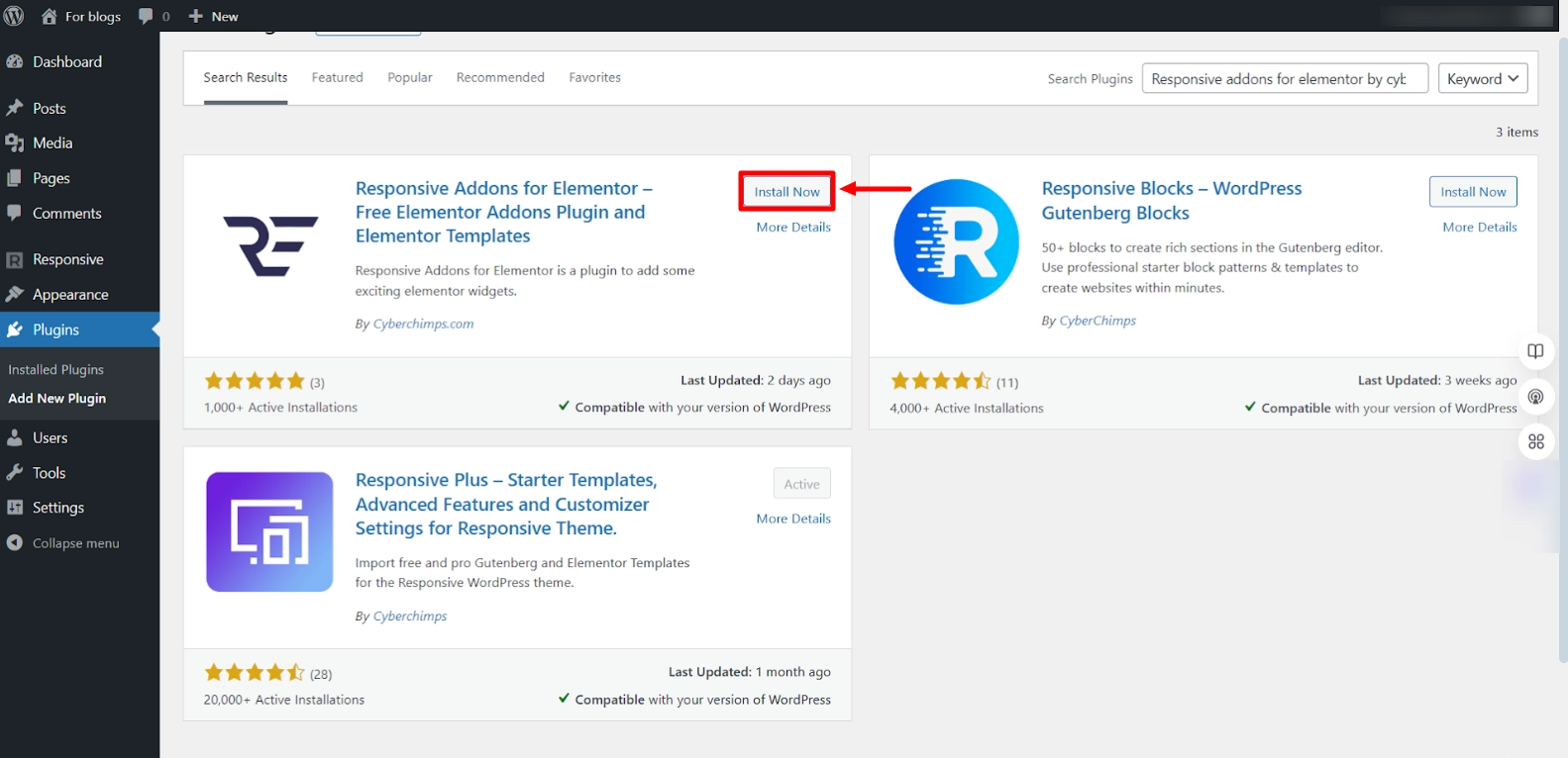
Step 1: Installing Responsive Addons for Elementor Plugin
From your WordPress dashboard, go to Plugins > Add New Plugin.
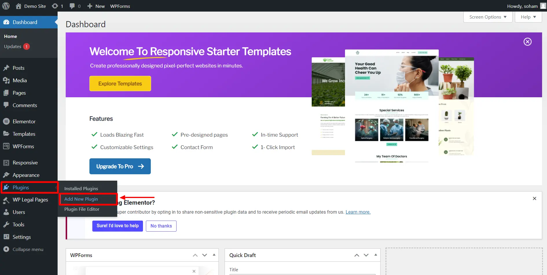
Search for Responsive Addons for Elementor by Cyberchimps and then click on install now.
After installing, activate the plugin by clicking the Activate button.
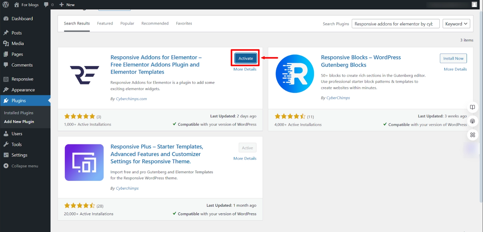
You have now successfully installed the plugin. Let us see how to add the post carousel.
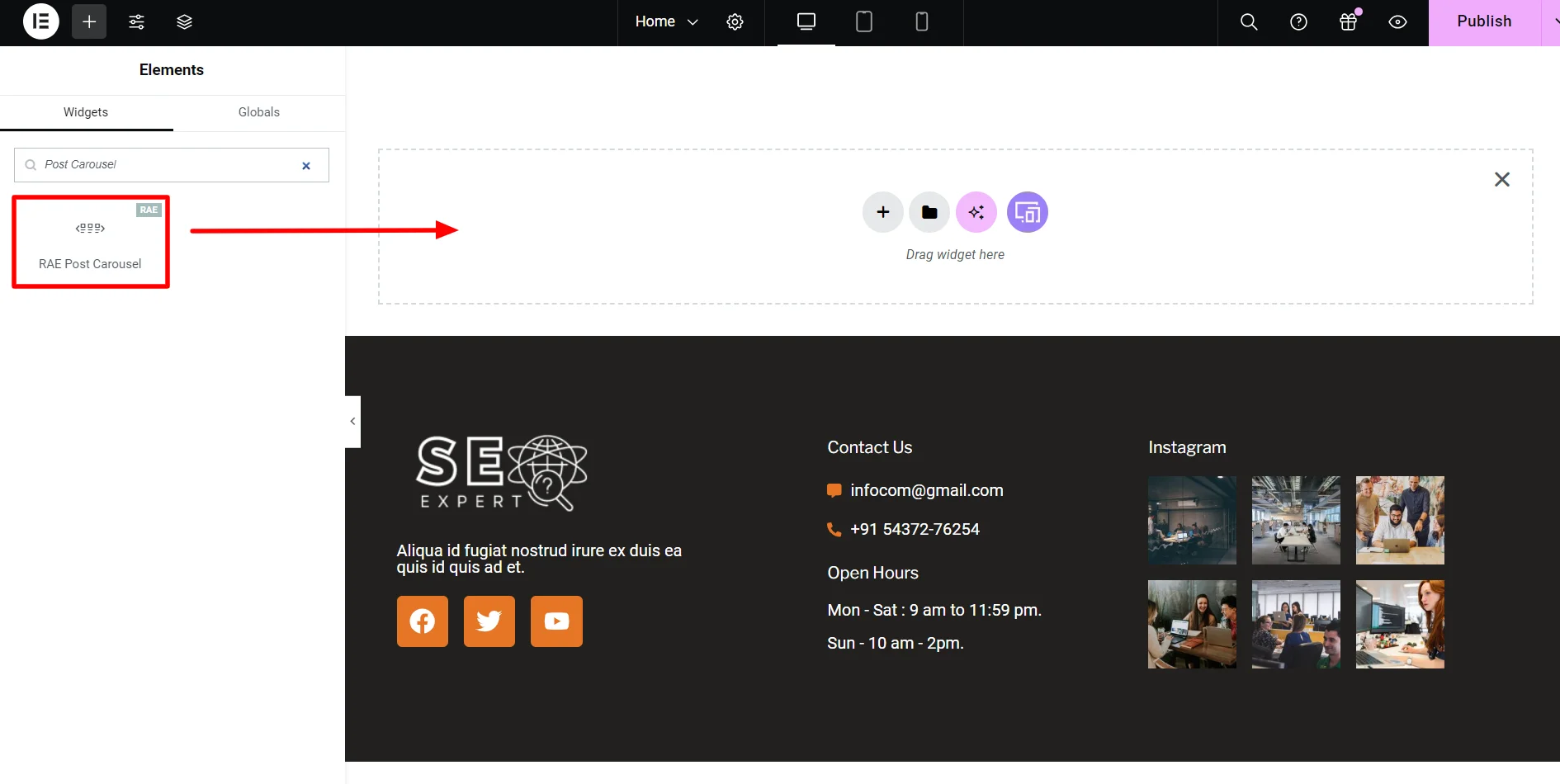
Step 2: Inserting the RAE Post Carousel Widget
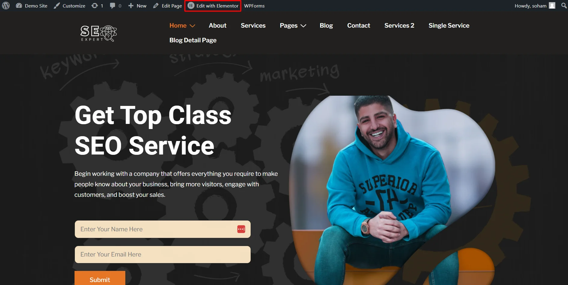
Open the page where you want to add the post carousel widget in the Elementor editor. For tutorial purposes, we will take an SEO expert template by Cyberchimps.
Next, click on Edit with Elementor button.
In the widgets section, search for Post Carousel.
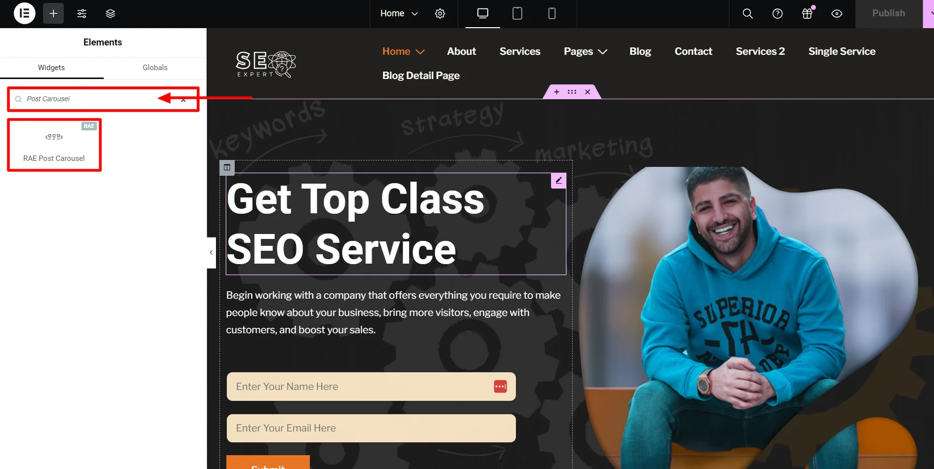
Drag and drop the RAE Post Carousel widget on your page.
This how the widget will look like by default
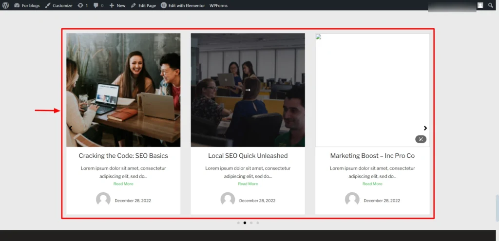
The RAE post carousel widget is now inserted in the webpage and is ready for customization.
Step 3: Customizing RAE Post Carousel Widget
You should know the settings of the Responsive Addons for Elementor’s post carousel widget to get the most out of it. We will now go through every customization option.
Content Settings
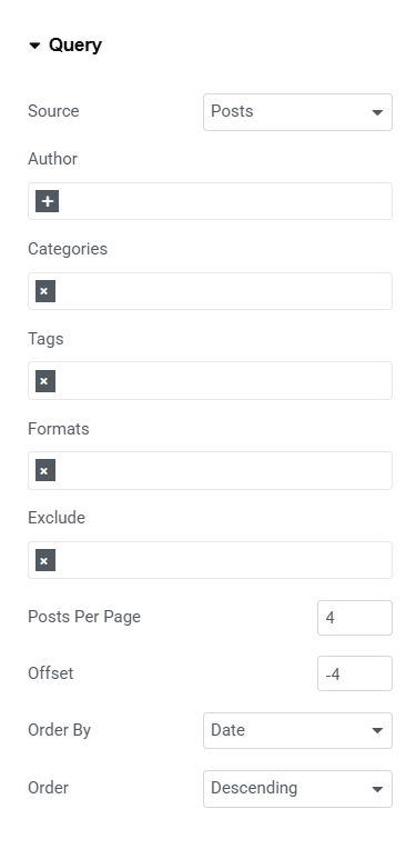
Query
- Source: Select what to add to your carousel posts, pages, or floating buttons.Add the posts you want to include based on author, categories, or tags.
- Posts Per Page: Decide how many posts you want to add per page.
- Offset: Set the offset for the post’s pagination.
- Order By: Decide how the page should be ordered.
- Order: Select whether the order should be descending or ascending.
We have tailored the Content tab configurations of the post carousel Widget to create a unique and dynamic presentation:
To keep the carousel visually appealing and not overcrowded, we’ve limited the number of posts displayed per page to 4. This creates a clean and balanced layout for users to navigate.
We’ve set the offset to -4, ensuring that the widget skips the last four posts in the sequence. This feature helps prioritize specific posts and manage the display order efficiently.
The posts in the carousel are now sorted by date. This allows the most recent content to take priority, keeping the website fresh and up-to-date.
We’ve chosen the descending order for post arrangement. This ensures that the newest posts are displayed first, immediately grabbing visitors’ attention.
Layout Settings
Layout Settings
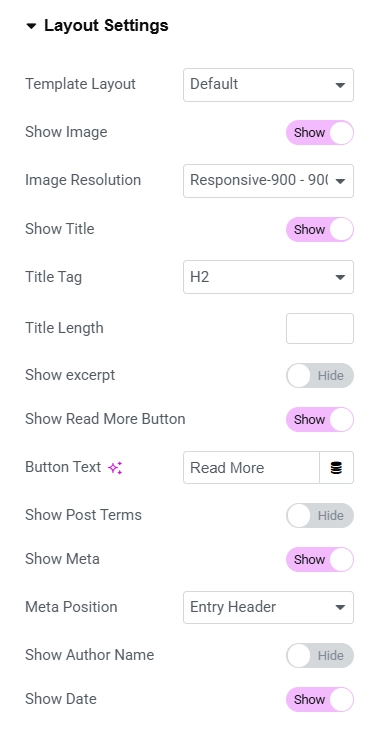
- Template Layout: Choose the template layout for the widget.
- Show Image: To include an image, turn on this option and set the image’s resolution.
- Show Title: This option lets you decide whether to show title. Set the title in the next option.
- Show Excerpt: When turned on, this will summarize your post. Its setting is in the following options.
- Show Read More Button: This will add a read more option to the post and direct the reader to the post.
- Show Post Terms: Hide or show post terms.
- Show Meta: If you turn this option on, your post’s metadata will be shown. You can choose what to show in the following options.
- Meta position: You can set the position of the meta description.
- Show Date & Author Name: Here, you can enable the author name and date of the posts.
Following are the changes we’ve made in layout settings:
We’ve enabled this option to ensure that each post in the carousel displays a featured image. The images add visual interest and provide a preview of the content.
Titles are an important element of the post carousel, so we’ve turned this option on. This allows readers to see the post titles at a glance, making navigation easier.
We’ve chosen to disable the excerpt option for a cleaner and more concise look. This helps keep the focus on the images and titles, ensuring the layout remains uncluttered.
Post metadata has been enabled to provide additional context about each post. This includes details like the post author and date, giving readers a quick overview.
The metadata is strategically placed in the entry header to keep it prominent yet visually balanced within the layout.
We’ve disabled the author name but enabled date of the posts published.
Carousel Settings
Carousel Settings
- Effect: Select the transition effect for your carousel.
- Visible Items: Choose the number of posts you want to show on one page.
- Items Gap: Adjust the gap between the posts.
- Image Height: Adjust the height of the featured image of your post.
- Slider Speed: Select the duration of transition between the slides.
- Pause on Hover: This will pause the rotation while hovering over the widget.
- Infinite Loop: Turn on if you want to keep your posts rotating.
- Grab Cursor: This shows the grab cursor when hovered over the slider.
- Navigation: If you want arrows on the sides, turn on the arrows toggle.
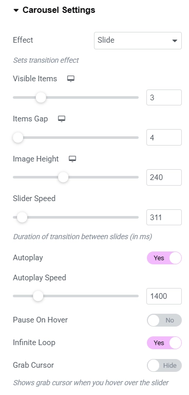
Breakdown of the adjustments we made in the carousel settings:
We selected the Slide effect for a smooth and modern transition between posts, making navigation visually appealing.
To create a balanced layout, we set the visible items to 3, ensuring multiple posts are displayed at once.
A gap of 4 was chosen to maintain sufficient spacing between posts, giving the carousel a clean and organized look.
The height of the featured images was adjusted to 240px to maintain a consistent visual aesthetic.
We fine-tuned the slider speed to 311ms, ensuring a seamless yet noticeable transition between slides.
To keep the content rotating without interruption, we enabled the Infinite Loop option.
The grab cursor is enabled, providing a more interactive experience when hovering over the carousel.
For intuitive navigation, we activated both the arrows and dots, making it easy for users to explore posts effortlessly.
Links Settings
Links
- Images, title, and Read More
- No Follow: Turn on this option if you want no follow link.
- Target Blank: When turned on, this will open the link in a new tab.
Style Settings
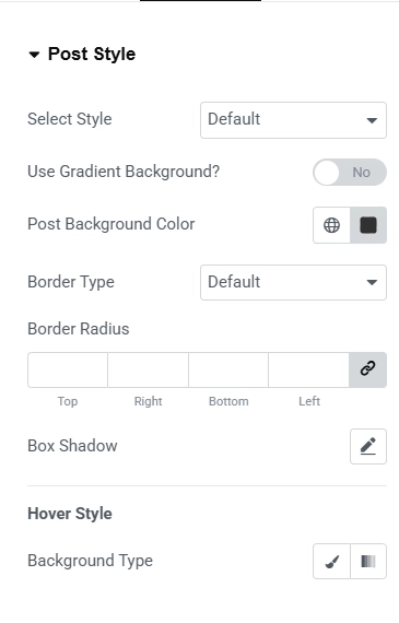
Post Style
- Select Style: Choose the styles for your slides from the dropdown.
- Use Gradient Background: If you want a gradient background to your post, turn on this option and select a color from the next option.
- Border Type: To change the border of the post, select it from the dropdown.
- Border Radius: Set this option to make the border rounded.
- Background Type: If you want the background to change while hovering, edit this setting.
We’ve made following chnage in the post style settings:
We’ve chosen a sleek black background for the posts. This adds a bold and modern aesthetic, making the content stand out against the background.
Thumbnail Style
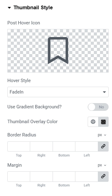
Thumbnail Style
- Post Hover Icon: Choose the icon to display while hovering over the slide.
- Hover Style: Select the hover style from the dropdown menu.
- Use Gradient Background: This toggle allows you to add a gradient background to your slide switch and adjust the colors in the next option.
- Thumbnail Overlay Color: If you want to change the color while hovering, do it here.
- Border Radius: If you want the rounded border to your thumbnail, adjust it accordingly.
- Margin: This option will create a margin between the thumbnail and the border.
We’ve customized the Thumbnail Style settings of the Post Carousel Widget:
We’ve chosen a bookmark icon from the icon library to display when hovering over the slide. This adds a sleek, modern touch while making it visually engaging for users.
The hover style is set to Fade In, creating a smooth and professional transition effect when users hover over the carousel slides.
To highlight the hover effect further, we’ve customized the overlay color to a semi-transparent black shade (#000000BF). This ensures the content underneath remains subtly visible while maintaining focus on the hover icon and text.
Read More Button Style
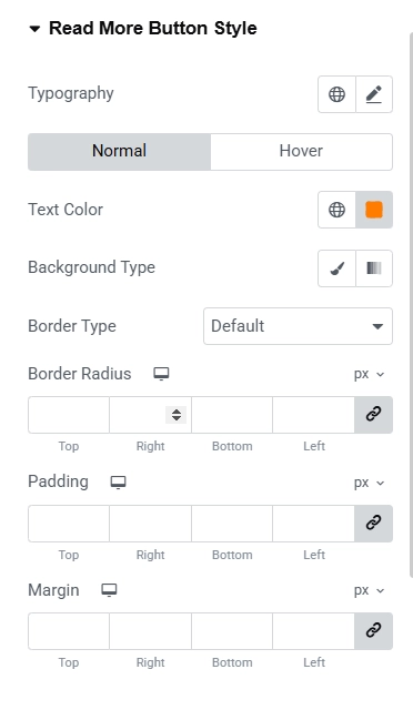
Read More Button Style
- Typography: Customize the text of the read more button using this option.
- Text Color: Change the color of the read more option.
- Background Type: Select the background type for the read more button.
- Border Type: If you want the border to the button, select the type from the dropdown and adjust it from the following options.
In our sample website, we’ve implemented several modifications to enhance the button’s visibility and ensure it aligns with the overall design:
One of the first adjustments we made was changing the text color of the “Read More” button. By setting it to a vibrant orange (#FF7B00), the button now grabs attention and adds a lively touch to the carousel, enhancing the overall visual appeal.
Rest all of the setting we have kept it default.
Style Settings
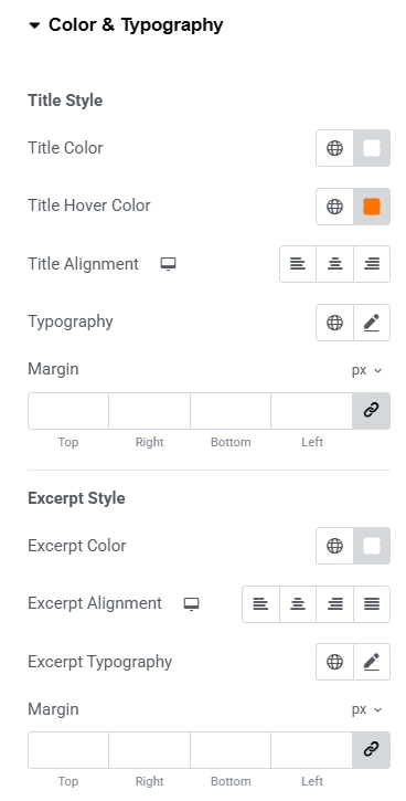
Color & Typography
- Title Style:
- Title Color: Set the title color of the post.
- Title Hover Color: Change the title color when a user hovers over it.
- Title Alignment: Set the title alignment of the post.
- Typography: Customize the font of the title using this option.
- Margin: This creates a space around your title.
- Excerpt Style:
- Excerpt Color: Set the color for your excerpt using this option.
- Excerpt Alignment: Adjust the alignment of the excerpt.
- Excerpt Typography: Customize the font of your excerpt.
- Margin: Increasing this will create a space around the excerpt.
We’ve made some changes to the color and font settings of the Post Carousel Widget:
To make the title stand out against the background, I’ve set the color to white (#FFFFFF). This ensures that the title is easy to read, regardless of the background image or color.
For an interactive experience, I’ve set the hover color of the title to #FF7400. This vibrant orange color will draw attention when a user hovers over the title, adding a dynamic touch to the post.
Similarly to the title, I’ve set the color of the post excerpt to white (#FFFFFF). This maintains consistency and readability across the website, ensuring that the excerpt complements the title’s color.
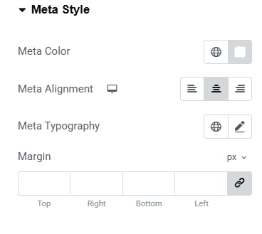
Meta Style
- Meta Color: Set the meta color using this option.
- Meta Alignment: Align meta to the left, center, or right.
- Meta Typography: Customize the meta font of the posts.
- Margin: Set margin for the meta information.
We’ve implemented several adjustments to the meta Style settings.These modifications improve the overall appearance and readability of the blog posts featured in the carousel.
To ensure the text stands out against the background, we’ve set the Meta Color to white (#FFFFFF). This provides a clean, minimalist look while maintaining high contrast for easy readability.
For a more balanced and visually appealing layout, we’ve aligned the Meta information to the center. This ensures that the post details such as the author, date, and categories are neatly positioned, creating a cohesive and professional appearance.
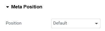
Meta position
- Position – Choose the location for the meta data. If the position is chosen to be Absolute, the following controls will appear.
- Horizontal Orientation – Adjust the horizontal alignment of the meta data.
- Offset – Specify the horizontal offset value for the meta data.
- Vertical Orientation – Adjust the vertical alignment of the meta data.
- Offset – Specify the vertical offset value for the meta data.
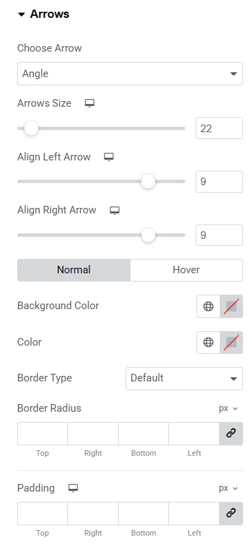
Arrows
- Choose Arrow: If you want to change the arrow, choose one from the dropdown menu.
- Adjust the size and the alignment of the Arrows from the following options.
- Background Color: Set the background color of the arrows.
- Color: Set the color of the arrows using this option.
- Border Type: Select the border type for the arrows.
- Border Radius: If you want rounded borders, set them according to your preference.
- Padding: Adjusting this will add space around the arrows.
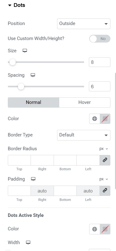
Dots
- Position: If you want the dots inside the slides, select the option from the menu.
- Use Custom Width/Height: If you want custom dimensions, adjust them after turning on the toggle.
- Color: Select the color of the dots.
- Border Type: Select one from the dropdown if you want a border to the dots.
- Border Radius: Make the border of the dots rounded using this option.
- Padding: Adjusting this will create a space around the dots.
You can also check out the Post Title widget by Responsive Addons for Elementor plugin.
FAQ
Install Responsive Addons for Elementor on your WordPress website. While editing the page in Elementor, please search for the post carousel widget and insert it wherever you want.
The Elementor Post Carousel widget is a tool in the Elementor editor that displays your website’s posts to visitors in a rotational format. This helps to increase your website engagement.
Yes, you can add the post carousel to your website for free. You must install the Responsive Addons for Elementor plugin, which is free to use and offers over 80 widgets.
Conclusion
Whether you’re displaying blog posts, products, or services, a post carousel is a great widget to increase user engagement.
The free Responsive Addons for Elementor plugin is a great tool to make your website appear professional.
If you found this article informative, please check out our other guides.
- How to Add Media Carousel To Your Elementor Website
- How to Add Price Box To Your Elementor Website
- How To Add Breadcrumbs To Elementor Website
Check out Responsive Addons for Elementor to access free templates and widgets.


