Want to add a price box to your Elementor website?
Improving your website’s functionality and user experience is extremely important in today’s competitive digital world.
One effective method to do this is by including dynamic elements that offer clear and immediate information to your visitors.
Prominently displaying product prices can significantly impact user engagement and conversion rates of these components.
This approach makes the shopping experience easier for your customers and builds trust and transparency.
Following the simple steps outlined in this article, you can easily integrate the price box widget into your Elementor website, making it a more engaging and informative online marketplace.
What is the Elementor Price Box Widget?
The Elementor price box widget is an adaptable tool for presenting product prices on your website in an attractive and informative manner.
This widget lets you exhibit your prices with diverse customization choices such as font styles, colors, and alignment, ensuring that it complements your website’s overall design and branding.
It is particularly beneficial for e-commerce websites as it assists in clearly and attractively showcasing pricing details, making it more straightforward for customers to make purchase decisions.
With the price box widget, you can also include sale prices, discounts, and other promotional information, thereby improving the shopping experience and potentially increasing sales.
This widget offers additional features and versatility to establish a professional and user-friendly online store.
Things You’ll Need for Adding Product Price in Elementor
To add a price box widget in Elementor, you will require several essential tools and resources to begin:
Elementor
Elementor, a widely used WordPress page builder plugin, streamlines the process of creating and customizing websites, making it accessible even to individuals without coding knowledge.
It boasts a user-friendly interface and drag-and-drop functionality that makes adding and arranging text, images, and widgets effortless.
As a straightforward plugin, Elementor is a top pick for beginners.
Responsive Addons for Elementor
In addition to Elementor, it’s essential to install Responsive Addons for Elementor. This no-cost WordPress plugin provides 80+ Elementor widgets and more than 250 Elementor website templates, thereby enhancing the capabilities of the Elementor page builder.
Adding the Responsive Addons For Elementor plugin ensures your website is fully responsive. It adjusts to all screen sizes and enhances your website’s performance and user engagement.
How to Add Price Box in Elementor
[Note: To add a price box widget, your website must be built with the Elementor page builder].
Cyberchimps offers 250+ Elementor templates you can use to build your website instantly.
Enhance your website design capabilities by utilizing the Responsive Addons for the Elementor plugin. It offers various advanced and customizable widgets that seamlessly integrate with Elementor.
Follow the steps below to add a free price box widget to your website.
Step 1: Installing and Activating Responsive Addons for Elementor
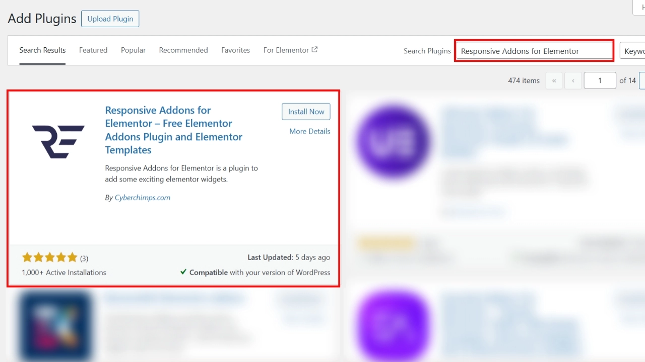
Navigate to the WordPress dashboard, select Plugin > Add new plugin

Search for Responsive Addons for Elementor in the search bar. Once the plugin appears, click the Install Now button.
After installation, click the Activate button to activate the plugin.
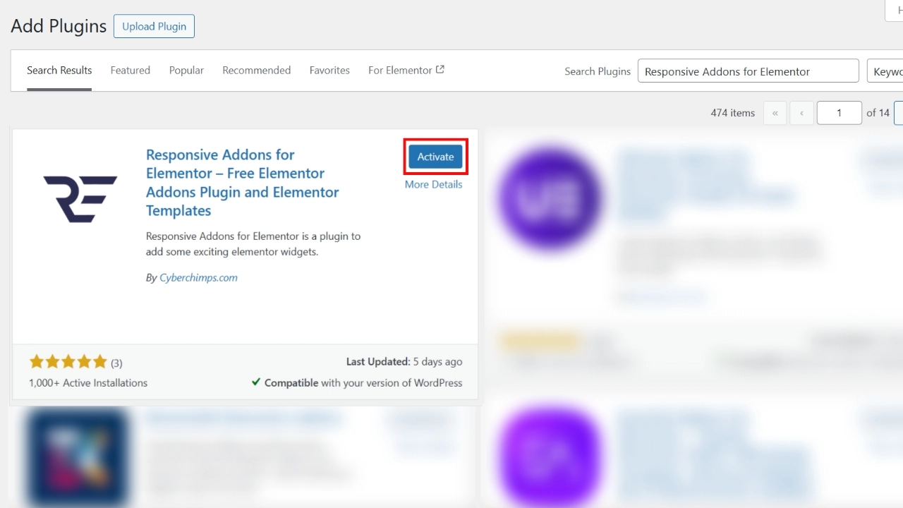
The Responsive Addons for Elementor plugin has been successfully added to your WordPress Dashboard.
Step 2: Adding Responsive Addons for Elementor Price Box Widget
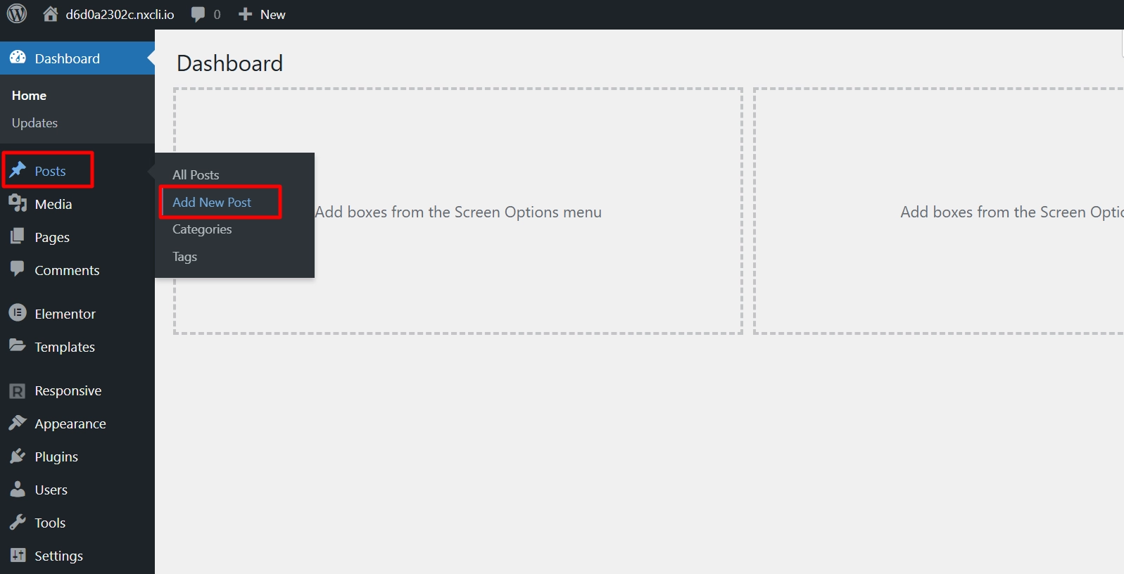
To learn how to add a price box widget, go to the WordPress dashboard and open Posts/Pages > Add New Post.
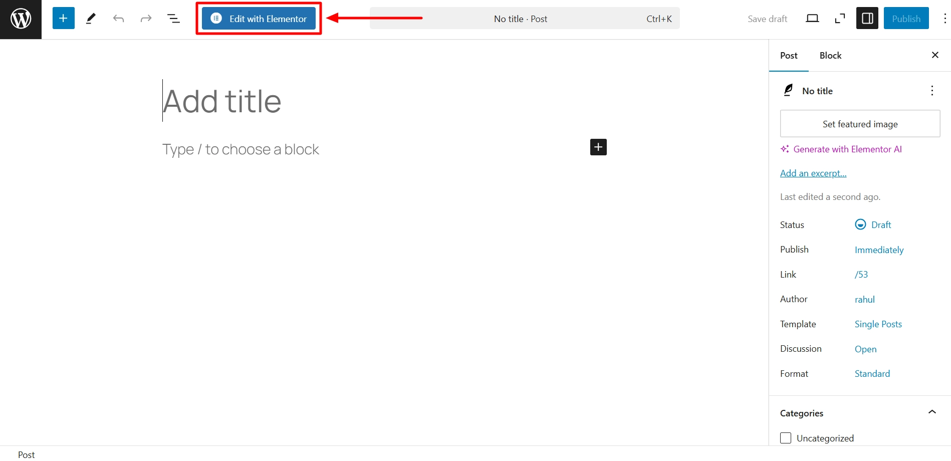
Next, click on Edit with Elementor.
Use the widget search bar to enter the RAE Price Box.
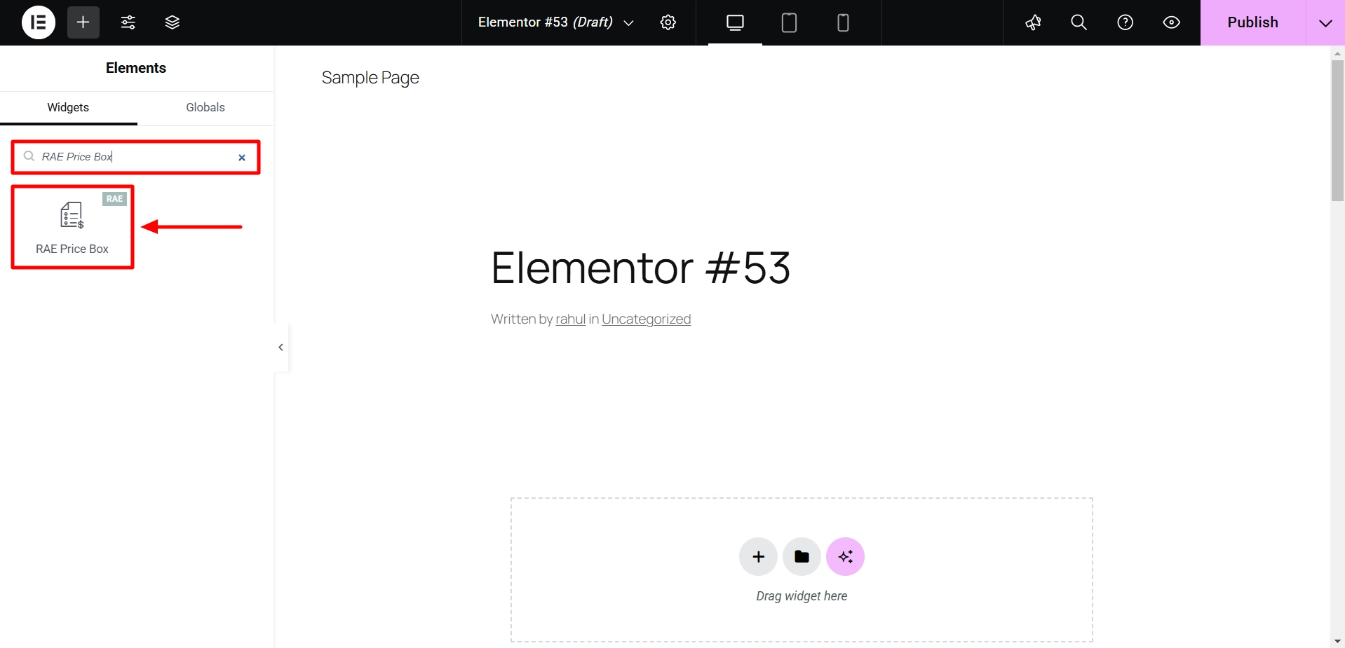
Drag and drop the widget onto the page to integrate it into your design.
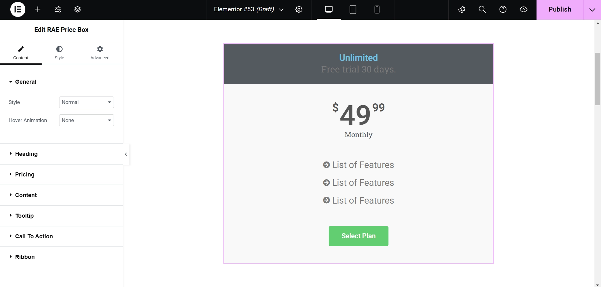
The price box will be successfully added once the widget is placed on the main page. We can then proceed with customizing it.
Step 3: Customizing Responsive Addons for Elementor Price Box Widget
There are several methods to customize your widget.
Next, let’s explore the Content section.
General
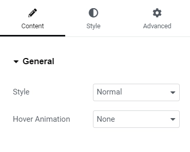
General Settings
- Style: Enables users to select the layout for the widget.
- Hover: Enables users to choose the type of hover animation for the widget.
Heading
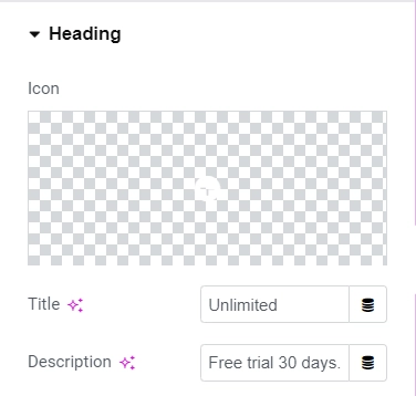
Heading Settings
- Icon: Choose an icon from the library to display with the heading text.
- Title: Add the heading text for the widget.
- Description (if the widget style is different from “Features at Bottom”): Provide the description text for the widget.
Pricing
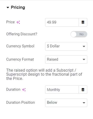
Pricing Settings
- Price: This function enables users to input the price amount.
- Offering Discount: Users can opt to display the original price if the displayed price is discounted.
- Original Price: Users must input the original price if the offering discount is turned on.
- Currency Symbol: Users can select the currency symbol for the displayed prices and have the option for a custom currency.
- Currency Format: This feature allows users to choose the currency style, such as whether the fractional part of the price should be displayed as a superscript or normal.
- Duration: Users need to input the duration for the pricing.
- Duration Position: This option allows users to select the position to display the duration, whether beside or above the price.
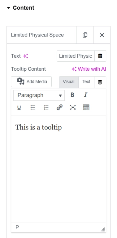
Content
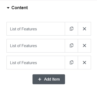
Content Settings
- Description: Permits the addition of feature descriptions.
- Tooltip Content: Enables users to input tooltip text using an editor.
- Icon: Allows users to select an icon from the icon library to display before a feature description.
- Override Global Settings: Empowers users to override the global styling of the features by toggling the button on. If this setting is activated, the following controls will be displayed:
- Icon Color: Enables users to modify the icon color of the features.
- Text Color: Grants users the ability to change the text color of the features.
- Background Color: Provides users with the option to change the background color of the feature text.
- Add Item: Enables users to include a new feature description item.
Tooltip
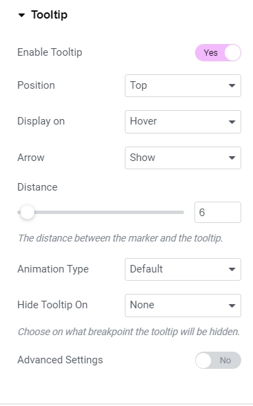
Tooltip Settings
- Tooltip Enable: This will allow users to show or hide the tooltip for all features.
- Position: Users can determine the position of the tooltip.
- Display on: Users can select the trigger method (click or hover) to display the tooltip.Arrow: Users can hide or show the tooltip’s arrow.
- Distance: This feature allows the user to set the distance between the marker and the tooltip.
- Animation Type: Users can select the animation for the tooltip when triggered.
- Hide Tooltip On: Users can hide the tooltip on tablet and mobile devices.
- When activating the “Advanced Settings” option, the following features can be accessed:
- Animation Duration: Setting the animation speed/duration.
- Width: Users can set the tooltip width to display on desktop, tablet, and mobile devices.
- Max Height: Setting the maximum height of the tooltip to display on various devices. If the content is large, a scroll bar will appear.
- Z-Index: Users can set the z-index of the tooltip. Increasing the z-index will make the tooltip visible.
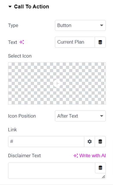
Call To Action
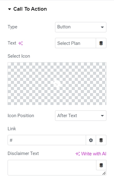
Call to Action
- Type: This feature allows you to select the type of CTA. The available options include None, Text, and Button. If the type is set to None, no other settings except for the Disclaimer text will be displayed.
- Text: This field enables you to input the text displayed for the CTA.
- Icon: You can select the library icon to display before or after the CTA text.
- Icon Position: This feature allows you to choose the icon’s position for the CTA. The available options are After text and Before text.
- Link: This feature can add the URL link for the CTA.
- Disclaimer Text: This field lets you input the disclaimer text below the CTA.
Ribbon
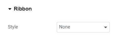
Ribbon Settings
- Ribbon Style: Provides the user with the option to select the style for the ribbon. Available choices include None, Corner Ribbon, Circular Ribbon, and Flag Ribbon. No further settings will be displayed if None is chosen as the style.
- Title: Enables the user to input the text shown on the ribbon.
- Horizontal Position: Permits the user to define the horizontal position of the ribbon about the widget. This option is only visible when the ribbon style is set to Corner or Circular Ribbon.
Step 4: Understanding the Settings of Price Box Widget
So, let’s understand the basics of Price Box Widget settings:
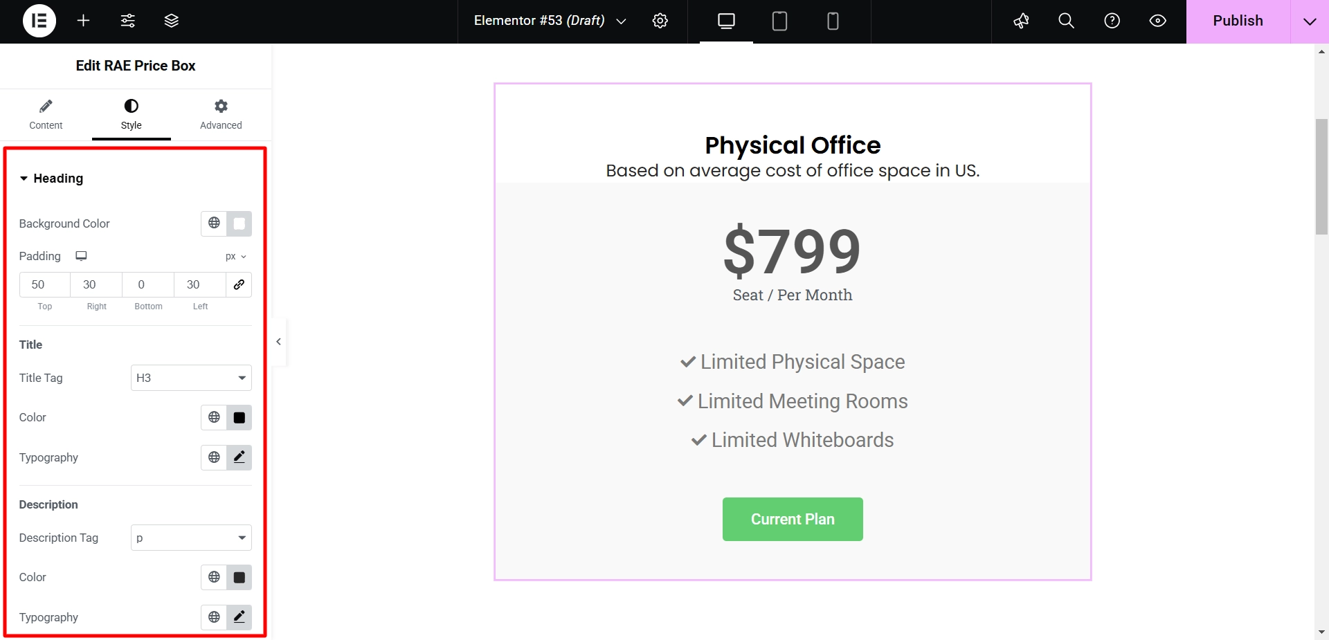
Heading
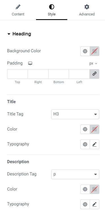
Heading Settings
- Background Color: You can choose the background color for the Heading section.
- Padding: Set the padding for the Heading section separately for desktop, tablet, and mobile devices.
- Title Tag: Choose the HTML tag for the title to be enclosed.
- Title Text Color: Select the color for the title text.
- Typography: Set the typography for the title text.
- These settings are available for all widget styles except for Features at the Bottom. Additionally, the following settings are available for the description text:
- Description Tag: Choose the description tag for the title to be enclosed.
- Description Text Color: Select the color for the description text.
- Typography: Set the typography for the description text.
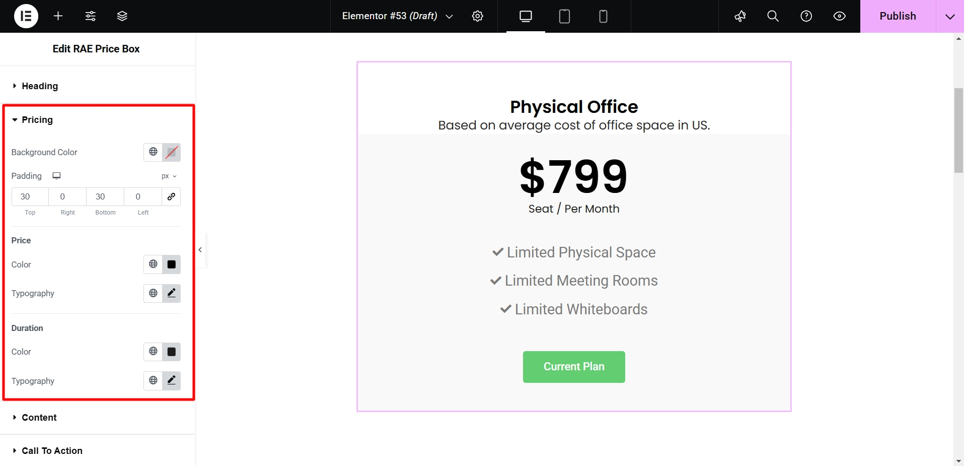
Pricing
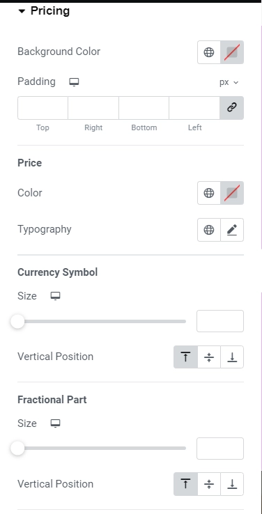
Pricing Settings
- Background Color – Allows the user to choose the background color for pricing.
- Padding – Allows the user to set the padding for the pricing section for desktop, tablet, and mobile devices. This setting is available for all widget styling except Circular Background for Price.
- Color – Allows the user to choose the color for the price text.
- Typography – Allows the user to set the typography for the price text.
- Currency Symbol – Allows the user to set the size for the currency symbol for desktop, tablet and mobile devices.
- Vertical Position – This allows the user to set the vertical position of the currency symbol relative to the price.
- Size – Allows the user to set the size of the fractional part of the price for desktop, tablet, and mobile devices.
- Vertical Position – This allows the user to set the vertical position of the fractional part of the price relative to the price.
- Color- Allows the user to choose the color for the duration of the text.
- Typography – Allows the user to set the typography for the duration of the text.
Content
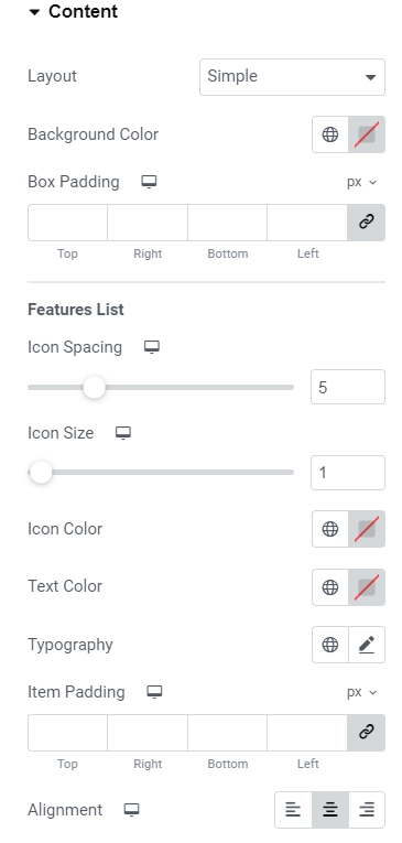
Content Settings
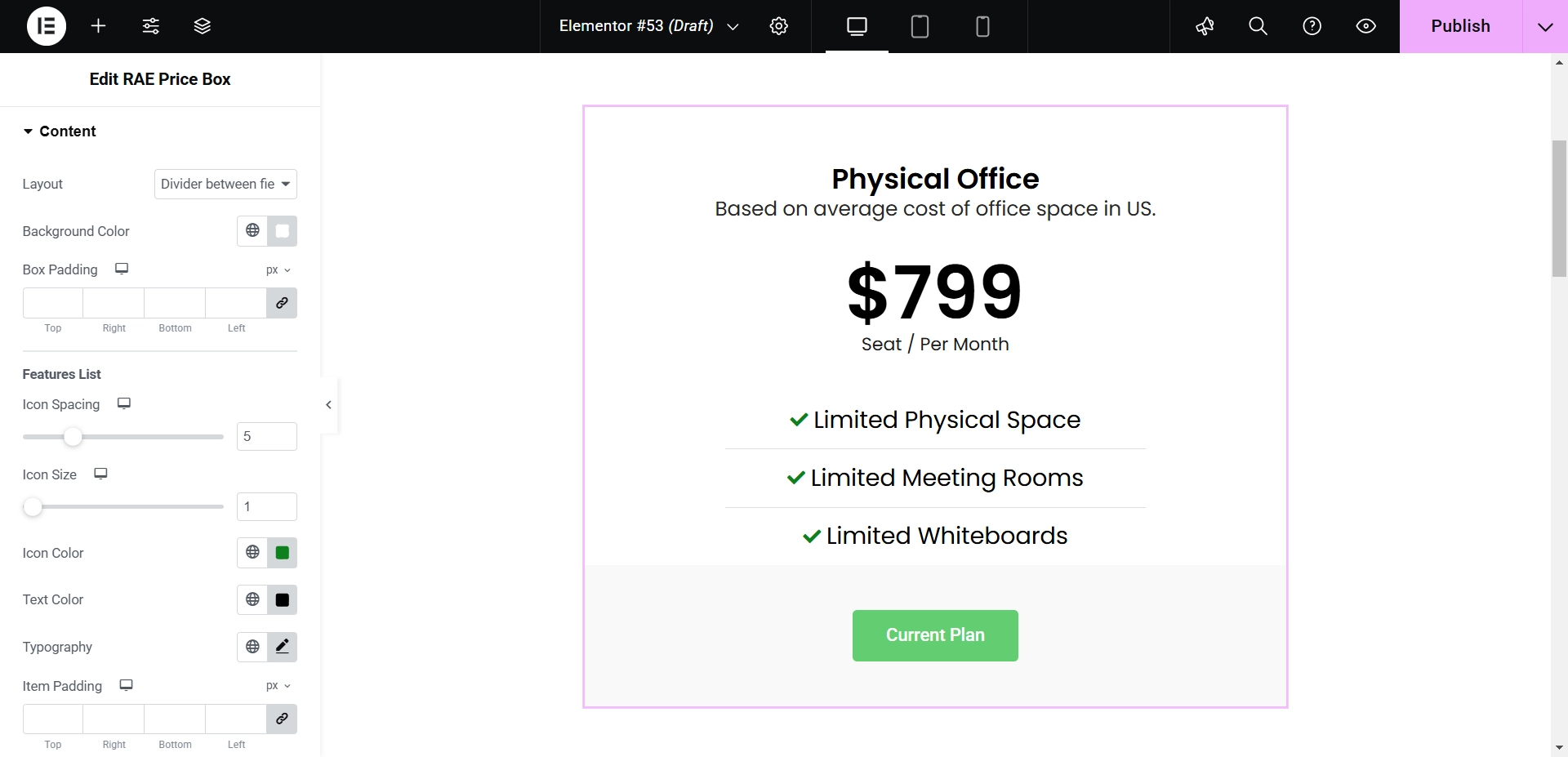
- Layout: The user can select the layout of the main content/features list. Available options are Simple, Divider between fields, Box Layout, and Stripped Layout.
- Background Color: The user can choose the background color for the main content.
- Box Padding: The user can set the padding for the main content box.
- Icon Spacing: The user can set the space between the icon and the feature text for desktop, tablet, and mobile devices.
- Icon Color: The user can choose the color for the icon in the features list.
- Text Color: The user can choose the color for the feature text in the features list.
- Typography: Allows the user to set the typography for the feature text.
- Item Padding: The user can set the padding for the features list item for desktop, tablet, and mobile devices.
- Alignment: Allows the user to align the features list items. The settings below are only available when the features list’s style is selected to be divided between fields.
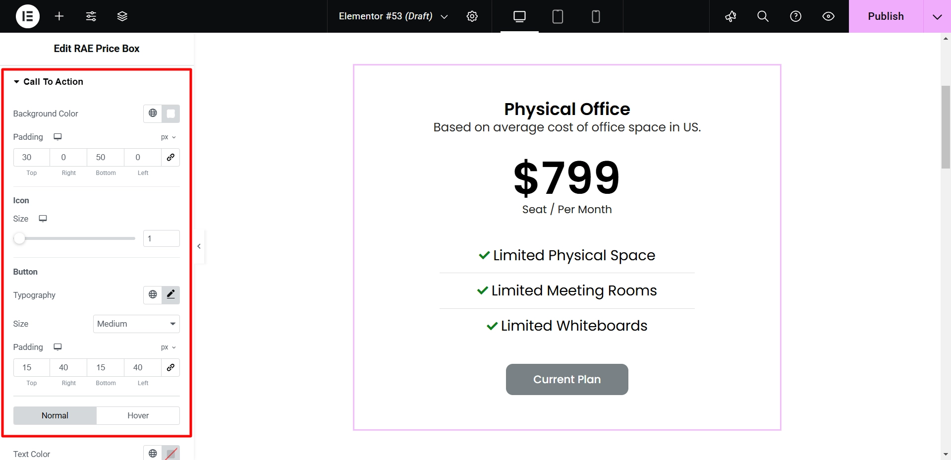
Call To Action
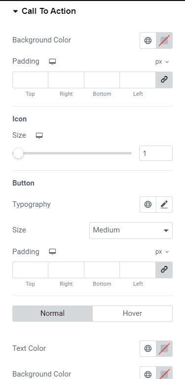
Call to Action Settings
- Background Color: Enables the user to select the background color for the CTA.
- Padding: Provides options to set the padding for the CTA on desktop, tablet, and mobile devices. These settings are applicable only for the CTA type Text.
- Icon Size: Enables the user to set the size of the icon.
- Typography: Allows the user to define the typography for the CTA text. These settings are applicable only to the CTA type Button.
- Typography: Allows the user to set the typography for the CTA button text.
- Size: Enables the user to choose the button size, such as Extra Small, Small, Medium, Large, and Extra Large.
- Padding: Provides options to set the padding for the CTA button on desktop, tablet, and mobile devices.
- Text Color: Enables the user to select the color for the CTA button text. This setting is applicable for both the Normal and Hover state.
- Background Color: Allows the user to choose the background color for the CTA button. This setting is available for both the Normal and Hover state.
Step 5: Styling Responsive Addons for Elementor Price Box Widget
Now, let’s dive into styling our price box widget to make it visually appealing.
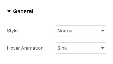
So, the first setting, which we can see under Content, is General. We’ll keep the Style as Normal and the Hover Animation as Sink for a subtle hover effect.
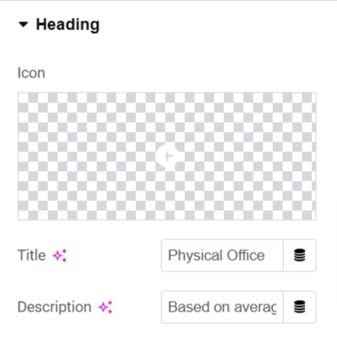
Moving on to the Heading section, I customized the Title and Description to differentiate each pricing plan. As I won’t use any icons in this design, I kept the Icon settings at their default values.
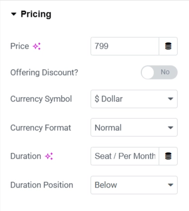
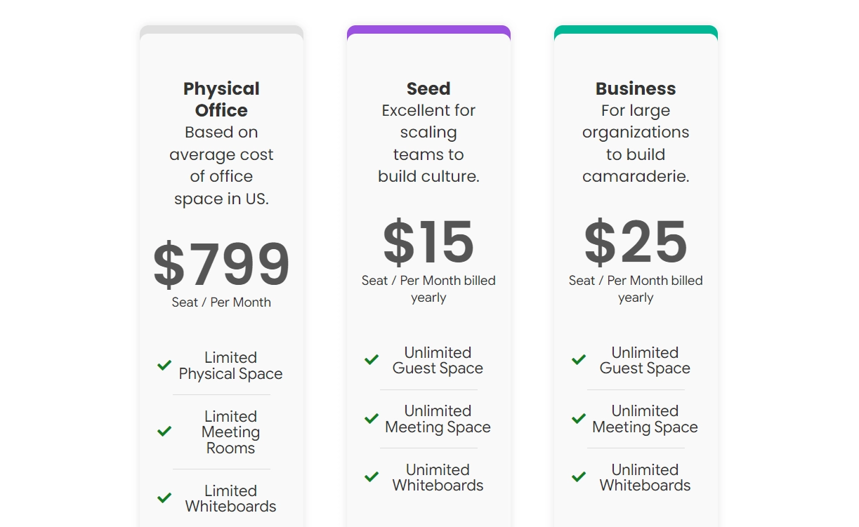
In the Pricing section, I’ve set the price for each plan. Select the correct Currency (e.g., ‘$,’ ‘€’) and specify the Duration (e.g., ‘Seat/Per Month,’ ‘Per Year’) to communicate the pricing structure to your customers.
Under the Content tab, I modified the text and replaced the icon.
Within the Call to Action tab, I edited the button text and changed its color.
After customizing the content, let’s move to the Style tab. I’ve modified the Heading section by changing the background color, adding padding, and adjusting the title and description colors and typography.
Moving to the Pricing tab, I’ve enhanced the visual appeal by adjusting the padding and customizing the font, color, and typography of both the price and duration.
Now, let’s customize the Content tab. I’ve added a divider between fields to improve readability, changed the background color, and adjusted the icon and typography for a more visually appealing presentation.
In the Call to Action tab, I adjusted the background and padding and customized the button’s typography and padding.
Once you’ve finished editing one price box, duplicate it to save time when customizing the others.
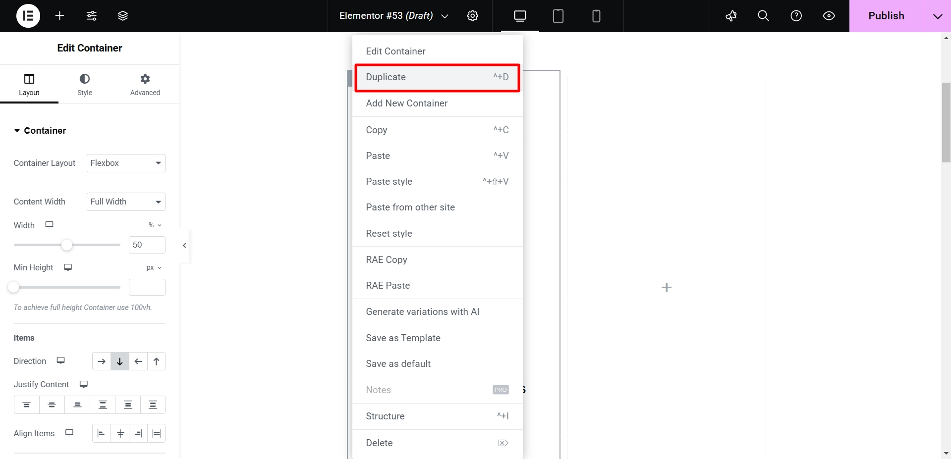
Upon duplication, proceed to modify each box’s price, description, and background color to ensure visual differentiation between pricing plans.
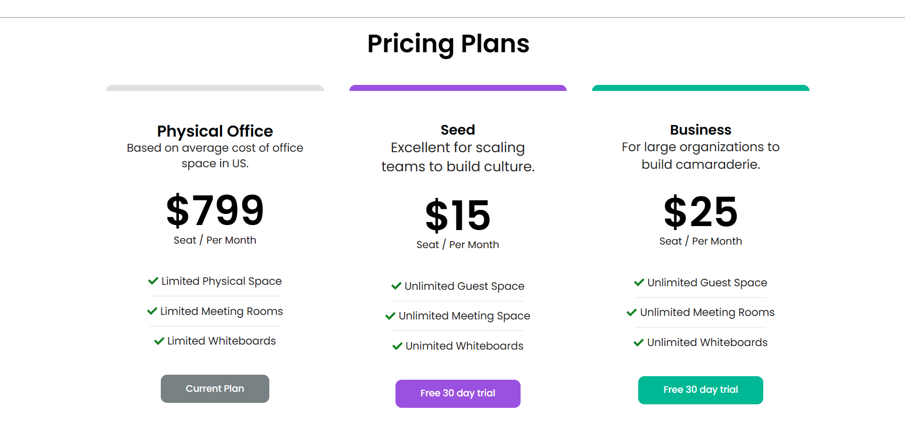
The Final Output
Here’s the final look of our Responsive Addons for Elementors’s price box.
FAQ
Install and Activate Responsive Addons for Elementor
Open the page where you want to add a price box (Use an Elementor template)
Edit with Elementor
Search for the price box widget
Drag and drop the widget
Customize the widget
Publish the page
The RAE Price Box widget allows for the addition of product and service packages in an attractive manner. It offers easy-to-understand customization controls for building the widget according to specific requirements.
Absolutely, you can add a price box for free using the Responsive Addons for Elementor plugin by Cyberchimps.
Conclusion
Adding a price box widget to your Elementor website is a simple task that could greatly improve your site’s functionality and user experience.
By following the steps specified earlier, you can effortlessly incorporate this interactive element, thus enhancing your website’s engagement and informativeness for your audience.
- How to Add Elementor Feature List To Your Website
- How To Add Product Rating To Elementor Website
- How to Fix a 400 Bad Request Error (6 Proven Methods)
- How To Add Menu Cart To Your Elementor Website
- How to Add Price List To Your Elementor Website
If you wish to include a logo carousel widget on your site, get the Responsive Addons for Elementor today! You might also want to install the Responsive theme, a versatile website theme that can streamline your website creation process.


