The header is the top section of your website displayed on all (or nearly all) pages and posts. It is the first thing every visitor sees, providing a significant opportunity to make a great first impression.
This section is where visitors are introduced to your brand, offerings, or ideas, and it aims to delight and intrigue them, encouraging them to explore your website further.
Responsive theme includes a drag-and-drop Header Builder, an excellent tool for creating impressive headers quickly and without coding. With this feature, you can easily add and customize the following elements:
- Site Title and Logo
- Primary Menu
- Secondary Menu
- Social
- Button
- Header Widgets
- and more…
You can position these elements by dragging them to your desired locations in the header.
Implementing a Header Using the Cyberchimps Responsive Theme #
This guide will walk you through creating and customizing a Header using the Cyberchimps Responsive Theme in WordPress.
Prerequisites #
Before proceeding, ensure you have installed and activated the Cyberchimps Responsive Theme.
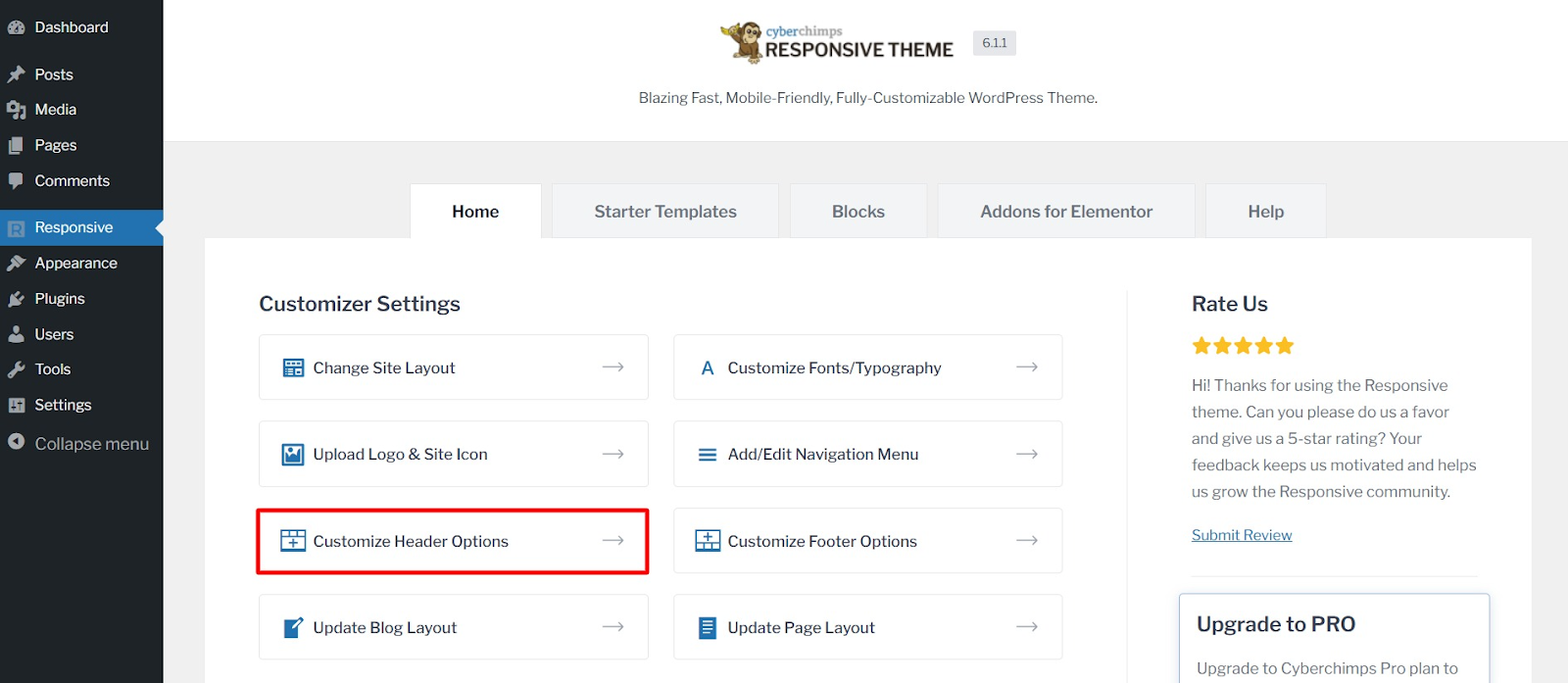
Accessing the Header Customization Options #
To begin customizing your Header, follow these steps:
- Navigate to your WordPress dashboard. Click on Responsive from the left panel and select Customize Header Option. Alternatively, hover over Appearance and click on Customize.
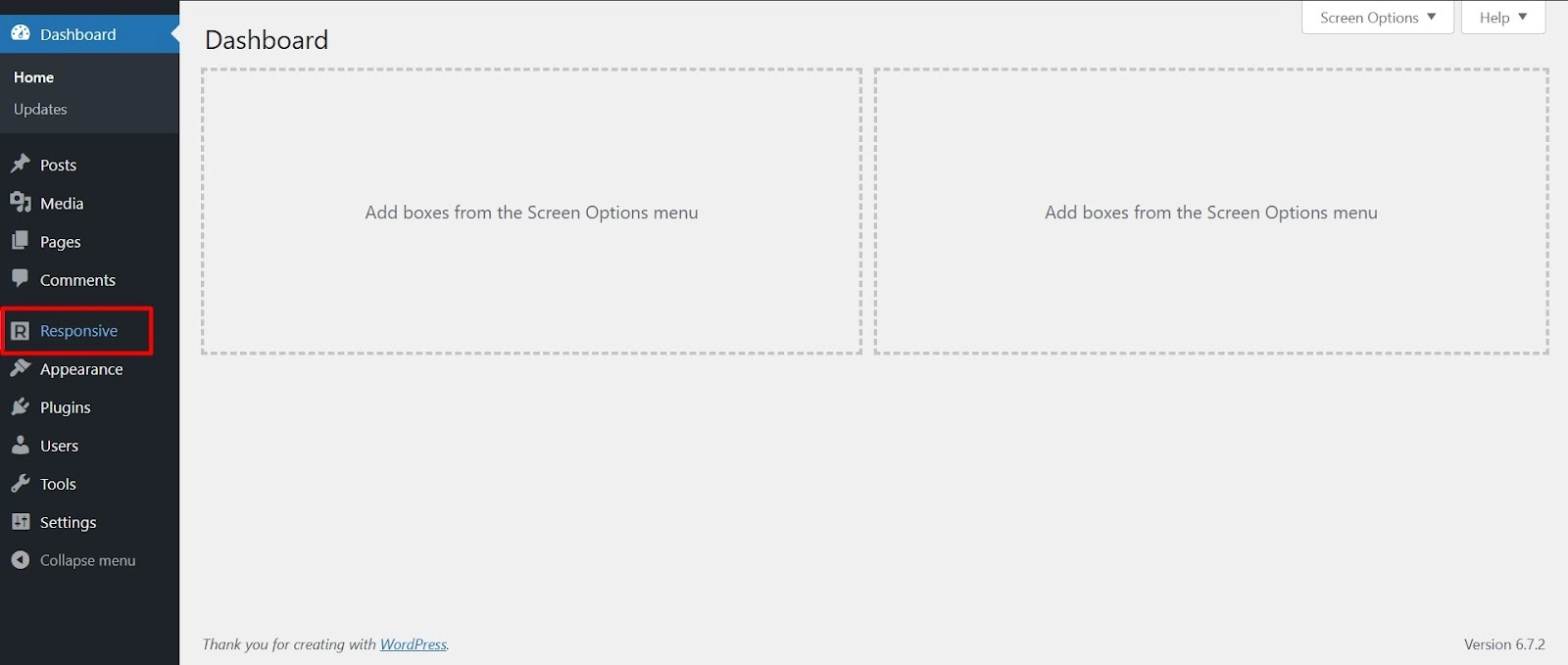
- Select Customize Header Options to open the footer settings.
Understanding the Header Builder #
All of your active header elements will be listed on the left-hand menu.
The rest of the screen will show a live preview of your header and the position of your elements across header sections.
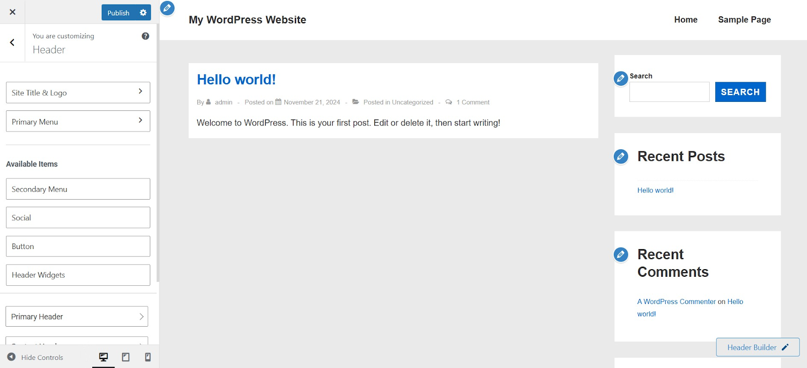
Site Title and Logo #
This section lets you set up your site’s branding, including the logo, title, and tagline.
General Settings #
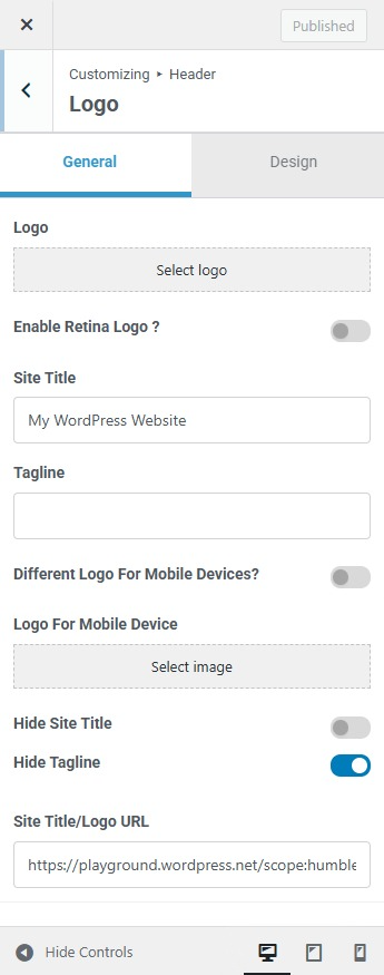
Logo: Upload an image to represent your site.
Enable Retina Logo: Use a high-resolution version of your logo for better clarity on Retina displays.
Site Title: Enter the name of your website.
Tagline: Add a short description or slogan for your site.
Different Logo for Mobile Devices: Use a different logo for mobile visitors.
Logo for Mobile Device: Upload the mobile-specific logo.
Hide Site Title: Remove the site title from view if you prefer only a logo.
Hide Tagline: Remove the tagline from being displayed.
Site Title/Logo URL: Set a link for the logo or site title, usually pointing to the homepage.
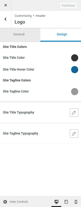
Design Settings #
The Design tab lets you adjust colors and spacing for your site’s identity:
Site Title Color: Choose the color of your site title.
Site Title Hover Color: Set the color when users hover over the site title.
Site Tagline Color: Change the color of the tagline text.
Site Typography: Customize the font style and size for the site title.
Site Tagline Typography: Adjust the font style and size for the tagline.
Primary Menu #
The Primary Menu settings control how your main navigation menu looks and functions.
Main Menu Settings #
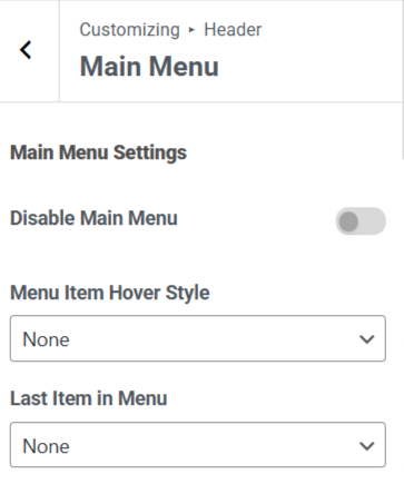
Disable Main Menu: Turn off the main menu if you don’t want it to appear.
Menu Item Hover Style: Choose how menu items behave when hovered over.
Last Item in Menu: Set a special item, such as a button or call to action, at the end of the menu.
Mobile Menu Settings #
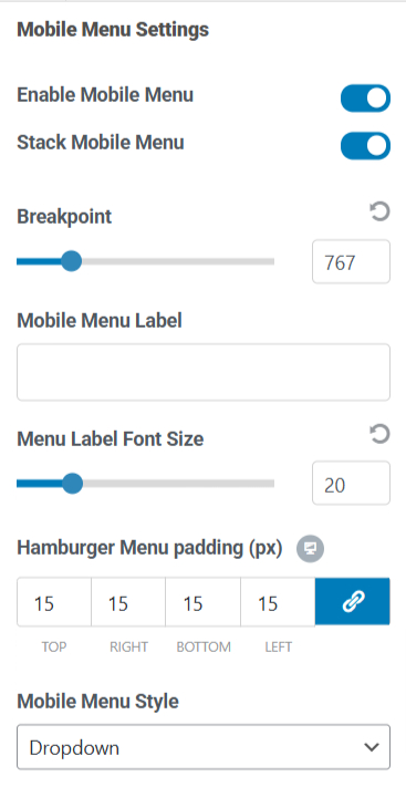
Enable Mobile Menu: Allow a mobile-friendly version of the menu.
Stack Mobile Menu: Arrange mobile menu items in a vertical stack.
Breakpoint: Decide when the menu switches to mobile mode (based on screen width).
Mobile Menu Label: Set a custom label for the mobile menu.
Hamburger Menu Padding: Adjust the spacing inside the mobile menu button.
Mobile Menu Style: Choose how the mobile menu appears.
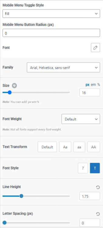
Mobile Menu Toggle Style: Customize the button style for opening the mobile menu.
Mobile Menu Button Radius: Round the corners of the menu button for a softer look.
Font: Customize the font of the mobile menu.
Font Family: Select the font style for menu items.
Size: Adjust the font size.
Font Weight: Make the text bold or lighter.
Text Transform: Change the text case (uppercase, lowercase, capitalized).
Font Style: Choose between normal, italic, or oblique text.
Line Height: Set spacing between lines in the menu text.
Letter Spacing: Adjust the space between letters for better readability.
Main & Mobile Menu Colors #
Customize the colors of your navigation menu:
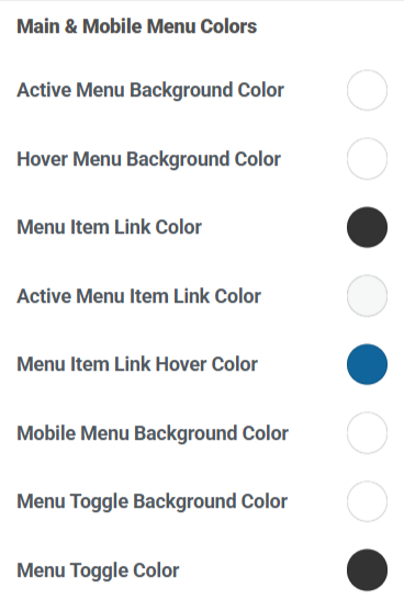
Active Menu Background Color: Change the background color of the currently active menu item.
Hover Menu Background Color: Set the background color when hovering over a menu item.
Menu Item Link Color: Choose the color for menu links.
Active Menu Item Link Color: Set a different color for the link of the currently active menu item.
Menu Item Link Hover Color: Adjust the color of links when hovered over.
Mobile Menu Background Color: Set a background color for the mobile menu.
Menu Toggle Background Color: Change the background color of the menu toggle button.
Menu Toggle Color: Set the menu toggle icon or text color.
Sub Menu Settings #
These settings help control the appearance of dropdown or submenus:
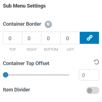
Container Border: Add a border around the submenu container.
Container Top Offset: Adjust the distance between the main menu and the submenu.
Item Divider: Insert dividers between submenu items for better separation.
Sub Menu Colors #
Customize the colors for dropdown menus:
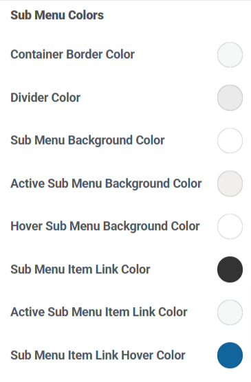
Container Border Color: Change the color of the submenu border.
Divider Color: Adjust the color of dividers between submenu items.
Sub Menu Background Color: Set a background color for the submenu.
Active Sub Menu Background Color: Change the background color of the currently active submenu item.
Hover Sub Menu Background Color: Adjust the background color when hovering over a submenu item.
Sub Menu Item Link Color: Set the color for submenu links.
Active Sub Menu Item Link Color: Choose a different color for the active submenu item.
Sub Menu Item Link Hover Color: Adjust the color of submenu links when hovered over.
These settings allow you to fully customize your website’s branding and navigation experience for both desktop and mobile users.
Visual Header Builder #
The Header comprises three distinct sections you can manipulate within the visual header builder area. You can utilize all three sections to add any element at any position.
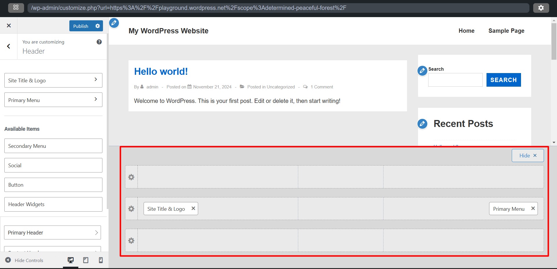
Three Header Sections #
- Primary Header: This is the central section of the Header. It displays your most important elements, such as the Logo, Primary Menu, Search bar, Cart, and Account links.
- Above Header: Located above the Primary Header on your website, this upper section can accommodate secondary elements such as a secondary menu, social icons, or call-to-action buttons. Additionally, you can insert HTML code to showcase current discounts, breaking news, or notifications for your website visitors.
- Below Header: Positioned below the Primary Header, this lower section serves the same purpose as the Above Header. It allows additional elements and information to be displayed without overcrowding the Primary Header.
The primary function of the Above and Below Headers is to minimize clutter in the Primary Header. They provide extra space to include all necessary elements and information while helping to prioritize content effectively.
You can adjust each section by clicking the “settings” icon on the left.
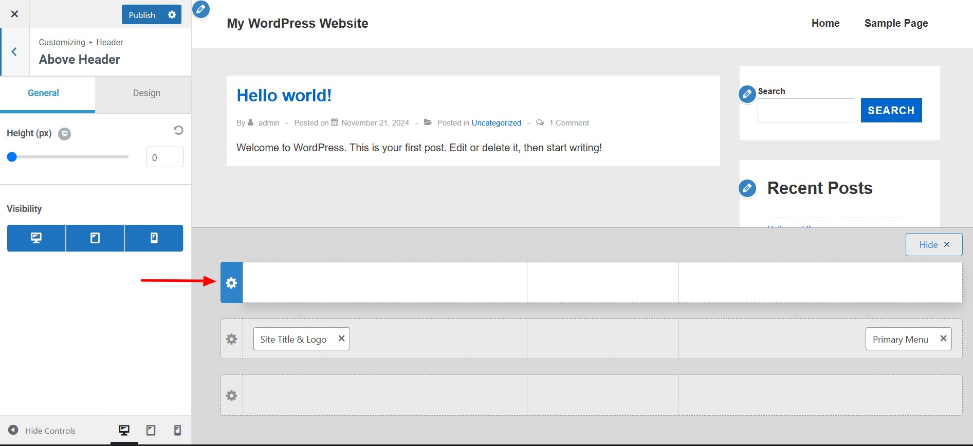
Each section features two tabs:
General
- Height: Set the height of each header individually.
- Visibility: You can select how the header will be displayed on desktop, laptop, and mobile devices.
Design
- Background Color: Choose the background color for the header.
- Bottom Border Color: You can add a bottom color to separate your header from another section or website content.
- Bottom Border Size (px): To separate your header from another section or website content, you can add a bottom border by adjusting the size.
- Padding: Add padding on one or more sides of the header. This creates space between the edges of the header section and its content.
- Margin: Add margin on one or more sides of the header. This creates space between the header and other areas of the website, such as other headers, page or post content, and the edges of the screen.
Each header can be customized separately for desktop and mobile views, allowing for different elements to be added for each format. You can also change the position of these elements as needed.
Adding Elements to the Header with the Visual Header Builder #
Using the + icon, you can add various elements to any of the three headers. Here are the available options:
1. Search: This element adds a search function to your Header. You can customize the Icon Size, Icon Color, and Margin.
2. Secondary Menu: If you require an additional (secondary) menu, you can add it here. It is also helpful to split your primary menu into two separate menus. For instance, you can create a header with a centrally positioned logo and menu items on both the left and right sides. You can customize this secondary menu in the same way as the Primary Menu.
3. Social (Header): Use this element to include your social media icons in the Header. You can manage these icons in the General tab by adding, selecting, or removing them. The Design tab offers options for styling the icons.
4. Button: The Toggle Button (often called the hamburger icon) expands your mobile/tablet menu. This element is only available in tablet or mobile views. You can choose the Icon and Icon Size buttons in the General tab, add a Menu Label (text next to the icon), and select the Toggle Button Style. The Design tab provides styling options such as Icon Color, Background Color, Border Radius, and Margin.
5. Header Widgets: This option allows you to add any website widgets (found under Dashboard > Appearance > Widgets) to your Header.
6. Cart: This element adds a Cart icon (for WooCommerce) to your Header. You can display the Cart Title, just the Cart icon, or include a Cart Total (this setting can be found in the General tab). Additionally, you can style your cart and the cart tray in the Design tab.
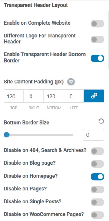
Transparent Header #
Enabling a transparent header removes the background color from the header. It shifts your content to the top of the page, positioning it directly underneath the header to create a transparency effect.
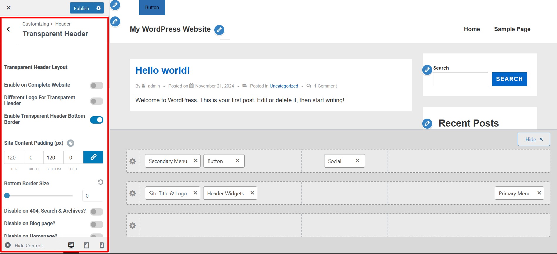
Transparent Header Layout Options #
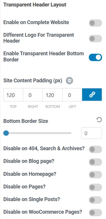
Enable on Complete Website: This option enables the transparent header site-wide. This action will open additional options to turn off the transparent header for specific pages or post types.
Different Logo for Transparent Header: If your logo looks good on the standard header but not with a transparent one, you can activate this option to upload a different logo specifically for the transparent header.
Enable Transparent Header Bottom Border: Adds a bottom border to the transparent header for better separation.
Site Content Padding (px): Adjusts the space between the header and the page content to prevent overlap.
Bottom Border Size: Defines the thickness of the bottom border for the transparent header.
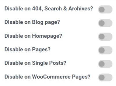
Page-Specific Disable Options
You can selectively disable the transparent header on specific pages:
Disable on 404, Search & Archives? Hides the transparent header on error pages, search results, and archive pages.
Disable on Blog Page? Prevents the transparent header from appearing on the blog index page.
Disable on Homepage? Removes the transparent header from the homepage.
Disable on Pages? Disables the transparent header on all individual pages.
Disable on Single Posts? Hides the transparent header on single blog posts.
Disable on WooCommerce Pages? Turns off the transparent header on WooCommerce product and checkout pages.
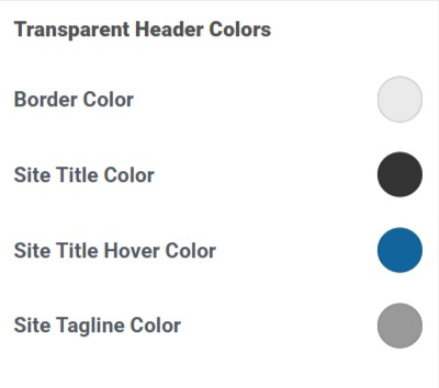
Transparent Header Colors #
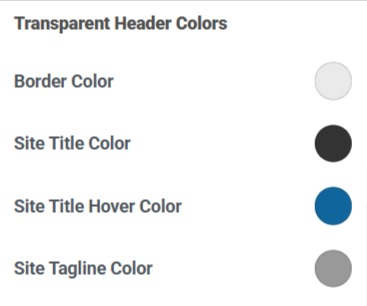
Border Color: Sets the color of the transparent header’s bottom border.
Site Title Color: Change the color of your site title in the transparent header.
Site Title Hover Color: Defines the color when users hover over the site title.
Site Tagline Color: Customize the color of the site tagline when using a transparent header.
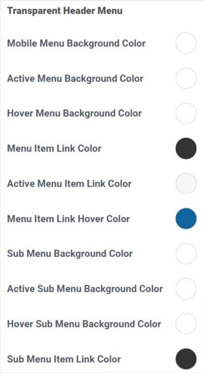
Transparent Header Menu #
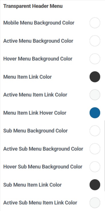
Mobile Menu Background Color: Sets the background color of the menu when viewed on mobile devices.
Active Menu Background Color: Changes the background color of the currently active menu item.
Hover Menu Background Color: Defines the background color when hovering over menu items.
Menu Item Link Color: Adjust the text color for menu links.
Active Menu Item Link Color: Changes the text color for the currently active menu item.
Menu Item Link Hover Color: Sets the text color when hovering over menu links.
Sub Menu Background Color: Defines the background color of dropdown menus.
Active Sub Menu Background Color: Changes the background color of the currently active submenu item.
Hover Sub Menu Background Color: When hovering over submenu items, adjust the background color.
Content Header #
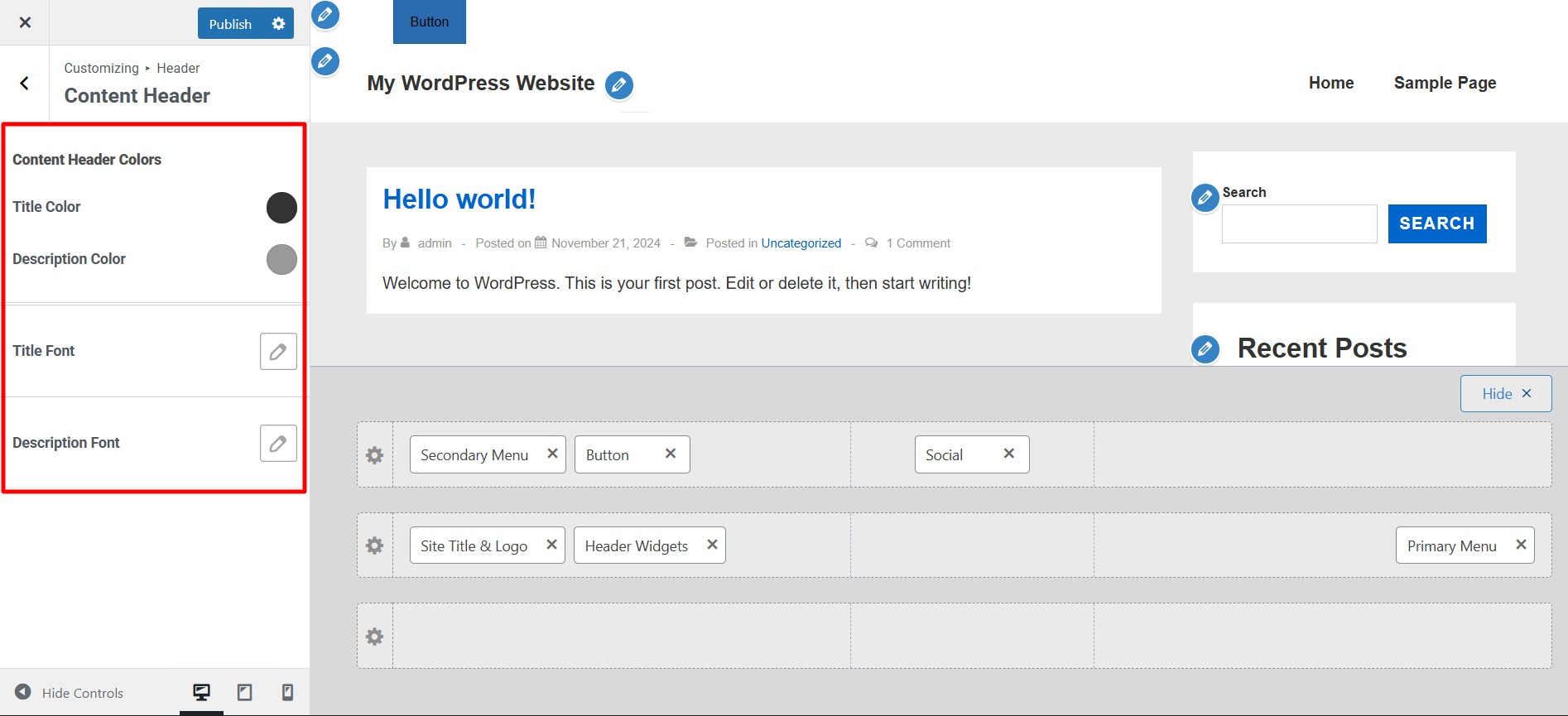
These settings are likely related to the design and styling of a webpage, application, or content management system. Here’s what each one typically controls:
- Content Header Colors – Defines the color of the header section that contains the main title or introductory text.
- Title Color – Sets the color of the main title text.
- Description Color – Controls the color of the description text, which is usually a subtitle or additional information under the title.
- Title Font – This allows you to choose a specific font style for the title text.
- Toggle Typography – This setting enables or disables typography customization options (such as font size, weight, and spacing).
- Description Font – Sets the font style for the description text.
- Family: This setting allows you to select a specific font style for the title.
- Size: Controls the font size of the title.
- Font Weight: Determines how bold or light the text appears.
- Text Transform: Modifies how the text appears in terms of capitalization.
- Font Style: Defines additional styling, such as italicization.
- Line Height: Controls the vertical spacing between lines of text.
- Letter Spacing (px): Adjusts the horizontal space between individual letters.
Sticky Header #
A Sticky Header is a website navigation bar that remains fixed at the top of the page when users scroll down. These settings allow customization of how the sticky header behaves.
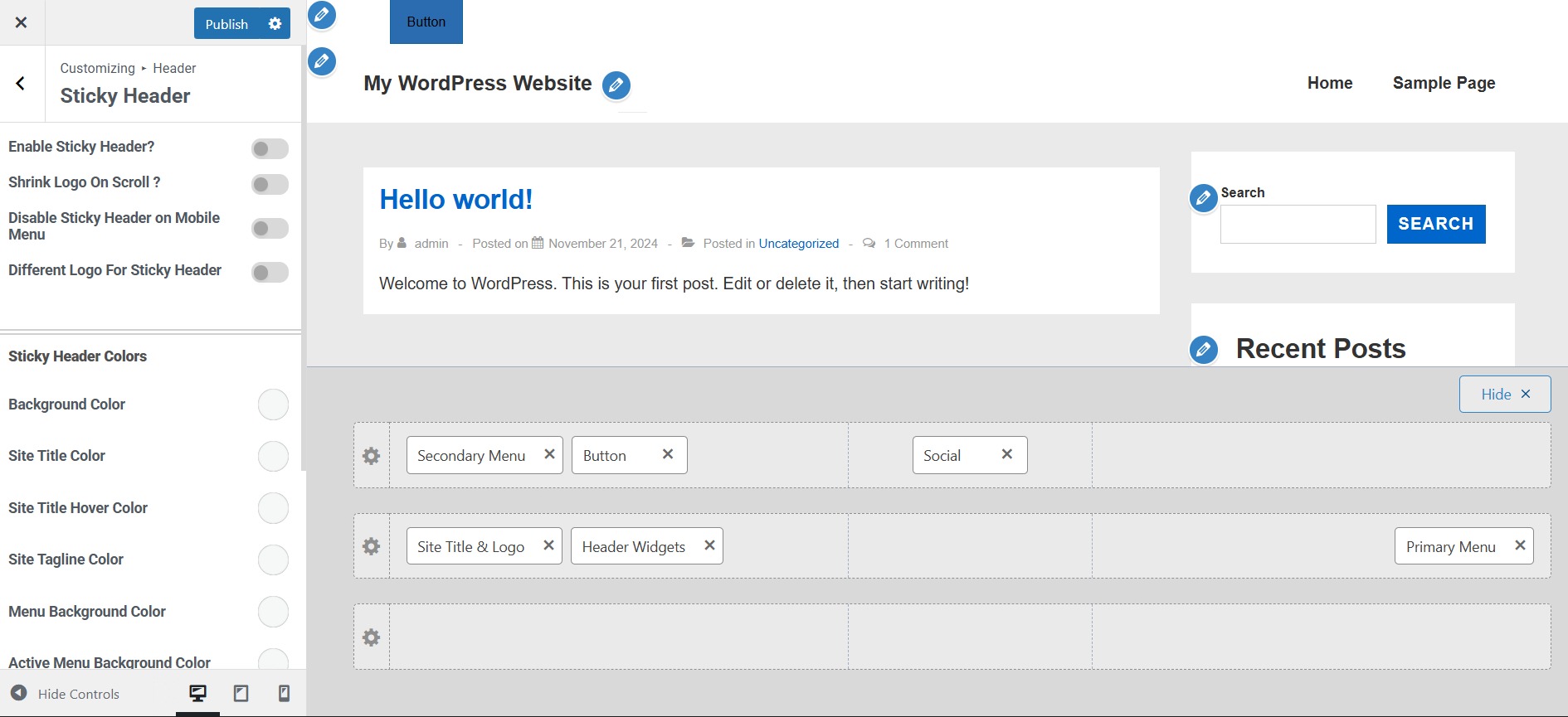
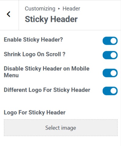
Enable Sticky Header? Turns the sticky header feature on or off.
Shrink Logo On Scroll? Reduces the size of the logo when the user scrolls down.
Disable Sticky Header on Mobile Menu: Prevents the sticky header from being active when viewed on a mobile device.
Different Logo For Sticky Header: Allows you to upload a separate logo for the sticky header.
Logo For Sticky Header: This lets you upload and specify which logo will be used when the sticky header is active.
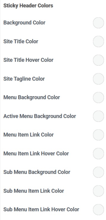
Background Color: Sets the sticky header’s background color when active.
Site Title Color: Defines the color of the website title text in the sticky header.
Site Title Hover Color: Changes the color of the site title when hovered over.
Site Tagline Color: Sets the color for the tagline (if displayed) in the sticky header.
Menu Background Color: Defines the background color of the entire menu section in the sticky header.
Active Menu Background Color: Sets the background color of the currently active menu item (the page the user is currently on).
Menu Item Link Color: Controls the default color of menu links (navigation items).
Menu Item Link Hover Color: Changes the color of menu links when hovered over.
Sub Menu Background Color: Sets the background color for the dropdown or submenus in the sticky header.
Sub Menu Item Link Color: Defines the color of links inside the submenu.
Sub Menu Item Link Hover Color: Changes the submenu link color when hovered.
Transparent Header #
In this section, you’ll find options to style your transparent header, including settings for the site title, background, menu, submenu, and colors.

Bottom Border Size: Controls the thickness of the bottom border for the transparent header.
Enable on Complete Website: This option applies the transparent header across your entire site. If unchecked, you can selectively enable it on specific pages.
Different Logo for Transparent Header: Allows you to upload an alternate logo specifically for the transparent header (useful if your default logo doesn’t contrast well against the transparent background).
Enable Transparent Header Bottom Border: Adds a bottom border to the transparent header, which can help define the header area if needed.
Site Content Padding (px): Adjusts the spacing between the transparent header and the page content to prevent overlap.
Disable on 404, Search & Archives? Hides the transparent header on error pages, search result pages, and archive pages.
Disable on Blog Page? Prevents the transparent header from appearing on the main blog listing page.
Disable on Homepage? Removes the transparent header from the homepage.
Disable on Pages? Turns off the transparent header on all standard pages.
Disable on Single Posts? Hides the transparent header on individual blog posts.
Disable on WooCommerce Pages? Prevents the transparent header from displaying on eCommerce-related pages like product pages, carts, and checkout.
Border Color: Sets the bottom border color for the transparent header.
Site Title Color: Defines the text color of the site title.
Site Title Hover Color: Changes the site title color when hovered over.
Site Tagline Color: Adjusts the text color of the site tagline (if displayed).
Mobile Menu Background Color: Sets the background color of the mobile navigation menu.
Active Menu Background Color: Changes the background color of the currently active menu item.
Hover Menu Background Color: Defines the background color when hovering over menu items.
Menu Item Link Color: Adjusts the text color of menu links.
Active Menu Item Link Color: Changes the text color of the currently active menu item.
Menu Item Link Hover Color: Defines the text color when hovering over menu links.
Sub Menu Background Color: Sets the background color for dropdown menus.
Active Sub Menu Background Color – Changes the background color of the currently active submenu item.
Hover Sub Menu Background Color – Adjusts the background color when hovering over submenu items.
Sub Menu Item Link Color: Sets the text color for submenu links.
Active Sub Menu Item Link Color: Changes the text color of the active submenu item.
Sub Menu Item Link Hover Color: Defines the text color when hovering over submenu links.
Menu Toggle Background Color: Defines the background color of the menu toggle button.
Menu Toggle Color: Sets the menu toggle icon or text color.
Background Image: Allows you to upload an image to be used as a background for the transparent header instead of a solid color.
Keep in mind that these settings apply only to your transparent header. If you use your regular header on some pages, these settings will not be applied there.
Finalizing Your Header #
Once you’ve made your desired changes:
- Review the live preview to ensure your footer appears as expected.
- Click Publish to save your modifications.
- Refresh your website to see the updated header in action.
Following these steps, you can create a professional and functional header using the Cyberchimps Responsive Theme in WordPress.
A well-optimized header sets the tone for your website, enhances usability, and strengthens your brand presence.


it looks like things have been changed as I can’t find the Visual Header Builder anywhere in the settings
The new way to build headers is using Header Footer Builder, it comes free in the Responsive theme customizer.
Hi! Thank you for this walkthrough. Whenever I enable the tagline on my website, the title becomes off-centre, lined up with the left end of the tagline while the tagline is centred, is there a way to centre both? Thank you in advance.
Hey,
Please open a ticket at support@cyberchimps.com, our team will help you resolve the issues.