Are you a website owner concerned about your website’s mobile experience and want to optimize your WordPress site for mobile users?
If yes, then this guide is for you!
I understand that failing website metrics can be frustrating, especially when you have invested a lot of effort, time, and money in building a website from scratch.
Mobile optimization metrics are among the irritating factors that persist on your website even after tons of optimizations.
My team and I consulted with many website development and UX experts, and a common insight we gained was that website owners often fail to mobile-optimize their websites correctly!
What do I mean? The answer is quite long, based on continuous mistakes—probably ones you are also making.
Make sure you read through the article to understand what exactly!
- Why is Mobile Optimization Essential for WordPress Sites?
- How to Test Your WordPress Website for Mobile Compatibility
- 8 Ways to Optimize Your WordPress Website for Mobile
- FAQ
- Conclusion
Why is Mobile Optimization Essential for WordPress Sites?
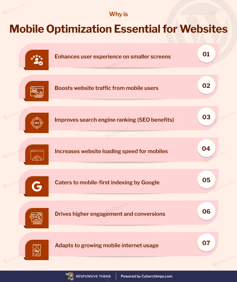
If you are searching for this, you probably already understand the gravity of fact: why you need to mobile optimize your WordPress site.
Well, if not, without spending much time, I will summarize for you in short some crucial stats that will give you a clear idea:
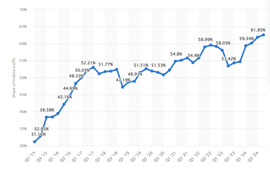
Recent research by Statista found that between the first quarter of 2015 and the fourth quarter of 2025, mobile device website traffic jumped from 31.16% of users to 61.85%. However, 73% of mobile users reported experiencing slower website performance on mobiles than on other devices.
Another survey reveals that mobile commerce accounts for 23% of total purchases and contributes 60% of e-commerce revenues.
Nevertheless, 53.8 expert web designers believe that most websites still need to be optimized for mobile. 73.1% of designers say that non-responsive design is the primary reason users leave a website. Further, it causes 65.4% higher bounce rates and 80.8% lower conversion rates.
Furthermore, other key mobile usage data stats reveal:
- 88% of users are less inclined to return to a website after having a negative experience.
- 90% of consumers have quit using an app because of its poor mobile performance.
- 57% of users do not recommend a business with a poorly designed mobile website.
- 50% of customers abandon a website if it is not mobile-friendly.
- 66% of mobile users believe a negative user experience harms their perception of the brand.
- Following a bad mobile experience, 40% of users switch to competitors.
These facts might have given you a clear idea of why you should optimize your WordPress website if you haven’t yet.
How to Test Your WordPress Website for Mobile Compatibility
Before we dive into addressing the primary concerns and mistakes on the mobile responsiveness of your website, it is essential to evaluate what parameters are hindering your website’s compatibility.
To identify issues, you can run performance tests using multiple tools and software. However, most of these tools highlight problems with different names.
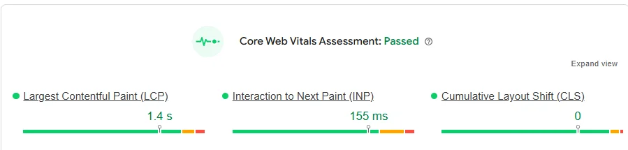
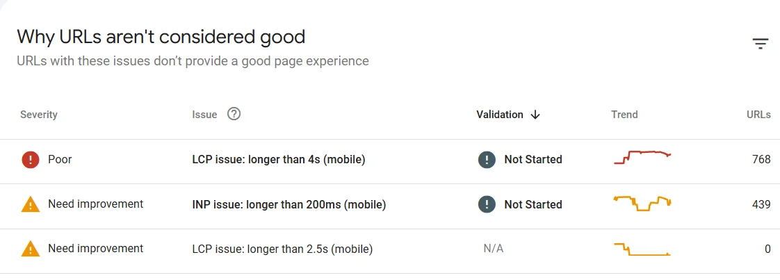
Page Speed Insights test is a Google-recommended check that covers most compatibility checks. As the name suggests, it is a standard test that clearly shows your website’s performance page speed matrix.
It calculates performance insights into your website’s page load speed when a user visits it and determines if your website passed or failed based on three crucial core web vitals:
- Largest Contentful Paint (LCP): It tracks the time your site takes for the largest visible content element on the page to load and become visible to the user.
- First Interactive Paint (FIP): This metric measures the time it takes for a webpage to respond to the first user interaction.
- Cumulative Layout Shift (CLS): This metric calculates how much your page’s layout shifts during its loading phase.
To run your website’s page speed insight test, you can directly go to Page Speed Insights and paste your website’s URL.
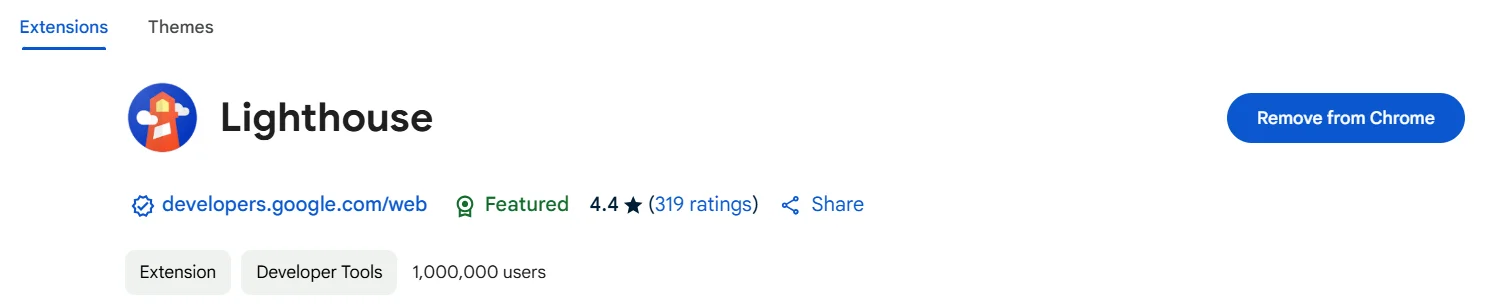
Also, to simplify, you can download the Lighthouse extension, which runs through a page speed insights check when clicked on a website.
8 Ways to Optimize Your WordPress Website for Mobile
Alongside the challenges highlighted by the mobile compatibility test, developers generally overlook other common mistakes due to their lack of experience and knowledge.
Based on the most common mistakes, experts suggest, we will cover how you can avoid or solve them.
1. Selecting the Right WordPress Theme
A WordPress theme is crucial when creating a WordPress website. It provides the required layout and wireframe. Choosing a theme is the first step in building your website; the rest of the website is built on its fundamentals.
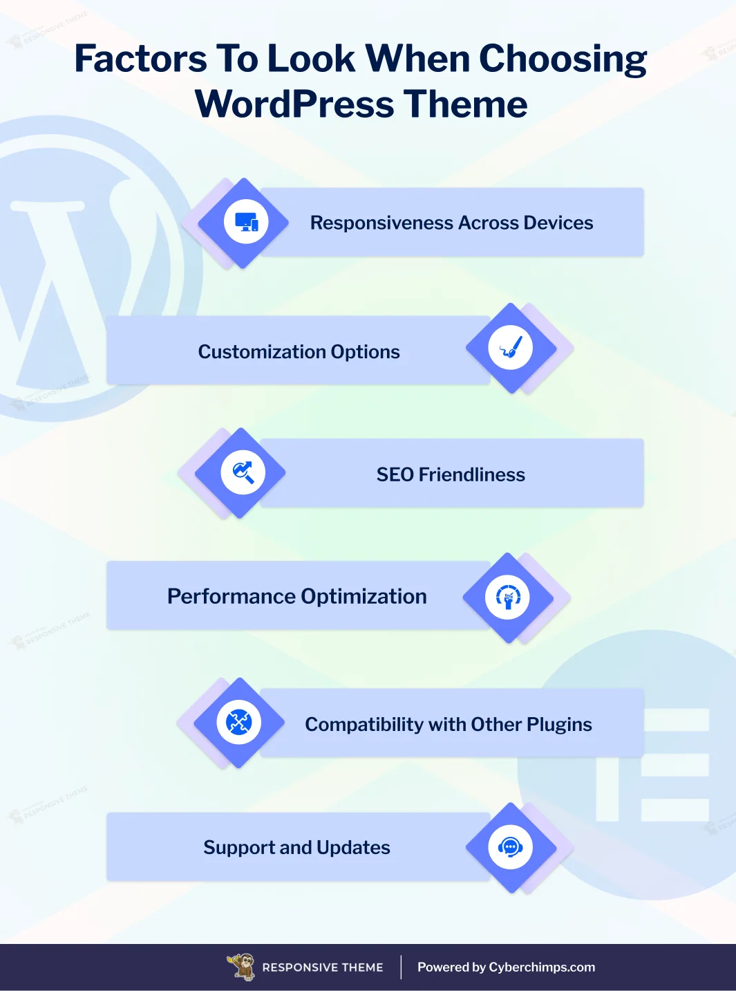
A common mistake people make when choosing a theme is choosing just any random theme. The WordPress directory features over 50000 themes; however, most do not offer the essentials you need.
As a result, once you build your website, you will face challenges such as large page sizes, slow page loading, lack of responsiveness, conflicts with other plugins and tools, and more.
Further, you can check out our detailed guide on How To Choose A WordPress Theme?
However, to further ease your stress, you can check out our suggestion: Cyberchimps Responsive Theme.
Responsive Theme by Cyberchimps
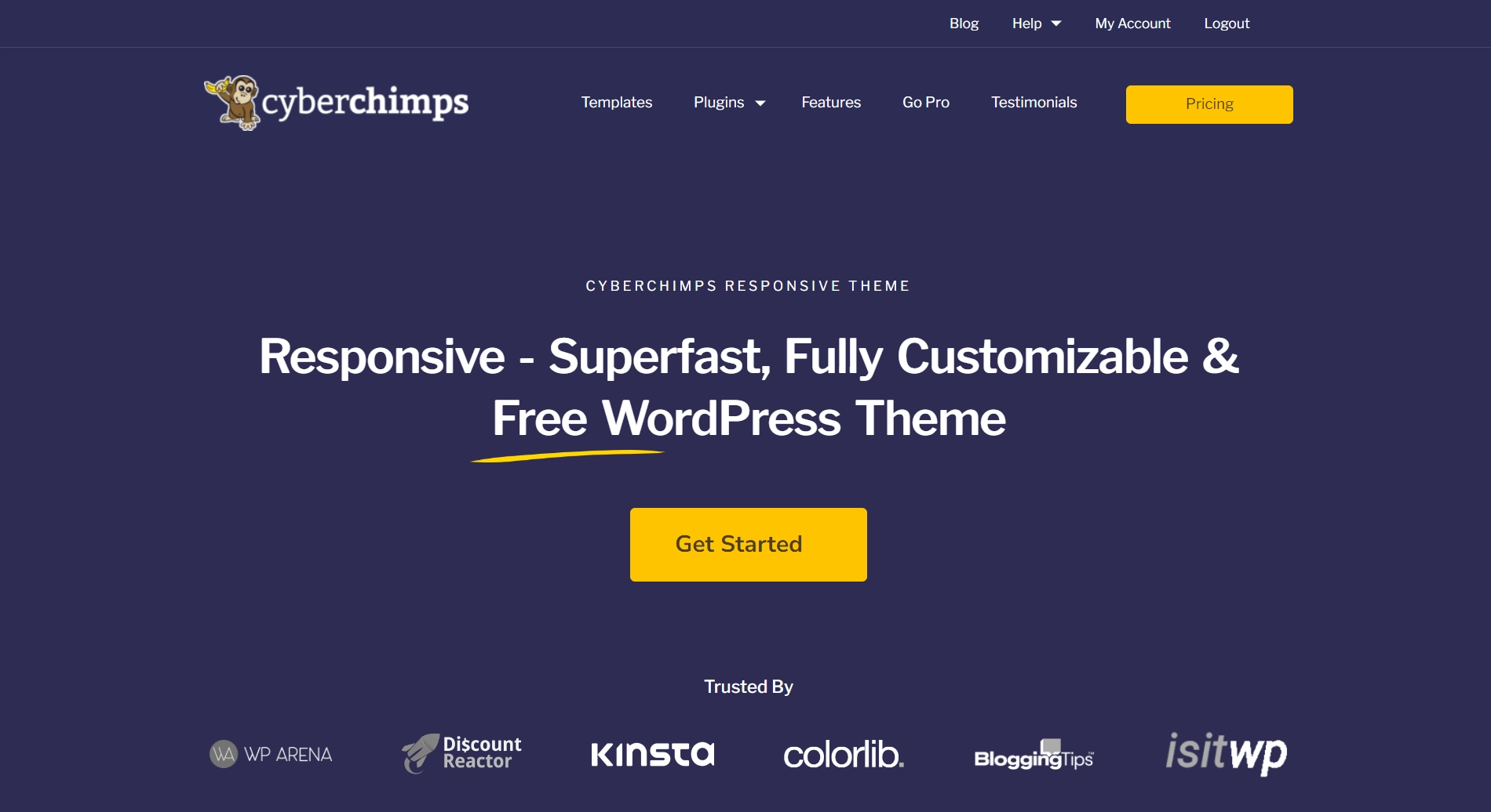
As the name suggests, Cyberchimps Responsive is a mobile-optimized, multipurpose WordPress website theme. It includes all the necessary elements to build a functional website that is accessible to users of all device types.
Some major features of the theme include:
- It is fast and lightweight, with a 100% GTmetrix score for test websites.
- Optimized codes for SEO and search rankings efficiency.
- Provides comprehensive customization options, including a visual composer with exclusive color and font presets, a header and footer builder, and simple navigational settings.
- Integrates seamlessly with third-party tools.
- Regular updates and ongoing user support via email, support tickets, guided documentation, and tutorial videos.
Furthermore, the theme works smoothly with its sister plugin, Responsive Plus—Starter Templates, which includes over 250 website templates for constructing Elementor and Gutenberg sites with a single import.

Checkout the Cyberchimps Responsive Theme Review to learn about the theme in detail.
2: Using Optimized Images
Visuals undoubtedly play a significant role when a user comes to your website; it hooks them and works as one of the most engaging components.
However, developers and designers often make common mistakes while using images and visuals on websites. High-quality images are often big and contribute to page loads on the website, knowingly or unknowingly. Adding such images contributes to the page size, which loads slowly and hampers user experience.
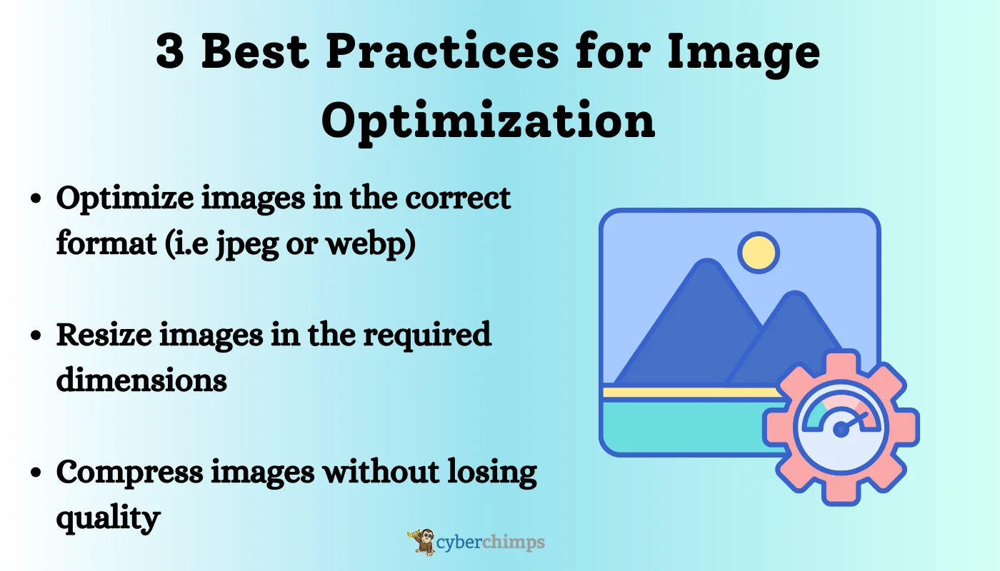
If you are wondering how to optimize images for your website, consider using tools like TinyPNG, Pixelied, or PhotoPea. These tools help you optimize, resize, and compress images to fit your requirements.
3. Accelerated Mobile Pages (AMP)
While you might have heard of the term AMP, you might not have applied it on your site or might not have understood what it is.
Basically, AMP, or Accelerated mobile pages, is an open-source code framework offered by Google to help users create fast-loading web pages on mobile devices.
Applying this framework on the back of your website codes makes your page faster and more accessible to mobile users.
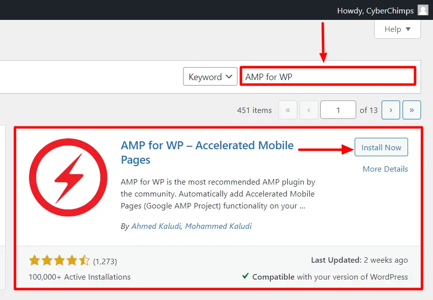
If you are a WordPress user who is less familiar with coding and is concerned about creating AMP, you may consider using AMP plugins like AMP for WordPress.
To learn how to use it, refer to our guide on How To Set up AMP On Your WordPress Website.
4. Optimize Mobile Navigation
A study by Top Design Firms in 2021 highlighted that 38% of users stop using your website if its layout is unattractive or difficult to navigate.
While building your website’s mobile navigation, putting yourself in your users’ shoes and thinking from their perspective is essential. Developers often misjudge and fail to realize that websites are different and that standard navigation does not work the same way for all.
Furthermore, mobile screens are much smaller, so make sure the tool you are using provides settings to create website navigation specifically for mobile devices.
5. Remove Unused Plugins and Clear the Cache Regularly
Plugins are the best medium to add relevant features and functionalities to any WordPress website without coding.
If you are using WordPress, you must have tried various plugins to add features to your website. However, it is essential to remember that plugins are similar to any other mobile app that takes storage space and records cache.
Any CMS platform offers limited storage, and when your website is loaded with unnecessary plugins and caches, it slows down. Hence, to make the best optimal use of space, keep only the required plugins on your site and delete unused plugins.
Also, it is recommended that website caches are continuously cleared. Caches are basically saved copies of webpages, images, scripts, and other resources that any plugin uses.
To clear a website’s unnecessary caches, consider using caching plugins like WP Rocket or W3 Total Cache, which clear website caches in a single click.
Further, you can also consider reading our guide on How to Clear WordPress Cache: Step-by-Step Beginner’s Guide.
6. Implementing a Responsive Typography
Website typography is often overlooked when people develop their websites without a designer.
Website typography is crucial in keeping your content consistent, clear, and mobile-friendly. However, it’s not always obvious that the font and typography that suit a desktop will also look good on mobiles.
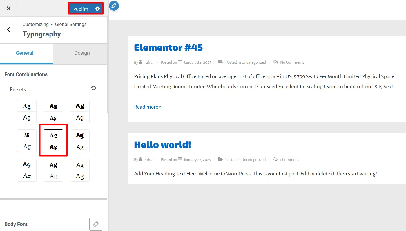
When choosing website typography, you should ensure and test fonts for different screens. You should also take care of font sizes, line heights, spacing, and padding for screens.
These crucial technicals primarily affect the overall website responsiveness.
Further, if you want a convenient option to finalize your website color and typography, consider using the WordPress Presets offered by Responsive Theme Customizer.
To learn more about WordPress Presets and how to use them, refer to our guide: What are Presets in WordPress?
7: Optimizing Mobile SEO
While you might not be aware of the term mobile SEO, it refers to a combination of simple SEO strategies specifically tailored to mobile devices.
However, this refers to the overall mobile optimization of a website for accessibility and performance combined with local search enhancements.
8. Performance Monitoring
You have correctly implemented and resolved the performance issues, and your website may also temporarily pass the mobile compatibility issues.
However, some websites’ performance tanked. This is generally due to negligence in performance monitoring.
All the tools and technologies you use to build your WordPress website are dynamic and continuously change with updates and fixes. During these fixes in version, the latest changes often bring about new challenges for mobile compatibility.
Therefore, it becomes crucial that you continuously audit your website performance via Google tools like Search Console and Analytics, which provide a clear report on the conflicts hindering it.
FAQ
To optimize your website specifically for mobile devices, you can use the following ways:
1. Use a responsive theme
2. Use optimized images
3. Enable AMP
4. Improve website navigation
5. Remove unused plugins
6. Using a responsive typography
7. Implement mobile SEO strategies
8. Regularly test performance
Your WordPress site may not look good on mobile due to various factors, probably unresponsive theme, poor navigation, oversized images, or unoptimized typography. To ensure that improve your website’s mobile appearance, you should run a mobile compatibility test and work on the highlighted challenges.
To edit your WordPress site for mobile only, you can use mobile-specific CSS, enable responsive settings in your theme, and use plugins like WP Touch. Page builders like Elementor also allow mobile-specific customization for layouts, fonts, and images.
Conclusion
Solving the highlighted issues across the guide will help you solve various mobile compatibility issues.
Also, ensure you are careful when choosing the right tools while making the website, as some initial mistakes can cost you rebuilding your site from scratch.
While most of the issues can be resolved with the suggested solutions, some may require you to find a different solution. If you have further difficulties tackling these problems, consider consulting and hiring a mobile SEO expert.
Further, if you find this article valuable, you can also consider reading:
- How to Rank in AI Overview
- Best WordPress eCommerce Website Examples
- How to Customize A WordPress Theme – In A Correct Way
Also, check out the Cyberchimps Responsive theme.


