Are you looking for a way to customize your WordPress theme?
If you are using a classic theme like Cyberchimps Responsive Theme, you might be aware that classic themes offer a no-code customizer.
You can easily set and modify the layouts of your WordPress website, add header and footers, and take complete control of your website appearance.
Let’s get started.
- What is a Theme Customizer?
- Preparing for Theme Customization
- Customize Your Website Using WordPress Theme Customizer (like Cyberchimps Responsive Theme)
- Creating Your Website Header and Footer Using a Drag and Drop Builder
- Advanced Customization Using Theme-Specific Options
- Adding Custom Code (Without Breaking Your Site)
- Using the WordPress Theme Editor (Advanced)
- Common Mistakes to Avoid
- Final Touches and Testing
- FAQ
- Conclusion
What is a Theme Customizer?
WordPress theme customizer is a core feature of classic WordPress themes. You can tweak and personalize your website’s appearance like layout, header, footer and sidebars without writing code.
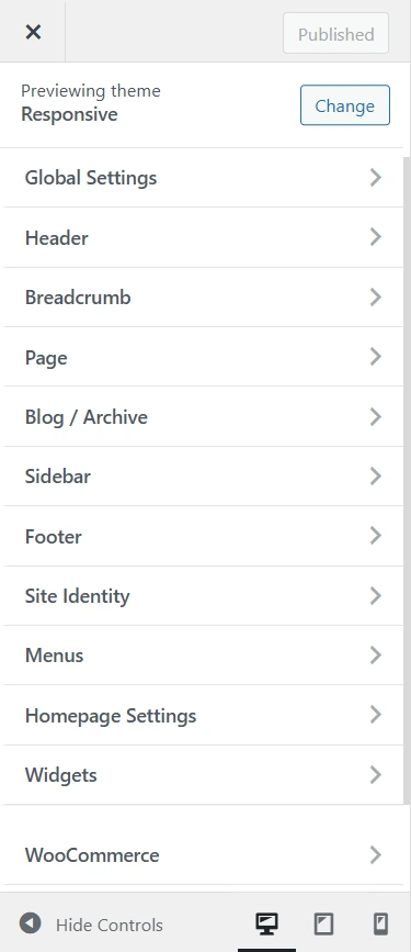
Theme customizers are beginner friendly. It consists of two sections: the website preview on the right and the sidebar on the left for modifying the details. At the bottom of this sidebar, you can find buttons that allow you to enable the responsive view.
Once you get a fair understanding of the settings, customizing your website using the theme customizer becomes easy.
Here are the most common settings that you will find in any classic theme customer (like the Cyberchimps Responsive Theme):
- Site Identity: These include settings for updating your logo, site title, site tagline, and favicon.
- Modify Colors: This option allows you to set the colors for your website’s headings, body text, background colors, and other settings.
- Typography: Options to set and modify the font typography for your website’s headings, body text, input field text, and any other typography options.
- Navigation Menu: Add, remove, and organize navigation menus. You can set the position of your navigation menus in the header, footer, and sidebar.
- Add Custom CSS: You can make styling-related changes by adding custom CSS to the theme customizer without editing the core theme stylesheets.
What’s the good part of using a theme customizer?
You can preview all the changes before clicking the “Publish” button. This keeps the guesswork away, and you can publish things once you achieve the expected design results.
Preparing for Theme Customization
Choose The Right WordPress Theme
Choosing a theme for your website should not be a tough decision, right?
However, the reality is that there are thousands of themes available in the free and premium categories on WordPress.org, making it difficult to select the right theme in the first place.
There are many popular themes available, too, for free.
Here are the things you should consider when choosing a theme for your WordPress business website:
- The number of positive reviews.
- Number of years in the business
- Support availability
- Check their forum threads to see if the issues are resolved or not
- Is there an official website available
- Do they have a plan to be in the same business for the coming years
- Check their TrustPilot reviews
If you haven’t checked the Cyberchimps Responsive theme, you’re missing a WordPress theme renowned in the WordPress community for its ease of use, quality, and quick support.
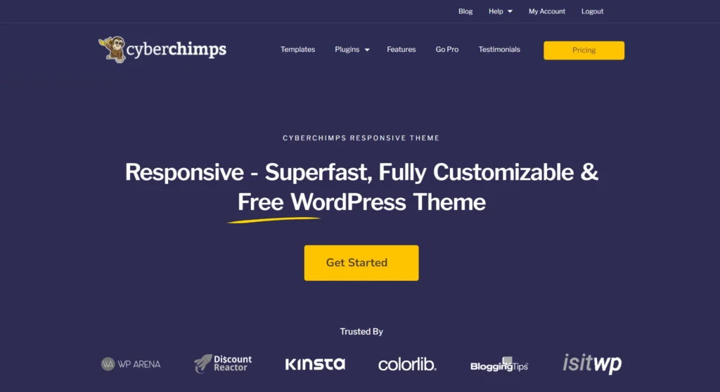
Its SEO friendliness, lightweight design, and compatibility with popular plugins make it a powerful tool for boosting your website’s visibility and traffic.
Here are some key features that you get with the Cyberchimps Responsive theme:
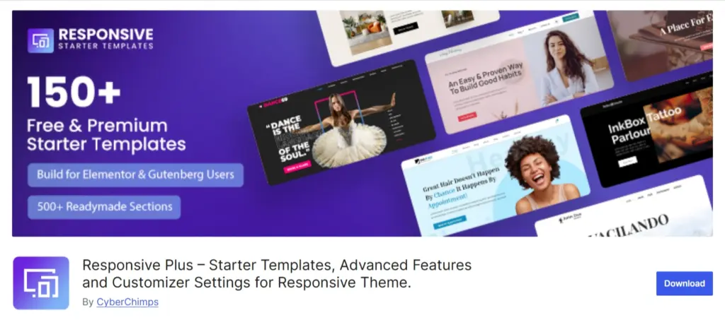
- Responsive Plus- Starter Template: The Responsive Plus- Starter Templates plugin offers a range of high-quality Elementor and Gutenberg templates to help you kickstart your website. You can choose from 250 pre-designed starter templates and start building your site.
- SEO-Friendly: Regarding SEO, the Responsive theme by CyberChimps is designed to help your website achieve top rankings on Google search pages due to its complete SEO optimization.
- Responsive Addons for Elementor: Responsive Addons for Elementor plugin offers over 80 Elementor widgets to make your website.
- Support’s Popular Plugins: The Responsive theme integrates with numerous popular plugins, such as MailChimp, WP Legal Pages Pro, WooCommerce, Yoast, WP Forms, Contact Form 7, and more.
Backup Your Website
Taking a backup before making any customizations saves your website from potential risks, such as website downtime, data loss, or hours of debugging to find issues.
We advise you to always take a backup before experimenting with new features in your theme customizer. This simple step can save you hours of work and rework.
Set Up a Child Theme (When and Why You Need One)
The safest way to customize and update a WordPress theme is to create a child theme and make your changes there. This keeps your customizations separate, so they won’t be lost when the parent theme is updated.
To create a child theme, add a custom stylesheet and copy any necessary functions from the parent theme into the child theme’s functions.php file.
Once set up, activate the child theme on your website instead of the parent theme.
Before updating the parent theme, it is best to test everything on a staging site. Apply the update there, check that your customizations still work perfectly, and then push the changes to your live site.
Customize Your Website Using WordPress Theme Customizer (like Cyberchimps Responsive Theme)
Accessing the Customizer
As mentioned earlier, classic themes like Cyberchimps Responsive allow different types of changes that can be made from the theme customizer.
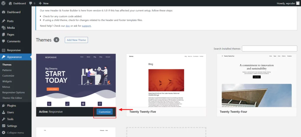
You can access your theme’s Customizer from your WordPress admin dashboard. Go to Appearance > Customize, or click the Customize button in your active theme’s thumbnail.
Now, you’ll find the Customizer, which allows you to make changes to your WordPress theme. You can see the results in the live preview area.
The theme customizer will always be on the left sidebar. The options available in the left panel can differ depending on the WordPress theme you’re using.
Most themes include essential settings such as the site’s tagline, widgets, homepage settings, menus, and Additional CSS options.
Let’s start by checking the basic site identity options.
Changing Site Identity (Logo, Site Title, Tagline)
The theme customizer lets you modify your site’s title, upload a logo, and add a tagline.
From the Customizer, go to header> Site Title & Logo > Logo.
In the same panel, you get options for adding Site Title and Site Tagline.
While using all these settings, you can see how it will look on your site immediately.
Adjusting Colors And Fonts
The options available in the Colors panel will largely depend on your installed WordPress theme.
For Cyberchimps Responsive Theme, you can check the access the color settings from Global Settings > Colors & Backgrounds.
The best part about global settings is that you can control the color and backgrounds of your entire website from one place.
You can set the colors for backgrounds, links, and more from this panel.
Responsive theme also provides a Global Color Pallette setting that sets the pre-defined colors for headings, texts, and backgrounds.
Modifying Layouts And Templates
Using the Customizer, you can set the layouts for your website pages.
Depending on the theme options, you have three to four layout options: full-width, boxed, content-boxed, flat, and so on.
These settings define the width of your content container and background width.
You also get the option to set the layouts for your blog page. Depending on the type of theme, you may get single or multiple layout options.
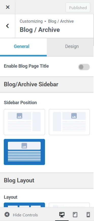
Here, you’ll also find options for setting the visibility of titles, meta information, featured images, buttons, and more.
Customizing Menus And Widgets
The Menus panel lets you create and manage navigation menus and decide where they appear on your website.
In this section, you’ll see all the WordPress menus you’ve previously created. You can click the View All Locations button to check the available menu placement options supported by your theme.
To create a new menu, simply click the Create New Menu button.
Next, give your menu a clear name so you can easily manage it later. Then, choose the menu’s location and click Next to continue.
To add items to your menu, click the Add Items button, which opens a new panel.
In the appropriate fields, you can include custom links, pages, posts, categories, and tags.
If you want to change the order of menu items, click the Reorder link and arrange them using the arrow icons.
Creating Your Website Header and Footer Using a Drag and Drop Builder
The Responsive theme features a powerful drag-and-drop Header Builder, making it easy to create stunning headers quickly — no coding required.
This tool unlocks endless design possibilities, allowing you to customize your website’s navigation easily.
And yes — absolutely no coding involved!
You can visually build any header or footer effortlessly and get it done faster than ever before.
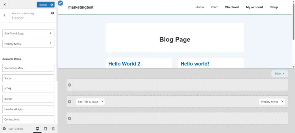
Using the Header Builder, you can easily add elements to your website’s header, including a logo, primary menu, secondary menu, HTML code, buttons, social icons, and more.
Similarly, the Footer Builder lets you customize your footer with a footer menu, various widgets, and social icons.
Both builders offer complete control over the placement and styling of your header and footer elements — all through a live visual editor.
You can access the header and footer from the theme customizer itself.
Once you drag and drop the elements in the required areas, you can style the header and footer with options such as colors, borders, typography, and spacing.
Not to mention that the header and footer are responsive on all devices.
Advanced Customization Using Theme-Specific Options
Many classic themes provide advanced customization options in their theme customizer. These settings are usually not included in the free theme.
You might have to upgrade to a paid plan to get additional customization controls. Luckily, that’s not the case with Cyberchimps’ Responsive theme.
Responsive Plus – Starter templates is a powerful plugin that supercharges the Responsive theme. The plugin extends the customizer options when popular plugins are installed like WooCommerce, LMS plugins, and similar plugins that extend the core functionality.
The Responsive Plus—Starter Templates plugin offers options to enable or disable modules based on your requirements. This ensures that your website’s speed and performance are not impacted if the module is not activated.
Brilliant, isn’t it?
Advanced Modules (Mega Menu, Woocommerce Customization)
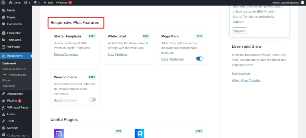
The Responsive Plus plugin offers modules for WooCommerce, mega menu, LifterLMS, White Label settings, and more.
If a particular module is not required for your website, disabling it reduces the amount of code and resources needed, resulting in a faster load time.
Responsive Plus plugin also provides the best customization options for designing a fully functional and interactive mega menu.
By providing these modules, the Responsive Plus plugin eliminates the need to install and activate a dedicated plugin for every feature requirement. You don’t need five different plugins to add five features; all can be done from a single plugin.
Starter Templates For Quick Design
Starter templates or website templates are pre-designed templates that allow you to create a new WordPress website. They have pre-styled choices, pre-configured page structures, and additional features that can ease website development.
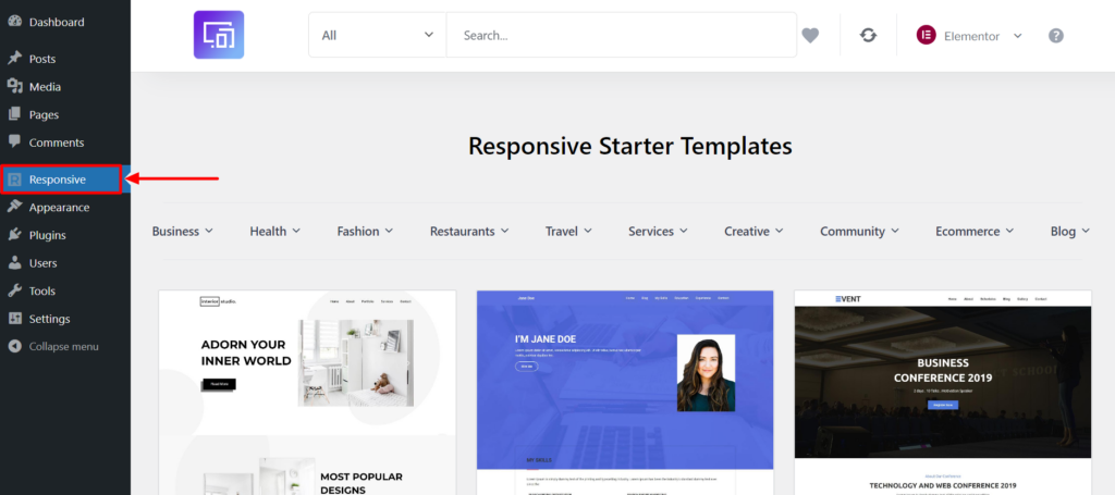
Depending on which classic theme you choose, that theme can also provide you with pre-build Starter Templates as a basis for designing your website.
Never have you made it as easy as building with Responsive Plus – Starter Templates. Choose your preferred page editor, either Elementor or Gutenberg and easily align your website design.
Responsive Plus is a free WordPress plugin with a collection of 250+ ready-to-use Responsive Starter Templates that can be imported with a single mouse click. Simply import a website template, replace its contents, and you can launch a website.
Ready-to-use templates have a sleek, contemporary look that can be suited to a broad variety of niches. There are multiple starter templates included with it that have a sleek, contemporary design that can give a boost to your website.
Once you have imported a template, you can edit its contents and use blocks to shape the design of a template as you like.
Easy peasy!
Adding Custom Code (Without Breaking Your Site)
Using The Additional CSS Section
Adding custom CSS lets you fine-tune your website’s design — from fonts and colors to spacing and animations. In short, it gives you complete creative control over your site’s appearance.
Intermediate and advanced WordPress users often add CSS directly to their theme’s style.css file. While this method offers flexibility, it requires extra steps like accessing your WordPress hosting via FTP and modifying theme files — which can be tricky if you’re unfamiliar with coding.
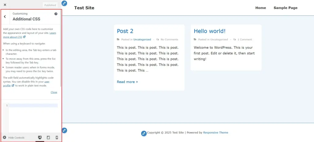
For beginners, using the Additional CSS panel in the WordPress Theme Customizer is a much simpler option. This lets you add your CSS code and instantly preview changes on the right side of the screen.
As you write CSS, WordPress even helps by suggesting attributes based on what you type and highlighting any errors in your code — making the process smoother and more beginner-friendly
Using the WordPress Theme Editor (Advanced)
The Theme files editor allows you to modify all files associated with your WordPress theme from the respective interface.
WordPress theme files are stored in your web hosting account space. You can access and edit them from your WordPress Dashboard Appearance > Theme Files Editor.

Every theme contains the following files that you can edit to customize their design: style.css, functions.php, and template files.
To edit the theme files, you should understand PHP or CSS well. WordPress recommends against making changes directly on your live site, as this could potentially break your site or result in losing your changes during a theme update.
Editing CSS For Custom Styles
The style.css file includes all design elements of a theme, such as fonts, colors, and layouts. You can customize the appearance of your website by adding custom CSS and modifying this file.
Php And Template File Modifications
The functions.php file defines the functionality and features of a WordPress theme. This file includes custom menus, logos, widgets, and featured images written in PHP.
Theme Template Files use a combination of HTML, PHP code, and template tags to define the layouts of your WordPress pages. Modifications to these files will impact the display of your custom 404 page, post pages, and archive pages.
Before editing your WordPress theme files from the admin dashboard, it’s important to understand that many security plugins restrict access to them. The Theme Files Editor allows for direct access to these files, and to enhance security, many plugins disable this feature to prevent hackers from injecting malware.
Common Mistakes to Avoid
Not Backing Up Before Making Changes
As advised before, one crucial step is to take a backup before making edits from the Customizer.
It’s not essential, but website accidents can happen to anyone.
Any time you try to make changes to the website, such as trying out new design layouts, modifying existing code, or even installing a new plugin, you have the potential to mess up your WordPress website.
A backup will act as a safety measure and safeguard your website from all your actions. This way, you won’t lose your hard work.
Backups can help you quickly restore your previous version without stress if things go wrong.
Backups ensure your content, theme customizer settings, plugins, and data are intact.
Use free WordPress backup plugins like UpdraftPlus, or Jetpack Backup to backup your business website.
Editing The Parent Theme Directly
Editing the parent theme from the Customizer does not cause any issues for most businesses, and it’s not such a pain.
However, the theme author might not have considered edge cases if you’re running a website with multiple custom post types, product pages, and other third-party plugin pages.
It’s better to choose the approach of child themes. They help prevent changes that can damage your website.
Overloading Your Site With Too Many Plugins
One of the most common mistakes that WordPress websites make is adding too many plugins without realizing their impact on the website’s performance.
WordPress plugins add features, but not all are optimized for speed and performance.
Activating too many plugins on your website will add their respective JS, CSS, and many other files that will get loaded on all the pages without any requirement.
It will ultimately negatively impact your website, and you will eventually have to increase the memory on your hosting to run these plugins.
A better approach is to use plugins that are not built for a specific purpose—that is, plugins that solve more than one feature requirement on your website.
For example, you need to implement popups on your website, so you add a popup plugin. Next, you need a contact form, so you install a separate plugin for adding contact forms, and so on.
Instead, you can install and activate a plugin that provides both functionalities, like the Responsive Blocks plugin, which offers 50+ WordPress blocks to improve your website’s block editor capabilities.
Or Responsive Plus, a Starter templates plugin that adds to core functionalities—additional features for the Responsive theme and Starter Templates for all users.
The conclusion is to install plugins with multi-purpose features optimized for performance.
Final Touches and Testing
Check Mobile Responsiveness
With a significant shift of internet users on mobile, you need to ensure that your website looks good on all devices. Be it a mobile phone, a tablet, or various devices of different dimensions.
It may look like a pain to check the responsiveness on mobile and tablet devices, but thanks to the responsive design feature inside the theme customizer.
This feature lets users quickly preview their website on various device sizes without leaving their website customization process. Previewing sites on mobiles ensures that users’ experience is not different than that on desktops.
The device previewer is near the “Collapse” button in the customizer controls footer.
There are only three default options available, and they are purposefully vague. Instead of resembling specific devices, the goal is to give a general idea of how a website may appear on a tablet-sized device in portrait orientation, a phone-sized device, and the standard desktop view.
Ensure Cross-Browser Compatibility
Ensuring your website looks the same and works well on different browsers is essential for a smooth user experience.
Cross-browser compatibility means your website or app should look and function the same way on all popular browsers like Chrome, Firefox, Safari, and Edge.
Most modern browsers have built-in tools that help you check and fix how your website looks and works. Chrome DevTools, Firefox Developer Tools, and Safari Web Inspector let you check the layout and fix any design or coding issues.
Besides those built-in tools, unique testing platforms like BrowserStack, CrossBrowserTesting, and Sauce Labs let you test your website on different browsers and devices.
Using both tools helps you ensure your website works well everywhere and maintains a high-quality user experience.
While online testing tools are helpful, testing your website on actual devices gives the most accurate results. It helps you catch problems that you might not see with virtual tools.
FAQ
Responsive Theme by Cyberchimps is the most customizable theme in the WordPress ecosystem. It is fully customizable, free, easy-to-use and offers premium features in the free version that most themes offer in their paid versions.
Yes, most of the classic WordPress themes are fully customizable. However, there are some WordPress themes that are build for only specific business niches for example creating a food recipe website, travel blog or such businesses. These themes are usually not customizable to the extend as required and probably you might to change the theme in a few days.
Yes, customizing a WordPress theme is easy and does not need any technical knowledge. You can easily customize your WordPress theme by going into admin dashboard > Appearance > theme > customize.
Conclusion
I’m glad you’ve made it to the end of this article.
Now you know what is a theme customizer and how you can use it to style your WordPress website.
You learned about the importance of backups, child themes, and preventive measures to take before customizing your theme.
Here’s the final takeaway from this article –
Theme customizers are easy to use and do not need any coding knowledge. Use theme customizers to style your website’s layouts, buttons, typography, colors, and other frontend aspects.
Backup your website before making changes, use a child theme and do not edit your theme template files directly.
If you liked this article, you might want to read these as well:
Get started with the Responsive Theme and import a Starter Template to kickstart your website today.


