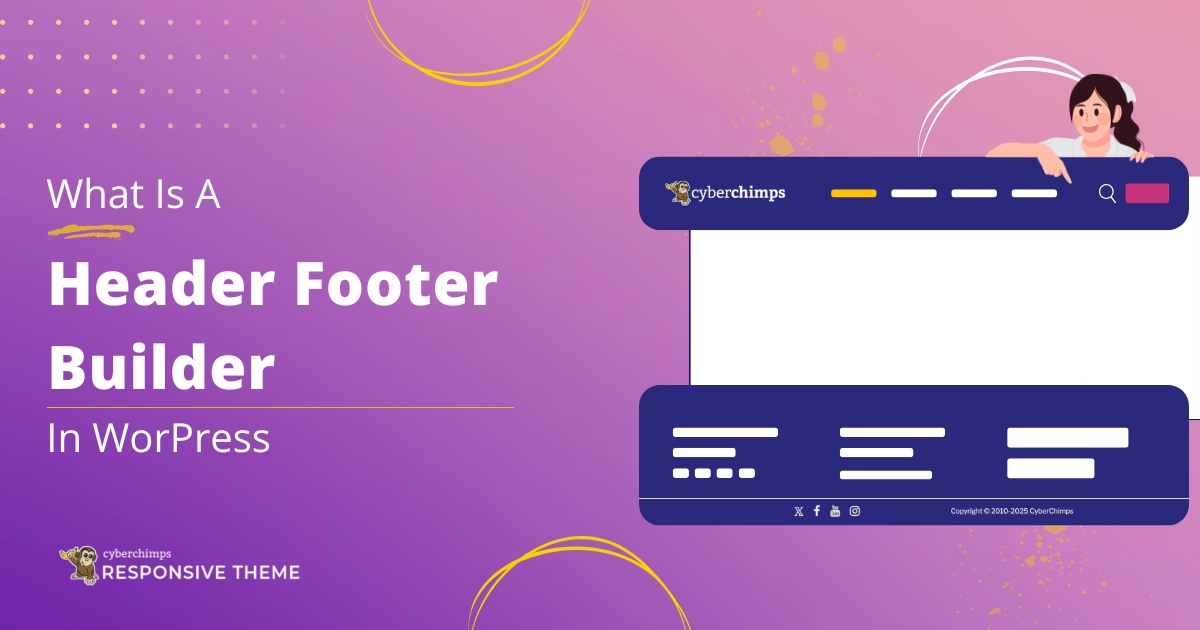
We are thrilled to introduce the long-awaited drag-and-drop Header and Footer Builder. It opens all-new design possibilities and allows you to customize your website’s navigation with a theme.
Responsive theme’s Header and Footer Builder is now available with Responsive free v6.1.0, making it easier than ever to design and customize your site’s header and footer—no coding required.
This guide provides detailed instructions on effectively implementing this new feature on your website.
We will also outline best practices to ensure a seamless upgrade experience for your existing users, minimizing disruption and maintaining user satisfaction.
Our step-by-step approach will cover everything from initial setup to troubleshooting common issues, ensuring you have all the resources needed for a successful transition.
Let’s dive in!
- Must-Read: Before using Responsive Theme Header & Footer Builder
- What is Header Footer Builder in Responsive Theme?
- Highlights of the Header Footer Builder
- Build Extra Ordinary Headers for Your Website
- How to Use Responsive Theme Header and Footer Builder
- Some FAQs Related to Responsive Theme’s Header and Footer Builder
- Feedback and Helpful Resources
- Have trouble with Responsive Theme’s Header and Footer Builder?
Must-Read: Before using Responsive Theme Header & Footer Builder
Here are some key points that you must consider before enabling the Responsive theme’s Header and Footer Builder:
- Backup your site before you update or make any changes
- Try to update on the staging site at first (if you don’t have a staging site, here’s a guide on creating one)
- If you use a child theme, turn off the child theme and then update.
What is Header Footer Builder in Responsive Theme?
The Header Footer Builder lets you build any Headers and Footers visually and more efficiently.
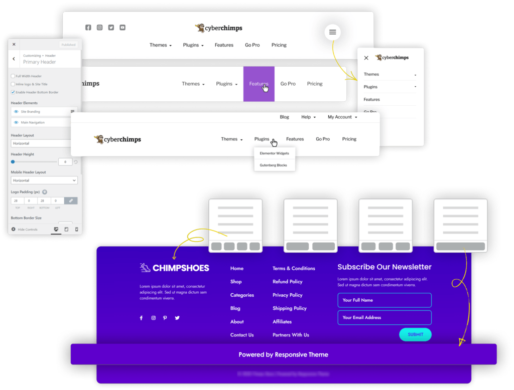
The header builder allows you to add a primary menu, secondary menu, logo, HTML code, buttons, social icons, and more elements to the headers. Likewise, the footer builder allows you to add a footer menu, various widgets, and social icons to the footer.
With a live editor, the header footer builder gives you complete control over the positioning and styling of header and footer elements.
Highlights of the Header Footer Builder
- Drag and Drop: Easy to customize the header and footer with a simple drag-and-drop interface.
- Header Elements: Essential header builder components like logos, menus, social icons, carts, buttons, widgets, HTML, and more with a few clicks
- Footer Elements: Essential footer builder components like menus, social icons, carts, widgets, HTML, and more with a few clicks
- Styling Options: Personalize styling like colors, typography, padding, border, and others to give a unique look to your site
- Responsive Layouts: Advanced customizable footer columns with styling capabilities for unique styles and layouts
Build Extra Ordinary Headers for Your Website
Do you wish to play around with headers and design them like pages?
The Header builder gives you various styling options to customize all the elements you could include in your header.
Examples of Headers You Can Build Using the Responsive Theme Header Builder
You have various styling options to customize elements such as margins, colors, borders, and typography. This control level enables you to precisely modify each item in the header’s appearance.
By leveraging these features, you can design headers that reflect your brand’s identity and stand out significantly from the default headers with the theme.
Whether you want a sleek, modern look or a more traditional style, these tools provide the flexibility to create a unique and visually appealing header that enhances your overall design.
Are You Considering Adding Multiple Elements To Your Header?
Picture a header with a website logo, title, navigation menu, social media icons, and a prominent call to action. While each element serves a vital function, having them all in one space can create a cluttered and overwhelming appearance.
It’s essential to balance functionality and aesthetics to ensure your header remains visually appealing and easy for visitors to navigate.
You can add elements above and below the headers according to your preference. It ensures that your headers look neat and contain everything needed.
With the Header Builder, you can create and customize an above-header, below-header, transparent header, and sticky header.
Besides, larger websites may need two menus.
With the header builder, you can add two menus to your website header. You can add them within the same header in different columns or headers.
How to Use Responsive Theme Header and Footer Builder
Ready to use Responsive Theme’s Header and Footer Builder?
Here’s how you can!
If you’re using the Responsive theme for the first time, you’ll receive the theme’s Header and Footer Builder as soon as you install it.
1. Update the Responsive theme and Responsive Plus Plugin
To use this feature, ensure the Responsive theme is updated to the latest version. The Header and Footer builder is available from Responsive theme Free v6.1.3.
So, go to your WordPress dashboard and navigate to Appearance > Themes. At the top of the theme, you’ll see a notification to update it.
Click on update now, and you’ll be good to go.
2. Navigate to Customizer
Go to Appearance > Customize > Header.
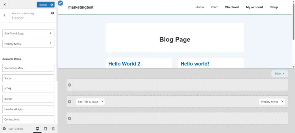
Now, you can start building by dragging and dropping the elements and seeing the real-time preview as you create a header and footer for your website.
3. Building the Header with Header Builder
Header Builder has three essential components:
- Visual Header Builder: Organize your header with three sections — Above Header, Primary Header, and Below Header.
- General Tab: Manage layout, alignment, and basic settings for header elements.
- Design Tab: Customize the appearance with colors, typography, spacing, and more.
With the Visual Header Builder, you can easily add and manage header elements and then fine-tune them using the General and Design tabs.
Let’s start with the header visual builder. The visual builder divides the header into three rows:
- Above Header
- Primary Header
- Below Header
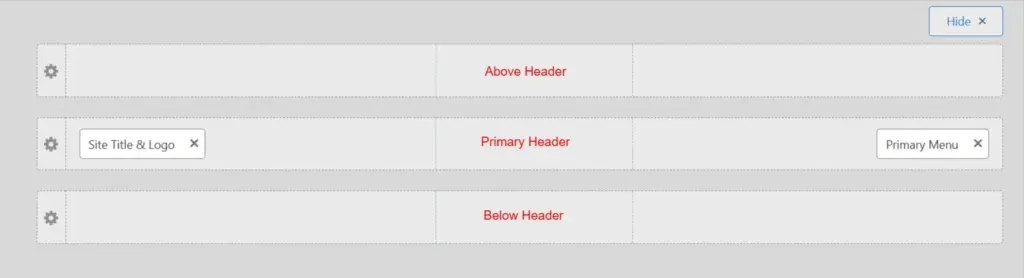
Start to drag and drop elements to different sections to place them in the required position. You can add the following elements from the Header Builder:
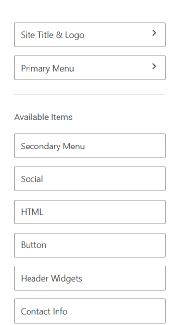
- Site Title & Logo
- Primary Menu
- Secondary Menu
- Social
- HTML
- Button
- Header Widgets
- Contact Info
- Search
You can now start customizing the elements from the General and Design tab. Clicking on an element in the visual builder will take you to its respective styling options.
The theme customizer has two parts for the header elements – General and Design.
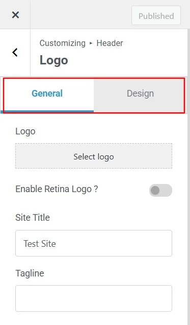
The elements you add in the Visual Header Builder will appear in the General tab. Simply click on any element to access and customize its settings.
Next, you can style your header elements from the design tab.
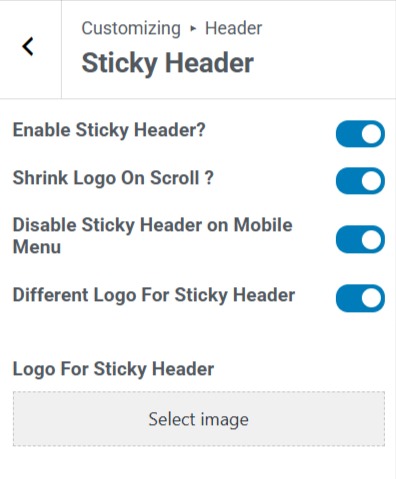
Building Transparent and Sticky Headers with Header Builder
The header builder also allows you to create transparent and sticky headers using a drag-and-drop approach without writing a single line of code.
Building the Footer with Footer Builder
You can create impressive footers using the Responsive theme footer builder, such as headers.
Footer load on all pages like headers. Visitors often try to find important information in the footer, such as company information, subscription fields, social links, and other company-related pages.
However, the footer is often neglected because it’s the last part of your website page. With the footer builder, you can completely control your website’s footer without writing any code.
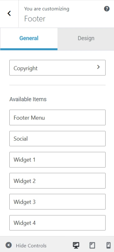
To edit the footer, navigate to Customize > Footer.
Again, the Footer layout is divided into three rows:
- Top Row
- Main Row
- Bottom Row
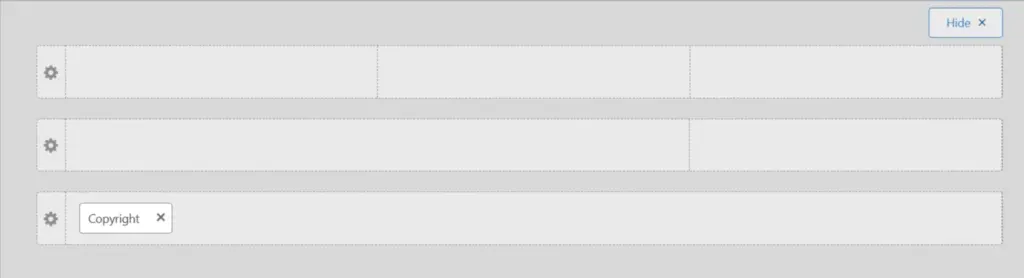
Use the below footer elements to build the footer with a drag-and-drop method:
- Footer Menu
- Social
- Widget 1
- Widget 2
- Widget 3
- Widget 4
- Colophon Widget
- Scroll to Top
- Copyright
Once the elements are placed in the respective rows and columns, you can start styling your footer, just like in the header builder.
You can also set the number of columns in the footer rows. The Responsive theme offers a setup to add six columns and layout designs.
The footer builder’s layouts are responsive, which means you can set different layouts for desktop, tablet, and mobile.
Some FAQs Related to Responsive Theme’s Header and Footer Builder
We’ve compiled a list of frequently asked questions to help you get the most out of Responsive theme’s new Header and Footer Builder:
The Responsive theme’s Header/Footer Builder is a powerful visual tool within the theme customizer. It lets you design unique and flexible headers and footers for your website.
With a simple drag-and-drop interface, you can easily add and arrange different elements to create the perfect layout.
The unrestricted feature is available in the Responsive theme’s version 6.1.0 and above.
Enabling the Responsive theme’s Header and Footer Builder will not affect your existing design. However, if you have used a child theme to customize the header and footer, it might affect them. Don’t hesitate to contact the support team before updating in case of child theme users.
You can still use the theme if you don’t want to upgrade to the new version. However, you’ll miss the header and footer builder capability, security updates, and future updates.
No, you don’t require any coding skills to use Header and Footer Builder. Since Responsive Theme’s Header and Footer Builder are user-friendly, you can easily drag and drop elements and adjust the settings to fit your design preferences.
Yes. Using the Header Builder, you can add above- and below-headers. Drag and drop the elements you wish to add.
Yes. The header builder allows you to build and design a Transparent or Sticky Header.
Feedback and Helpful Resources
The Responsive theme Header and Footer builder are designed to empower you with the freedom to create and transform your website-building journey into a breeze!
We have created this new feature based on our users’ feature requests and feedback, and we hope you’ll enjoy the change. So, don’t hesitate to submit any queries or feedback if you need support.
We’re excited to see how our Responsive theme users will leverage this new feature and create a stunning site. We can’t wait to hear your thoughts and grow with you.
Here are some document links that will help you to get started with Responsive Header Footer Builder.
Have trouble with Responsive Theme’s Header and Footer Builder?
As always, our support team is ready to help you get started or assist you if you encounter any issues with Responsive Theme’s new Header and Footer Builder.
Here are some docs that will help you in understanding header footer builder:
- Create a Header Using Responsive Theme’s Header Builder
- Create a Footer Using Responsive Theme’s Footer Builder
- How To Create A Sticky Header Using Cyberchimps Responsive Theme
- How To Change The Copyright Footer Text In WordPress
Our support team will provide detailed and personalized guidance to ensure a smooth experience with Responsive Theme’s header and footer builder and that your site looks just as you want.
If you liked this article, you might want to read these as well.
So, don’t let any minor issue prevent you from using this fantastic builder. Contact our support team immediately.


