The Responsive Addons for Elementor (RAE) Data Table widget allows you to add a table with filled data on your page and also gives controls to customize the styling of the table as per requirement.

Content #
Header #
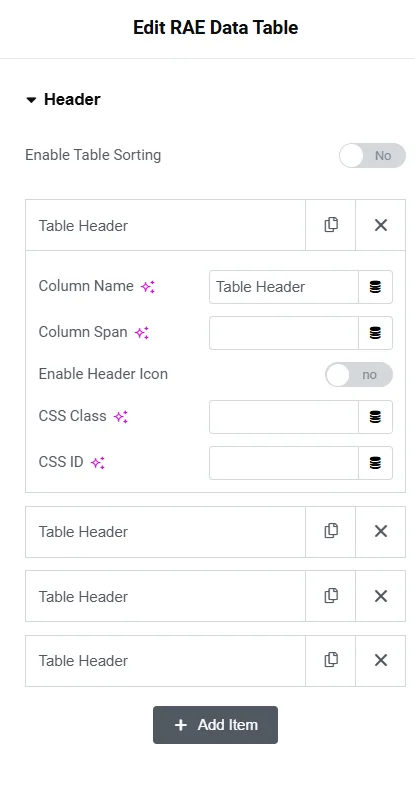
- Enable Table Sorting – Show or Hide the table sorting button.
- List of table header – Each header item has the following controls for configuration:
- Column Name – Add header item name
- Column Span – Add the number of columns that header item should span
- Enable Header Icon – Show or Hide icon to be displayed with the header item
- Header Icon Type – Choose the icon type. Available options are None, Icon, and Image.
- Icon – Add icon for the header item, this control is only available if the Header Icon Type is set to Icon.
- Image – Add the image for the header item, this control is only available if the Header Icon Type is set to Image.
- Image Size(px) – Set the image size for the image of the header item, this control is only available if the Header Icon Type is set to Image.
- CSS Class – Add a CSS class if required.
- CSS ID – Add a CSS ID if required.
Content #
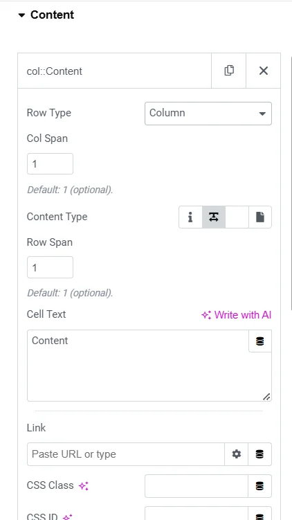
List of items for table data. Each item has the following controls:
- Row Type – Select the type of row content. If Row is selected from the option then a row will be started which should be followed by column type contents.
- If Column is selected then the following controls for the column content will be available:
- Col Span – Set the column span for that particular item. Default: 1.
- Content Type – Choose the content type for the column. Available options: Icon, Textarea, Editor, and Templates. Default: Textarea.
- Row Span – Set the row span for that particular item. Default: 1.
- Cell Text – Add the text content for the column content item. This control is a Textarea if the Content Type is set to Textarea or text editor if the Content Type is set to Editor.
- Icon – Add the icon for the column content item. This control is available only if the Content Type is set to Icon.
- Choose Template – Select a template from which the column content data should be fetched.
- Link – Add link for the column content item.
- CSS Class – Add a CSS class if required.
- CSS ID – Add a CSS ID if required.
Export #
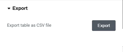
This control allows the user to export the table data in a CSV format file.
Style #
General Style #
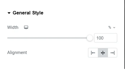
- Width – Set the width of the table.
- Alignment – Choose the table’s alignment.
Header Style #
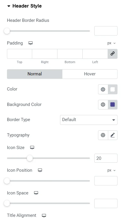
- Header Border Radius – Set the border radius for the table header.
- Padding – Set the padding dimensions for the table header.
- Normal/Hover State:
- Color – Set the text color for the table header.
- Background Color – Set the background color for the table header.
- Border Type – Set the border type for the table header. If the Border Type is not set to None then the controls for Border Width and Border Color will be available.
- Typography – Set the typography settings for the table header.
- Icon Size – Set the icon size for the table header.
- Icon Position – Set the icon position for the table header.
- Icon Space – Set the icon spacing for the table header.
- Title Alignment – Set the alignment for the table header item text.
Content Style #
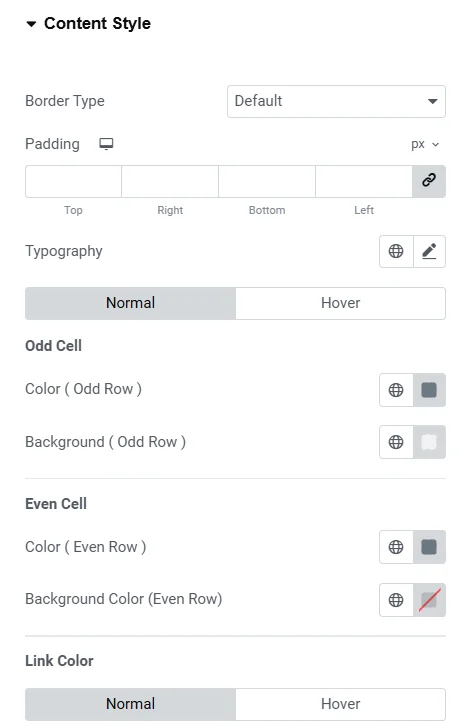
- Border Type – Set the border type for the content item cell. If the Border Type is not set to None then the controls for Border Width and Border Color will be available.
- Padding – Set the padding dimensions for the content item cell.
- Typography – Set the typography settings for the content item cell.
- Normal/Hover State :
- Color(Odd Row) – Set the text color for the odd row cells.
- Background(Odd Row) – Set the background color for the odd row cells.
- Color(Even Row) – Set the text color for the even row cells.
- Background(Even Row) – Set the background color for the even row cells.
- Link Color
- Normal/Hover State:
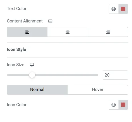
- Text Color – Set the text color for the link in table content.
- Content Alignment – Set the alignment for the table content item.
- Normal/Hover State:
- Icon Style
- Icon Size – Set the icon size for the table content item.
- Normal/Hover State :
- Icon Color – Set the icon color for the table content item.
Responsive Options #
Enable Responsive Table – Toggle table responsiveness. If the value is set to Yes then the following controls will be available:
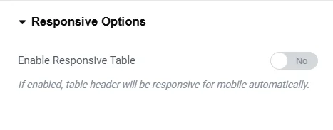
- Width – Set the table width for different devices.
- Color – Set the color for the table for different devices.
- Background Color – Set the background color for the table for different devices.
- Typography – Set the typography settings for the table.
- Border Type – Set the border type for the table. If the Border Type is not set to None then the controls for Border Width and Border Color will be available.


