The Responsive Addons for Elementor (RAE) Flip Box Widget helps you create animated boxes that flip to the other side, once the visitor hovers over them.

Responsive Addons for Elementor (RAE) FlipBox
Content #
Front #
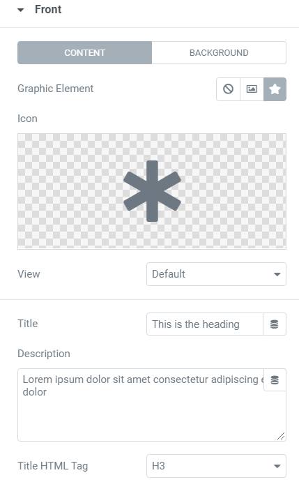
This tab controls the content of the front side of the flip box.
- 1.Graphic Element: Choose between None, Image, or Icon to display a graphical element in the front of the flip box.
- 2.If Image is selected as the Graphic Element: Choose Image: Select or upload an image. Image Size: Set the size of the image, from thumbnail to full, or set a custom size.
- 3.If Icon is selected as the Graphic Element: Icon: Select an icon from the FontAwesome library. View: Choose the default icon view, or select Stacked or Framed. Shape: If Stacked or Framed is chosen, choose Circle or Square.
- 4.Title & Description: Choose the title and description that appears in the front of the flip box.
- 5.Title HTML Tag: Choose the HTML tag for the title of the front box.
Background
This tab controls the background of the front side of the flip box.
Background Type: Choose Color, Image, or Gradient as the background of the front of the flip box.
If you choose an Image Background, the following options become available:

- 1.Position: Select the position of the image, such as Top Center, Top Right, Center Center, etc.
- 2.Attachment: Select from Default, Scroll, or Fixed.
- 3.Repeat: Choose from Default, No-repeat, Repeat, Repeat-x, or Repeat-y.
- 4.Size: Select from Default, Auto, Cover, or Contain.
- 5.Background Overlay: Choose a color for the overlay.
If you choose Gradient Background, the following options become available:

- 1.Color: Select the primary color of the gradient.
- 2.Location: Select the location of the primary color.
- 3.Second Color: Select the second color of the gradient.
- 4.Location: Select the location of the second color.
- 5.Type: Choose Linear or Radial.
- 6.Angle: Set the angle of the gradient.
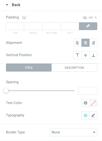
Back #

The backside of the flip box has the same elements as the front side listed above, except for the graphic element that only appears on the front. The backside also includes a button.
- 1.Button Text: Choose the text that appears inside the button.
- 2.Link: Choose where the button points to. The link needs to include the entire URL (including http / https).
- 3.Apply Link On: Choose to apply the clickable link to the Button Only, or to the Whole Box.
Settings #

- 1.Height: Control the height of the flip box.
- 2.Border Radius: Set the border radius of the flip box, and make its corners round.
- 3.Flip Effect: Choose between flip effects, including flip, slide, push, zoom in, zoom out or fade.
- 4.Flip Direction: If you choose the flip or slide effects, you can have the flip box flip right, left, up or down.
- 5.3D Depth: Slide to On to give the flip box a 3D animation effect.
Style #
Front #

- 1.Padding: Add padding to the content area of the front of the flip box.
- 2.Alignment: Choose to align the flip box content to the left, right or center of the flip box.
- 3.Vertical Position: Align the flip box content to the top, center or bottom of the flip box.
- 4.Border Type: Set a border to the entire flip box.
- 5.Width: If a border type is chosen, set a width for the border.
- 6.Color: If a border type is chosen, select a color for the border.
Icon
- 1.Spacing: Control the space between the icon and the title.
- 2.Primary Color: Choose the primary color of the icon.
- 3.Secondary Color: Choose the secondary color of the icon.
- 4.Icon Size: Choose the size of the icon.
- 5.Icon Padding: Set the amount of padding around the icon.
- 6.Icon Rotate: Rotate the icon to any angle.
- 7.Border Width: Set the width of the icon border.
- 8.Border Radius: Set the radius of the icon border to control corner roundness.
Title
- 1.Spacing: Control the space between the title and description.
- 2.Text Color: Choose the color of the title.
- 3.Typography: Set the typography settings of the title.
Description
- 1.Text Color: Choose the color of the description.
- 2.Typography: Set the typography settings of the description.
Back #
For the backside of the flip box, you get all the options listed previously for the front side, minus the graphical element settings. You also get control over the button settings.
Button #
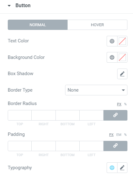
- 1.Size: Choose a size for the button (extra-small, small, medium, large, and extra-large).
- 2.Typography: Customize the typography of the button text.
- 3.Text Color: Choose the text color of the button.
- 4.Background Color: Choose the color of the button background.
- 5.Border Color: Control the color of the button border.
- 6.Border Width: Control the width of the button border.
- 7.Border Radius: Control the border radius of the button.


