↓ Skip to Main Content
Cyberchimps Logo

Main Navigation

  • Templates
  • Features
  • Plugins
    • Responsive Plus
    • Starter Templates
    • Addons for Elementor
    • Responsive Blocks
  • Go Pro
  • Blog
  • Pricing
  • Login

Installation & Updates

1
  • How to Install & Activate the Responsive Addons for Elementor

Widgets

85
  • Image Gallery
  • Advanced Tabs
  • Archive Posts
  • Archive Title
  • Audio Player
  • Author Box
  • Banner
  • Breadcrumbs
  • Business Hour
  • Button
  • Contact Form 7 Styler
  • Call To Action
  • Custom Add To Cart
  • Content Switcher
  • Countdown
  • Facebook Feed
  •  Data Table
  • Divider
  • Dual Color Header
  • FAQ
  • FlipBox
  • Featured Image
  • Feature List
  • Fancy Text
  • Icon Box
  • Gravity Forms Styler
  • Google Map
  • Image Hotspot
  • LearnDash Course List
  • Lottie
  • Logo Carousel
  • Mailchimp Styler
  • Login & Register
  • Media Carousel
  • Menu Cart
  • Modal Popup
  • MultiButton
  • Nav Menu
  • OffCanvas
  • Portfolio
  • Post Comments
  • Post Content
  • Post Excerpt
  • Post Info
  • Post Navigation
  • Post Title
  • Posts
  • Post Carousel
  • Price Box
  • Price List
  •  Pricing Table
  • Product Carousel
  • Product Category Grid
  • Products
  • Progress Bar
  • Reviews
  • Search Form
  • Site Logo
  • Slider
  • Sticky Section
  • Sticky Video
  • Table of Contents
  • Team Member
  • Testimonial Slider
  • Theme Builder
  • Timeline
  • Twitter Feed
  • Video
  • WooCommerce Breadcrumbs
  • WP Forms Styler
  • One Page Navigation
  • Content Ticker
  • Woo Checkout
  • Back to Top
  • Particle Backgrounds for Elementor
  • Product Price
  • Product Image
  • Product Stock
  • Product Upsells
  • Product Meta
  • Product Title
  • Product Rating
  • Product Content
  • Product Short Description
  • Product Additional Information
View Categories
  • Home
  • Docs
  • Responsive Addons For Elementor
  • Widgets
  • Image Hotspot

Image Hotspot

The Responsive Addons for Elementor (RAE) Hotspot widget allows you to quickly create a product showcase and highlight some of its key features.

Content #

Hotspot #

Hotspot
  1. 1.Background Map Image: Choose an image to be displayed as the main content of the widget.
  2. 2.Size: Adjust the image size. Available Options: Auto, Contain, Cover.
  3. 3.Position: Control the image position. Available options: Left, Center, Right, Unset.
  4. 4.Height: This allows you to adjust the image height.
  • Hotspot Indicator List: This option shows the total number of indicators added to the image. Drag and drop to change their position, duplicate or delete or add an indicator. Upon clicking on an indicator, it will open settings for it. You can select the content for the indicator from here. Each indicator has separate settings available.
    • Title & Description: This option contains two text fields where you can input the indicator Title and Description.
    • Button Text: Text field to input the button text.
    • Button Link: URL field to add a custom URL to the button.Note: Both “Button Text” and “Button Link” fields are required to contain a value for the button to be displayed.
    • Content Image: Allows you to add an image to the indicator. Image will be displayed towards the left of the indicator content.
      • Size: Adjust the image size. Available options: Auto, Contain, Cover.
      • Position: Control the image position. Available options: Left, Center, Right, Bottom, Initial, Top and Manual.Selecting “Manual” shows you the following two options.
      • Image Position X: Adjust the image position over the X axis.
      • Image Position Y: Adjust the image position over the Y axis.
    • Horizontal Position: Adjust the indicator position on the background image over the X-axis.
    • Vertical Position: Adjust the indicator position on the background image over the Y-axis.

Additional Settings #

Additional settings
  1. 1.Display Glow: Checking this setting will add a glow-like effect to all the indicators.
  2. 2.Display Inner Circle: Checking this setting will display a smaller circle within the indicators.
  3. 3.Display Content Condition: This allows you to permanently display the indicator content or display it only on hover.

Style #

Indicator #

Indicator
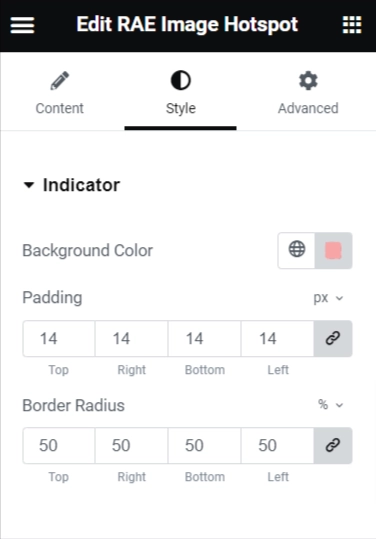
  1. 1.Background Color: Allows you to change the background color of the indicators.
  2. 2.Padding: Adjust the size of the indicators by changing this property.
  3. 3.Border Radius: Adjust the border radius of the indicators to make it appear as square or have rounded corners.
  4. 4.Inner Indicator Circle > Color: Allows you to change the color of the inner circle within the indicators if the setting is active.
  5. 5.Glow > Color: Allows you to change the color of the glow effect if the setting is active.

Content #

Hotspot content
  1. 1.Background Color: Allows you to change the background color of the content box.
  2. 2.Color: Allows you to change the text color of the content.
  3. 3.Content Border Radius: Adjust the border radius of the content box to make it appear as square or have rounded corners.
  4. 4.Title > Typography: Set the typography settings for the content title.
  5. 5.Description > Typography: Set the typography settings for the content description.
  6. 6.Button:
    1. 1.Typography: Set the typogra
    2. phy settings for the content button.
    3. 2.Background Color: Allows you to change the background color of the button.
    4. 3.Color: Allows you to change the text color of the button.
    5. 4.Width: Adjust the width of the button.
    6. 5.Padding: Adjust the size of the button by changing this property.
    7. 6.Border Radius: Adjust the border radius of the button to make it appears square or have rounded corners.
Updated on April 14, 2025

What are your Feelings

  • Happy
  • Normal
  • Sad
Share This Article :
  • Facebook
  • X
  • LinkedIn
  • Pinterest
Google MapLearnDash Course List

Powered by BetterDocs

Table of Contents
  • Content
    • Hotspot
    • Additional Settings
  • Style
    • Indicator
    • Content

Our Products

Responsive Paid Plan

Responsive Addons for Elementor

Starter Templates

Responsive Blocks

WP Legal Pages

WP Adcenter

GDPR Cookie Consent

Powered by Responsive WordPress theme

RESOURCES

Responsive Platform

Learn Elementor

Download Free Theme

Brand Assets

Testimonials

Compare Astra/Kadence

TrustPilot

CCPA

Video Tutorials

FEATURES

WooCommerce

Header Footer Builder

Company

About

Pricing

Blog

Affiliate Program

Contact Us

Terms of Service

GDPR Privacy Policy

GDPR Cookie Policy

Support

Login

What’s New

Documentation

Request Support

Video Tutorials

Refund Policy

Service

Discount Coupon

Bug Bounty Program

Copyright © 2010-2025 CyberChimps  

Top
  • Constructive Blocks
    • Advanced Heading Block
    • Section Block
    • Advanced Columns Block
    • Pricing List Block
    • Pricing Table Block
    • Flip Box Block
    • Info Block
    • Image Slider Block
    • Post and Page Grid Block
    • Post Carousel Block
    • Icon List Block
    • Table of Content
    • Team Block
    • Shape Divider Block
    • Masonry Block
    • Portfolio Block
    • Accordion Block
    • Divider Block
    • Video Popup Block
    • Card Block
    • Spacer Block
    • Google Map Block
    • Block Quote
    • Expand
    • Image Hotspot
    • Instagram Feed Block
    • Image Boxes Block
    • Testimonial Block
    • Advanced Text Block
    • Testimonial Slider Block
    • Feature Grid Block
    • Inline Notice Block
    • WP Search Block
    • Social Share Block
    • Tabs Block
    • Progress Bar Block
    • Call/Mail Button
    • Anchor Block
    • Gutenberg Image Block – Responsive Block
    • Contact Form 7 Styler
  • Timelines
    • Count Up
    • Gutenberg Countdown Block
    • Content Timeline
    • Post Timeline Block
  • CRO
    • Multi Buttons Blocks
    • Call To Action Block