
Responsive Addons for Elementor (RAE) LearnDash Course List is a widget that allows showing the course list in different layout skins with many customizable options.
Content #
Layout Settings #

- 1.Skins – Layout skins for the widget.
- 2.Layout Mode – Layout mode for the courses in the list. Available options are Grid, Masonry, and Fit To Screen.
- 3.Number of Courses – Number of courses to be displayed in the widget.
- 4.Show course by category – Filter the courses by category.
- 5.Show by course tag – Filter the courses by tag(s).
- 6.Columns – Set the number of columns for the widget.
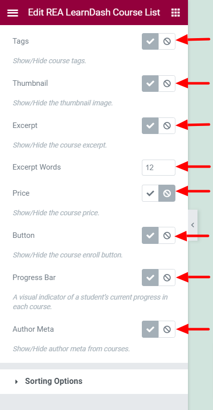
- 7.Tags – Show/Hide the course tags. This setting is available only if Skins is not set to Layout 3.
- 8.Thumbnail – Show/Hide the course thumbnail. This setting is available only if Skins is not set to Layout 3.
- 9.Course Meta – Show/Hide the course meta. This setting is available only if Skins is set to Layout 2.
- 10.Category – Show/Hide the course category. This setting is available only if Skins is set to Layout 3.
- 11.Date – Show/Hide the course date. This setting is available only if Skins is set to either Layout 2 or Layout 3.
- 12.Excerpt – Show/Hide the course excerpt.
- 13.Excerpt Words – Set the limit for the length of the excerpt. This setting is available only if Excerpt is set to Show.
- 14.Price – Show/Hide the course price.
- 15.Button – Show/Hide the course enroll button.
- 16.Progress Bar – Show/Hide the course progress bar.
- 17.Author Meta – Show/Hide the course author meta. This setting is available only if Skins is set to either Default or Layout 1.
Sorting Options #

- 1.Course Sorting – Set the field based on which the courses will be sorted.
- 2.Order of Sorting – Set the sorting order. Ascending or Descending.
- 3.My Courses – The courses to be displayed, whether current user’s enrolled or not-enrolled courses.
Style #
Card Style #
Normal State #

- 1.Background Type – Set the background for the cards.
- 2.Border Type – Set the border for the cards.
- 3.Border Radius – Set the border radius for the cards.
- 4.Box Shadow – Set the box shadow for the cards.
- 5.Transition – Set the transition duration for the cards.
Hover State #
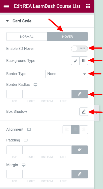
- 1.Enable 3D Hover – Enable/Disable 3D Hover effect for the cards.
- 2.Border Type – Set the border for the cards.
- 3.Border Radius – Set the border radius for the cards.
- 4.Box Shadow – Set the box shadow for the cards.
- 5.Background Type – Set the background for the cards.
Common Settings #
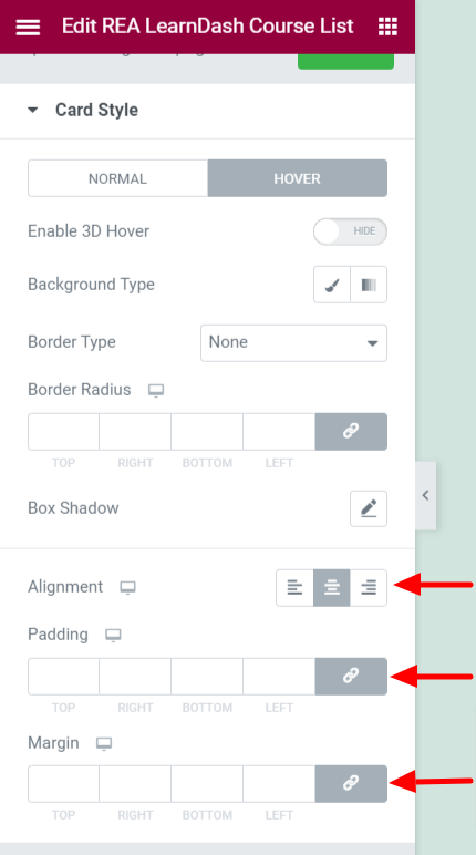
- 1.Alignment – Set the text alignment for the cards.
- 2.Padding – Set the padding for the cards.
- 3.Margin – Set the margin for the cards.
Tags Style #

This section is available only if Skins is not set to Layout 3 and Tags is set to Show.
- 1.Typography – Set the typography options for the tags.
- 2.Margin – Set the margin for the tags.
- 3.Color – Set the color for the tags.
- 4.Background Type – Set the background for the tags.
Image Style #

This section is available only if Skins is not set to Layout 3 and Thumbnail is set to Show.
- 1.Border Radius – Set the border radius for the image.
- 2.Bottom Space – Set the bottom space for the image.
Color & Typography #

Title #
- 1.Title Tag – Set the HTML tag for the course title.
- 2.Typography – Set the typography options for the course title.
- 3.Color – Set the color for the course title.
- 4.Margin – Set the margin for the course title.
Content #
This section is available only if Excerpt is set to Show.
- 1.Typography – Set the typography options for the course content.
- 2.Color – Set the color for the course content.
- 3.Margin – Set the margin for the course content.
Course Meta & Price #
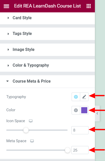
This section is available only if Skins is set to Layout 2.
- 1.Typography – Set the typography options for the course meta and price.
- 2.Color – Set the color for the course meta and price.
- 3.Icon Space – Set the spacing for the icon.
- 4.Meta Space – Set the spacing for the meta content.
Price #

This section is available only if Skins is not set to Layout 2 and Price is set to Show.
Below settings are available when Skins is not set to Layout 1.
- 1.Background Type – Set the background for the course price.
- 2.Typography – Set the typography options for the course price.
- 3.Color – Set the color for the course price.
- 4.Border Radius – Set the border radius for the course price.
- 5.Size – Set the size for the course price.
Below settings are available when Skins is set to Layout 1.
- 1.Typography – Set the typography options for the price ticker.
- 2.Color – Set the color for the price ticker.
- 3.Position – Set the position for the price ticker.
- 4.Border Radius – Set the border radius for the price ticker.
- 5.Height – Set the height for the price ticker.
- 6.Width – Set the width for the price ticker.
- 7.Background Type – Set the background for the price ticker.
Author Meta #
This section is available only if Skins is set to either Default and Layout 1 and Author Meta is set to Show.
- 1.Space Around – Set the space around for the author meta. This setting is available only if Skins is set to Layout 1.
Avatar #
This section is available if Skins is set to Layout 1.
- 1.Avatar Size – Set the avatar size.
- 2.Avatar Border Radius – Set the border radius for the avatar.
- 3.Avatar Space – Set the spacing for the avatar.
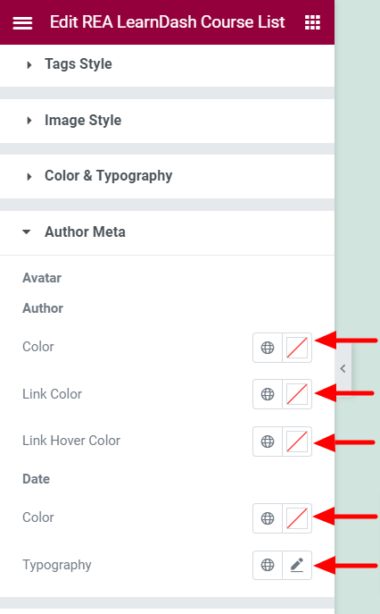
Author #
- 1.Color – Set the text color for the course author.
- 2.Link Color – Set the link color for the course author.
- 3.Link Hover Color – Set the link hover color for the course author.
Date #
- 1.Color – Set the text color for the date.
- 2.Typography – Set the typography options for the date.
Button #
This section is available only if Button is set to Show.
Normal State #
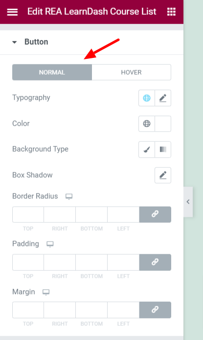
- 1.Typography – Set the typography options for the course to enroll button.
- 2.Color – Set the color for the course to enroll button.
- 3.Background Type – Set the background for the course to enroll button.
- 4.Box Shadow – Set the box-shadow options for the course to enroll button.
- 5.Border Radius – Set the border radius for the course to enroll button.
- 6.Padding – Set the padding for the course to enroll button.
- 7.Margin – Set the margin for the course to enroll button.
Hover State #

- 1.Color – Set the color for the course to enroll button.
- 2.Background Type – Set the background for the course to enroll button.
- 3.Box Shadow – Set the box-shadow options for the course to enroll button.
- 4.Transition – Set the transition duration for the course to enroll button.
- 5.Border Radius – Set the border radius for the course to enroll button.
Progress Bar #

This section is available only if Progress Bar is set to Show.
- 1.Typography – Set the typography options for the progress bar.
- 2.Label Color – Set the label color for the progress bar.
- 3.Fill Color – Set the fill color for the progress bar.
- 4.Space – Set the spacing for the progress bar.
- 5.Label Alignment – Set the label alignment for the progress bar.
- 6.Enable Steps Label – Enable/Disable the steps label.
- 7.Typography – Set the typography options for the progress bar. This setting is available if Enable Steps Label is Enabled.
- 8.Label Color – Set the label color for the progress bar. This setting is available if Enable Steps Label is Enabled.
- 9.Space – Set the spacing for the progress bar. This setting is available if Enable Steps Label is Enabled.


