
The Responsive Addons for Elementor (RAE) Logo Carousel is a widget that allows you to create a carousel of logos/images with different transition effects.
Content #
Logo Carousel #
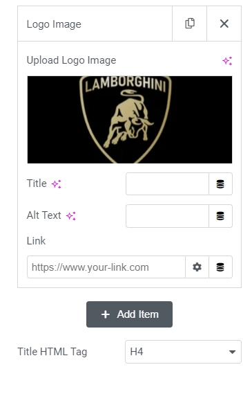
- 1.Logo Carousel Items – Each item has the following controls for configuration:
- 1.Upload Logo Image – Add a logo image.
- 2.Title – Add a title for the logo item to be displayed below the image.
- 3.Alt Text – Add an alternate text for the logo image.
- 4.Link – Add a link to the logo item.
- 2.Title HTML Tag – Choose a html tag for the title of the logos.
Carousel Settings #
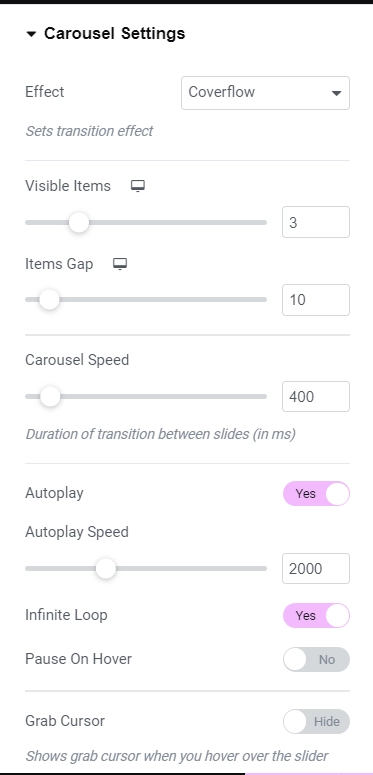
- 1.Effect – Choose the transition effect for the carousel. Available options are Slide, Fade, Cube, Coverflow and Flip.
- 2.Visible Items – Set the number of items to be visible on the carousel window. This setting is available only if the Effect is chosen to be Slide or Coverflow.
- 3.Items Gap – Set the gap between the carousel items. This setting is available only if the Effect is chosen to be Slide or Coverflow.
- 4.Carousel Speed – Set the carousel speed.
- 5.Autoplay – Set the autoplay parameter for the carousel.
- 6.Autoplay Speed – Set the autoplay delay for the carousel. This setting is only available if the Autoplay is set to Yes.
- 7.Infinite Loop – Set the infinite loop parameter for the carousel.
- 8.Pause On Hover – Set the pause on hover parameter for the carousel. This setting is only available if the Autoplay is set to Yes.
- 9.Grab Cursor – Set the grab cursor parameter for the carousel. If set to Yes then a grab cursor will be displayed on hovering over the slides.
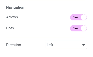
- 10.Arrows – Show/Hide navigation arrows.
- 11.Dots – Show/Hide pagination dots.
- 12.Direction – Choose the direction for the carousel.
Style #
Logos #
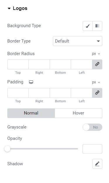
- 1.Background Type – Set the background type for each carousel item. Available options are Classic and Gradient, each option will have its own settings.
- 2.Border Type – Choose the border type for carousel items. If the value chosen is not None then Border Width and Border Color settings will be available.
- 3.Border Radius – Set the border radius for the carousel items.
- 4.Padding – Set the padding for the carousel items.
- 5.Background Type – Set the background type for each carousel item. Available options are Classic and Gradient, each option will have its own settings. This setting is available only for Hover state of the carousel items.
- 6.Grayscale – Add/Remove Grayscale effect on the carousel items. This setting is available for both Normal and Hover state of the carousel items.
- 7.Opacity – Set the opacity of the carousel items. This setting is available for both Normal and Hover state of the carousel items.
- 8.Shadow – Add/Remove the shadow for the carousel items. This setting is available for both Normal and Hover state of the carousel items.
Title #
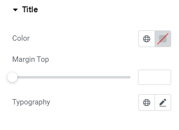
- 1.Color – Set the color for the logo title.
- 2.Margin Top – Set the margin top for the logo title.
- 3.Typography – Set the typography for the logo title.
Arrows #
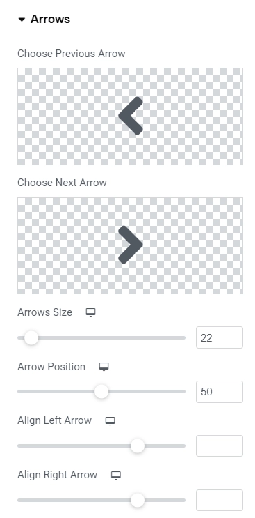
This section is available only if Arrows is set to Yes under Content > Carousel Settings.
- 1.Choose Previous Arrow – Add previous arrow icon.
- 2.Choose Next Arrow – Add next arrow icon.
- 3.Arrows Size – Set the arrows size.
- 4.Arrow Position – Set the arrows’ vertical position.
- 5.Align Left Arrow – Aligns the left arrow horizontally.
- 6.Align Right Arrow – Aligns the right arrow horizontally.
- 7.Padding – Set the padding for the arrows.
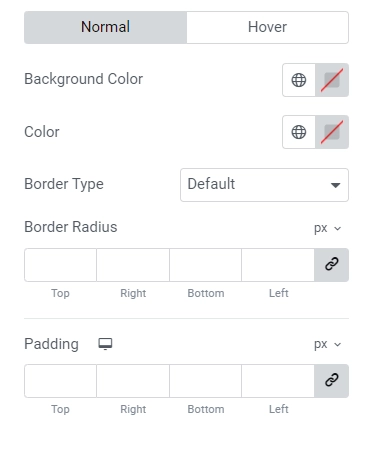
Normal State
- 1.Background Color – Set the background color for the arrows.
- 2.Color – Set the color for the arrows.
- 3.Border Type – Choose the border type for the arrows. If the value chosen is not None then Border Width and Border Color settings will be available.
- 4.Border Radius – Set the border radius for the arrows.
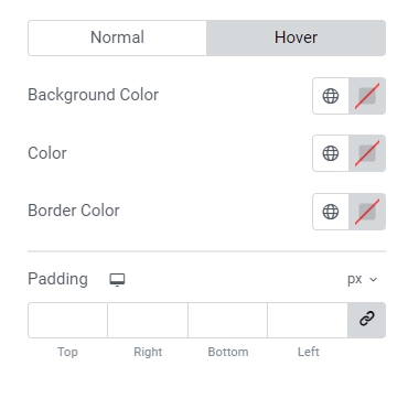
Hover State
- 1.Background Color – Set the background color for the arrows.
- 2.Color – Set the color for the arrows.
- 3.Border Color – Set the border color for the arrows.
Pagination: Dots #
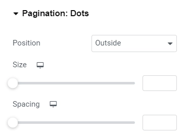
This section is available only if Pagination is set to Yes under Content > Carousel Settings.
- 1.Position – Choose the position of the dots. Whether they should be Inside or Outside.
- 2.Size – Set the size of the dots.
- 3.Spacing – Set the spacing between the dots.
Normal State
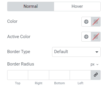
- 1.Color – Set the color of the dots.
- 2.Active Color – Set the color of the active/current dot.
- 3.Border Type – Choose the border type for the dots. If the value chosen is not None then Border Width and Border Color settings will be available.
- 4.Border Radius – Set the border radius for the dots.
- 5.Padding – Set the padding for the dots. Only top and bottom padding is editable.
Hover State
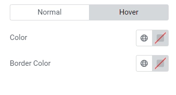
- 1.Color – Set the color for the dots.
- 2.Border Color – Set the border color for the dots.


