↓ Skip to Main Content
Cyberchimps Logo

Main Navigation

  • Templates
  • Features
  • Plugins
    • Responsive Plus
    • Starter Templates
    • Addons for Elementor
    • Responsive Blocks
  • Go Pro
  • Blog
  • Pricing
  • Login

Installation & Updates

1
  • How to Install & Activate the Responsive Addons for Elementor

Widgets

85
  • Image Gallery
  • Advanced Tabs
  • Archive Posts
  • Archive Title
  • Audio Player
  • Author Box
  • Banner
  • Breadcrumbs
  • Business Hour
  • Button
  • Contact Form 7 Styler
  • Call To Action
  • Custom Add To Cart
  • Content Switcher
  • Countdown
  • Facebook Feed
  •  Data Table
  • Divider
  • Dual Color Header
  • FAQ
  • FlipBox
  • Featured Image
  • Feature List
  • Fancy Text
  • Icon Box
  • Gravity Forms Styler
  • Google Map
  • Image Hotspot
  • LearnDash Course List
  • Lottie
  • Logo Carousel
  • Mailchimp Styler
  • Login & Register
  • Media Carousel
  • Menu Cart
  • Modal Popup
  • MultiButton
  • Nav Menu
  • OffCanvas
  • Portfolio
  • Post Comments
  • Post Content
  • Post Excerpt
  • Post Info
  • Post Navigation
  • Post Title
  • Posts
  • Post Carousel
  • Price Box
  • Price List
  •  Pricing Table
  • Product Carousel
  • Product Category Grid
  • Products
  • Progress Bar
  • Reviews
  • Search Form
  • Site Logo
  • Slider
  • Sticky Section
  • Sticky Video
  • Table of Contents
  • Team Member
  • Testimonial Slider
  • Theme Builder
  • Timeline
  • Twitter Feed
  • Video
  • WooCommerce Breadcrumbs
  • WP Forms Styler
  • One Page Navigation
  • Content Ticker
  • Woo Checkout
  • Back to Top
  • Particle Backgrounds for Elementor
  • Product Price
  • Product Image
  • Product Stock
  • Product Upsells
  • Product Meta
  • Product Title
  • Product Rating
  • Product Content
  • Product Short Description
  • Product Additional Information
View Categories
  • Home
  • Docs
  • Responsive Addons For Elementor
  • Widgets
  • Modal Popup

Modal Popup

Responsive Addons for Elementor (RAE) Modal Popup widget allows you to create amazing lightweight Popups that are displayed on click of a button, text, image, icon or automatically on some trigger events. Popups can include content, photo, saved section or page, Youtube or Vimeo or iFrames.

Modal popup

Clicking the button reveals a popup with the content in it

Content #

Content #

Modal popup content

Preview Modal Popup – It allows you to view changes to popup dynamically.

Title – The text set will be displayed as Title of the Popup.

Content Type – You can choose any content type from the dropdown field.

  • Content
  • Photo
  • Video Embed Code
  • Saved Section
  • Saved Page
  • YouTube
  • Vimeo
  • iFrame

Modal Popup #

Modal popup

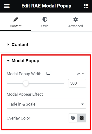
Modal Popup width – You can adjust the width of the Popup.

Modal Appear Effect – You can select animation at the time of popup appears.

Overlay Color – You can set the overlay color of the modal popup.

Close Button #

Close button

Close As – You can select an image or icon to be used as a close button for your popup.

Close size – You can adjust the size of the close icon or image.

Image / Icon position – You can adjust the position of the close icon/image.

You can also close the popup using the options ESC Key Press and on Overlay Click.

Display Settings #

Display Modal On – This option allows you to choose how you want your popup to appear. You can display it on the click of a text, icon, image, button or any other element.

Display settings

Popups can also be triggered by automatic triggers like exit intent, load after seconds, Enable cookies.

Exit Intent – Exit Intent detects the time just before the user is leaving the page.

After a few seconds – Popup can be loaded after a few seconds automatically.

Enable Cookies – Option to disable the popup for a particular number of days. Once the user closes the popup, you can decide for how many days popup will be disabled.

Custom Class / Id – You can trigger the popup by using different elements on the page. All you need is class / id of that element with which you are going to trigger the popup. Select the Custom Class from the dropdown and add the class / id in the field.

Note – Add the class or Id without the dot (.) or hash (#) selectors.

Style #

Title #

Title style

You can set the alignment, background color, text color, padding for the title of modal popup.

Content #

Content style

You can set the background color, text color, padding for the content of modal popup.

Button #

Buton style

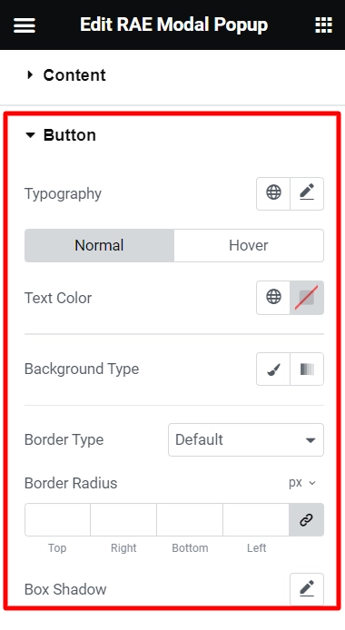
You can set the background color, text color, border radius, border color & width for the display button.

Updated on April 14, 2025

What are your Feelings

  • Happy
  • Normal
  • Sad
Share This Article :
  • Facebook
  • X
  • LinkedIn
  • Pinterest
Menu CartMultiButton

Powered by BetterDocs

Table of Contents
  • Content
    • Content
    • Modal Popup
    • Close Button
    • Display Settings
  • Style
    • Title
    • Content
    • Button

Our Products

Responsive Paid Plan

Responsive Addons for Elementor

Starter Templates

Responsive Blocks

WP Legal Pages

WP Adcenter

GDPR Cookie Consent

Powered by Responsive WordPress theme

RESOURCES

Responsive Platform

Learn Elementor

Download Free Theme

Brand Assets

Testimonials

Compare Astra/Kadence

TrustPilot

CCPA

Video Tutorials

FEATURES

WooCommerce

Header Footer Builder

Company

About

Pricing

Blog

Affiliate Program

Contact Us

Terms of Service

GDPR Privacy Policy

GDPR Cookie Policy

Support

Login

What’s New

Documentation

Request Support

Video Tutorials

Refund Policy

Service

Discount Coupon

Bug Bounty Program

Copyright © 2010-2025 CyberChimps  

Top
  • Constructive Blocks
    • Advanced Heading Block
    • Section Block
    • Advanced Columns Block
    • Pricing List Block
    • Pricing Table Block
    • Flip Box Block
    • Info Block
    • Image Slider Block
    • Post and Page Grid Block
    • Post Carousel Block
    • Icon List Block
    • Table of Content
    • Team Block
    • Shape Divider Block
    • Masonry Block
    • Portfolio Block
    • Accordion Block
    • Divider Block
    • Video Popup Block
    • Card Block
    • Spacer Block
    • Google Map Block
    • Block Quote
    • Expand
    • Image Hotspot
    • Instagram Feed Block
    • Image Boxes Block
    • Testimonial Block
    • Advanced Text Block
    • Testimonial Slider Block
    • Feature Grid Block
    • Inline Notice Block
    • WP Search Block
    • Social Share Block
    • Tabs Block
    • Progress Bar Block
    • Call/Mail Button
    • Anchor Block
    • Gutenberg Image Block – Responsive Block
    • Contact Form 7 Styler
  • Timelines
    • Count Up
    • Gutenberg Countdown Block
    • Content Timeline
    • Post Timeline Block
  • CRO
    • Multi Buttons Blocks
    • Call To Action Block