The Responsive Addons for Elementor (RAE) Price Box widget gives the option to add products and services packages in an attractive way. It gives you amazing and easy to understand customization controls to build the widget easily according to your requirements.
REA Price Box widget provides pre-designed layouts with customization fields for heading, price, call to action and many more. It has 4 layout options: Normal, Features at Bottom, Circular Background for Price and Pricing Above Call To Action. It also offers a few extra features like ribbon, disclaimer, hover option for the widget and its elements, tooltip, etc.

Content #
General #
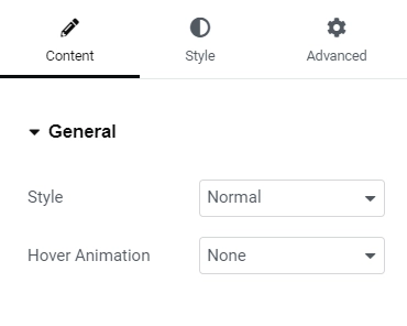
Style – Allows the user to choose the layout for the widget.
- Normal – This layout will have the sections in the following order: heading, description, pricing, list of features, call to action.
- Features at Bottom – This layout will have the sections in the following order: heading, pricing, description, call to action, list of features.
- Circular Background for Price – This layout will have the sections in the following order: heading, description, pricing(with circular background), list of features, call to action.
- Pricing Above Call To Action – This layout will have the sections in the following order: heading, description, list of features, pricing, call to action.
Hover – Allows the user to choose the type of hover animation for the widget.
Heading #
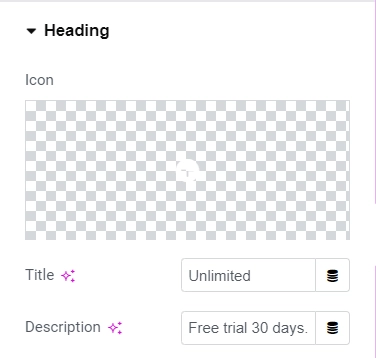
- Icon – Allows the user to choose the icon from the icon library to display with the heading text.
- Title – Allows the user to add the heading text for the widget.
- Description(If the widget style selected is anything other than Features at Bottom) – Allows the user to add the description text for the widget.
Pricing #
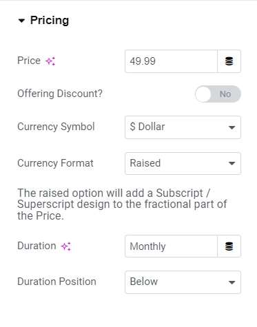
- Price – Allows the user to add the price amount.
- Offering Discount – Allows the user to choose whether to display the original price if the displayed price is discounted.
- Original Price – Allows the user to add the original price if the offering discount is turned on.
- Currency Symbol – Allows the user to select the currency symbol for price(s) being displayed. Also the option for custom currency.
- Currency Format – Allows the user to select the currency style whether the fractional part of the price should be displayed like a superscript or normal.
- Duration – Allows the user to add the duration for the pricing.Duration Position – Allows the user to select the position for duration whether to display it beside or above the price.
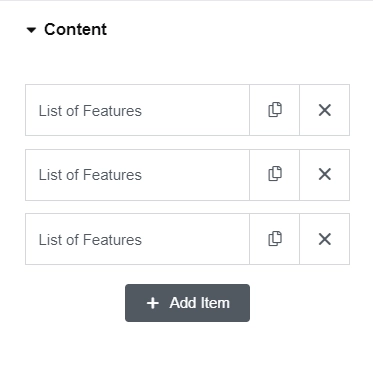
Content #
Shows all the feature items with its utility button. On clicking any item, it gets expanded displaying the following controls:
- Text – Allows the user to add the feature description.
- Tooltip Content – Allows the user to add the tooltip text using an editor.
- Icon – Allows the user to choose the icon from the icon library to display before a feature description.
- Override Global Settings – Gives the ability to override the global styling of the features by turning the toggle button on. If this setting is turned on then the following controls will be shown:
- Icon Color – Allows the user to change the icon color of the features.
- Text Color – Allows the user to change the text color of the features text.
- Background Color – Allows the user to change the background color of the features text.
- Add Item – Allows the user to add a new feature description item.
Tooltip #
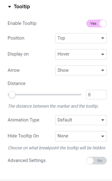
- Enable Tooltip – Allows the user to show or hide the tooltip for all the features. If this setting is turned on then:
- Position – Allows the user to set the position of the tooltip.
- Display on – Allows the user to select the trigger method (click or hover) on which the tooltip should be displayed.
- Arrow – Gives the ability to hide or show the arrow of the tooltip.
- Distance – Allows the user to set the distance between the marker and the tooltip.
- Animation Type – Allows the user to select the animation for the tooltip when it is triggered.
- Hide Tooltip On – Gives the user the ability to hide the tooltip on tablet and mobile devices.
- Advanced Settings – Turns on the following advanced settings for the tooltip:
- Animation Duration – Allows the user to set the animation speed/duration.
- Width – Allows the user to set the width of the tooltip to display on desktop, tablet and mobile devices.
- Max Height – Allows the user to set the maximum height of the tooltip to display on desktop, tablet and mobile devices if the content is large then the scroll bar will appear.
- Z-Index – Allows the user to set the z-index of the tooltip. Increase the z-index if the tooltip is not visible.
Call To Action #
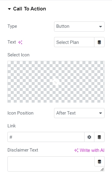
- Type – Gives the user the ability to choose the type of CTA. Available options are None, Text and Button. If the type is set to None then no other settings will be displayed except for Disclaimer text.
- Text – Allows the user to add the text to be displayed for the CTA.
- Icon – Allows the user to choose the icon from the icon library to display before or after the CTA text.
- Icon Position – Allows the user to choose the position of the icon for the CTA. Available options – After text and Before text.
- Link – Allows the user to add the url link for the CTA.
- Disclaimer Text – Allows the user to add the disclaimer text below the CTA.
Ribbon #
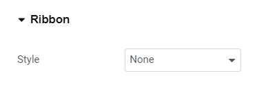
- Style – Gives the user the ability to choose the style for the ribbon. Available options are None, Corner Ribbon, Circular Ribbon and Flag Ribbon. If the style is chosen to be None then no other settings will be displayed.
- Title – Allows the user to add the text to be displayed on the ribbon.
- Horizontal Position – Allows the user to set the horizontal position of the ribbon relative to the widget. This setting is only displayed when the ribbon style is selected to be Corner Ribbon or Circular Ribbon.
- Distance – Allows the user to set the distance for the ribbon for desktop, tablet and mobile devices. This option is only available when the ribbon style is selected to be Corner Ribbon.
- Size – Allows the user to set the size of the ribbon for desktop, tablet and mobile devices. This option is only available when the ribbon style is selected to be Circular Ribbon.
- Top Distance – Allows the user to set the top distance of the ribbon relative to the widget. This option is only available when the ribbon style is selected to be Flag Ribbon.
Style #
Heading #
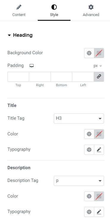
- Background Color – Allows the user to choose the background colour for the Heading section.
- Padding – Allows the user to set the padding for the Heading section for desktop, tablet and mobile devices.
- Title Tag – Allows the user to choose the html tag for the title to be enclosed within.
- Color – Allows the user to choose the colour for the title text.
- Typography – Allows the user to set the typography for the title text.
Below settings are available for all widget styles except for Features at Bottom.
- Description Tag – Allows the user to choose the description tag for the title to be enclosed within.
- Color – Allows the user to choose the colour for the description text.
- Typography – Allows the user to set the typography for the description text.
Pricing #
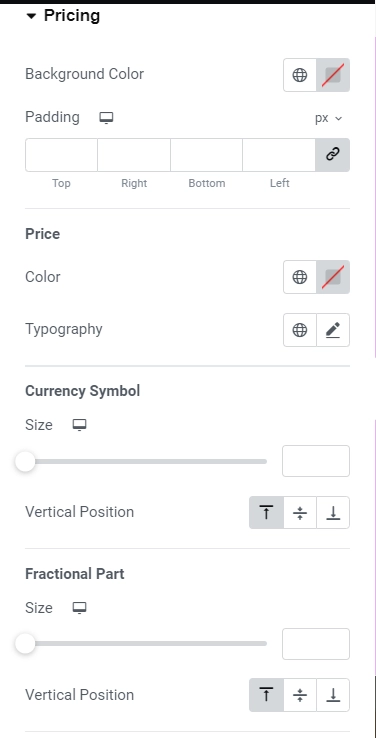
- Background Color – Allows the user to choose the background colour for pricing.
- Background Size – Allows the user to set the background size of the price. This setting is only available for widget styling Circular Background for Price.
- Border Type – Allows the user to select the border type for price background. This setting is only available for widget styling Circular Background for Price.
- Width – Allows the user to set the width of the border of price background for desktop, tablet and mobile devices. This setting is only available for widget styling Circular Background for Price.
- Color – Allows the user to choose the border color for price background. This setting is only available for widget styling Circular Background for Price.
- Box Shadow – Allows the user to set the shadow of the price background. This setting is only available for widget styling Circular Background for Price.
- Padding – Allows the user to set the padding for the pricing section for desktop, tablet and mobile devices. This setting is available for all widget styling except Circular Background for Price.
- Color – Allows the user to choose the colour for the price text.
- Typography – Allows the user to set the typography for the price text.
- Currency Symbol – Allows the user to set the size for the currency symbol for desktop, tablet and mobile devices.
- Vertical Position – Allows the user to set the vertical position of the currency symbol relative to the price.
- Size – Allows the user to set the size of the fractional part of the price for desktop, tablet and mobile devices.
- Vertical Position – Allows the user to set the vertical position of the fractional part of the price relative to the price.
- Color- Allows the user to choose the colour for the duration text.
- Typography – Allows the user to set the typography for the duration text.
Content #
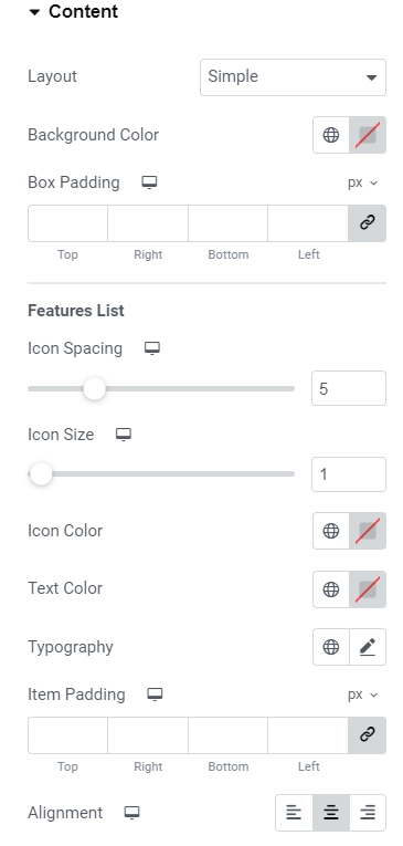
- Layout – Allows the user to select the layout for the main content/features list. Available options are Simple, Divider between fields, Box Layout and Stripped Layout.
- Background Color – Allows the user to choose background colour for the main content.
- Box Padding – Allows the user to set the padding for the main content box.
- Icon Spacing – Allows the user to set the space between the icon and the feature text for desktop, tablet and mobile devices.
- Icon Color – Allows the user to choose the colour for the icon in the features list.
- Text Color – Allows the user to choose the colour for the feature text in the features list.
- Typography – Allows the user to set the typography for the feature text.
- Item Padding – Allows the user to set the padding for the features list item for desktop, tablet and mobile devices.
- Alignment – Allows the user to set the alignment for the features list items. Below settings are only available when the features list’s style is selected to be Divider between fields.
- Style – Allows the user to select the style for the divider. Available styles are Solid, Double, Dashed and Dotted.
- Color – Allows the user to choose the colour for divider in the features list.
- Weight – Allows the user to set the thickness of the divider line for desktop, tablet and mobile devices.
- Width – Allows the user to set the width of the divider line for desktop, tablet and mobile devices. Below settings are only available when the features list’s style is selected to be Box Layout.
- Style – Allows the user to select the style for the box border. Available styles are Solid, Double, Dashed and Dotted.
- Color – Allows the user to choose the colour for the box border color in the features list.
- Weight – Allows the user to set the thickness of the box border for desktop, tablet and mobile devices. Below settings are only available when the features list’s style is selected to be Stripped Layout. Even and Odd
- Background Color – Allows the user to set the background colour of the even/odd number of features list item(s).
- Text Color – Allows the user to set the colour of the feature text of the even/odd number of features list item(s).
- Item Spacing – Allows the user to set the spacing around the even/odd number features list item.
Call To Action #
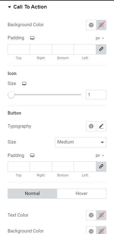
- Background Color – Allows the user to choose the background color for the CTA.
- Padding – Allows the user to set the padding for the CTA for desktop, tablet and mobile devices. Below settings are only available for the CTA type Text.
- Text Color – Allows the user to choose the colour of the CTA text.
- Typography – Allows the user to set the typography for the CTA text. Below settings are only available for the CTA type Button.
- Typography – Allows the user to set the typography for the CTA button text.
- Size – Allows the use to select the size of the button such as Extra Small, Small, Medium, Large and Extra Large.
- Padding – Allows the user to set the padding for the CTA button for desktop, tablet and mobile devices.
- Text Color – Allows the user to choose the colour for the CTA button text. This setting is available for both Normal and Hover state.
- Background Color – Allows the user to choose the background color for the CTA button. This setting is available for both Normal and Hover state.
- Border Style – Allows the user to select the border style for the CTA button for Normal state. Available options are None, Solid, Double, Dotted and Dashed.
- Border Width – Allows the user to set the border width of the CTA button for Normal state. This setting is available only when the border style is not set to “None”.
- Border Color – Allows the user to choose the border color of the CTA button for Normal state.This setting is available only when the border style is not set to “None”.
- Border Radius – Allows the user to set the border radius of the CTA button for desktop, tablet and mobile devices.
- Box Shadow – Allows the user to set the shadow for the CTA button for Normal state.
- Border Hover Color – Allows the user to choose the border color of the CTA button for Hover state.
- Hover Shadow – Allows the user to set the shadow for the CTA button for Hover state.
- Hover Animation – Allows the user to select the animation for the CTA button on hover.
- Color – Allows the user to choose the color of the disclaimer text.
- Typography – Allows the user to set the typography for the disclaimer text.
- Margin – Allows the user to set the margin of the disclaimer.


