Responsive Addons for Elementor (RAE) Product Carousel widget allows you to showcase your products in a carousel with many customizing features.
Note: This widget requires the WooCommerce plugin to be installed and activated as displays only WooCommerce products.
Content #
Layout Settings #
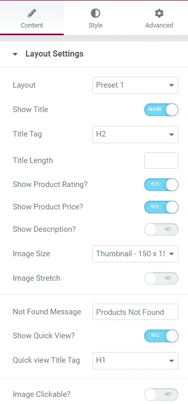
- Layout – Select the layout from the given options.
- Show Title – Show/Hide the title.
- Title Tag – Select the HTML tag for the title.
- Title Length – Set the length for the title.
- Show Product Rating – Show/Hide product rating.
- Show Product Price – Show/Hide product price.
- Show Description – Show/Hide product description.
- Image Size – Set the product image size.
- Image Stretch – Enable/Disable image stretch.
- Not Found Message – Add a message to display when no posts are found.
- Show Quick View – Enable/Disable the quick view feature.
- Quick View Title Tag – Select the title tag for Quick View.
- Image Clickable – Enable/Disable clickable image.
Carousel Settings #
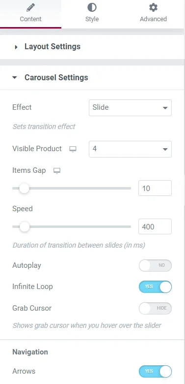
- Effect – Select the carousel effect.
- Visible Product – Set the number of products visible initially.
- Items Gap – Set the gap between items in the carousel.
- Speed – Set the carousel transition speed.
- Autoplay – Enable/Disable autoplay settings.
- Infinite Loop – Enable/Disable infinite loop settings.
- Grab Cursor – Enable/Disable grab cursor settings.
- Arrows – Enable/Disable arrows navigation.
- Dots – Enable/Disable dots navigation.
- Image Dots – Enable/Disable image dots navigation.
- Direction – Select the transition direction for the carousel.
Query #
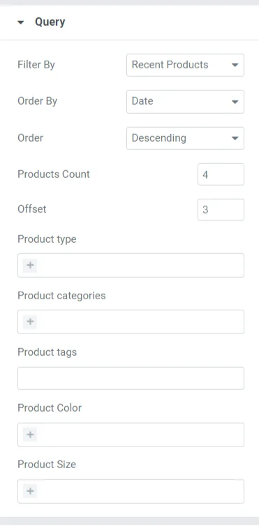
- Filter By – Select the parameter for filtering products.
- Order By – Select the parameter for ordering product display.
- Order – Choose the display order type (e.g., ascending/descending).
- Products Count – Set the number of products to display.
- Offset – Set the product offset.
- Product Type – Specify the product type for display.
- Product Categories – Add categories for product display.
- Product Tags – Add tags for product display.
- Product Color – Add colors for product display.
- Product Size – Add sizes for product display.
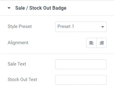
Sale/Stock Out Badge #
- Style Preset – Select the style preset for the badge.
- Alignment – Set the badge alignment.
- Sale Text – Add text for the sale badge.
- Stock Out Text – Add text for the out-of-stock badge.
Style #
Products #
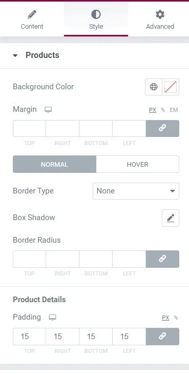
- Background Color – Set the background color for products.
- Margin – Set the margin for products.
- Border Type – Configure the border settings for products in Normal and Hover states.
- Border Color – Set the border color for products in Normal and Hover states.
- Box Shadow – Configure the box shadow properties for products.
- Border Radius – Set the border radius for products.
- Padding – Set padding for the Product Details section in product slides.
Color & Typography #
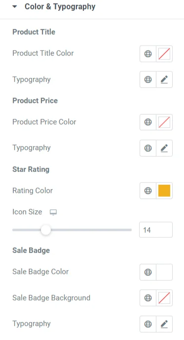
Product Title
- Product Title Color – Set the color for the product title.
- Typography – Set typography options for the product title.
Product Price
- Product Price Color – Set the color for the product price.
- Typography – Set typography options for the product price.
Star Rating
- Rating Color – Set the color for rating stars.
- Icon Size – Set the icon size for rating stars.
Sale Badge
- Sale Badge Color – Set the color for the sale badge.
- Sale Badge Background – Set the background color for the sale badge.
- Typography – Set typography options for the sale badge.
Stock Out Badge
- Stock Out Badge Color – Set the color for the stock out badge.
- Stock Out Badge Background – Set the background color for the stock out badge.
- Typography – Set typography options for the stock out badge.
Button #
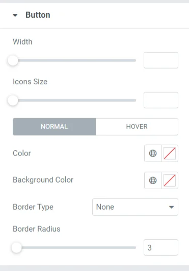
- Width – Set the button width.
- Height – Set the button height.
Normal State
- Color – Set the button color.
- Background Color – Set the button background color.
- Border Type – Set the button border settings.
- Border Radius – Set the button border radius.
Hover State
- Color – Set the button color on hover.
- Background Color – Set the button background color on hover.
Popup #
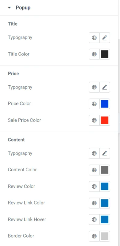
Title
- Typography – Set typography options for the popup title.
- Title Color – Set the color of the popup title.
Price
- Typography – Set typography options for the product price.
- Title Color – Set the color of the price.
- Sale Price Color – Set the color of the sale price.
Content
- Typography – Set typography options for popup content.
- Content Color – Set the color of the popup content.
- Review Color – Set the color for reviews in the popup.
- Review Link Color – Set the color of the review link.
- Review Link Hover – Set the hover color of the review link.
- Border Color – Set the border color for popup content.
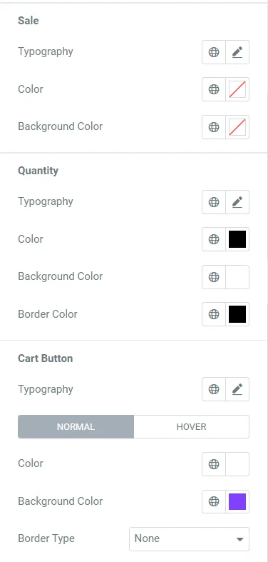
Sale
- Typography – Set typography options for the sale text.
- Color – Set the color of the sale text.
- Background Color – Set the background color of the sale text.
Quantity
- Typography – Set typography options for quantity.
- Color – Set the color for quantity.
- Background Color – Set the background color for quantity.
- Border Color – Set the border color for quantity.
Cart Button
- Typography – Set typography options for the cart button.
Normal State
- Color – Set the cart button color.
- Background Color – Set the cart button background color.
- Border Type – Set the border settings for the cart button.
- Border Radius – Set the border radius for the cart button.
Hover State
- Color – Set the cart button color on hover.
- Background Color – Set the cart button background color on hover.
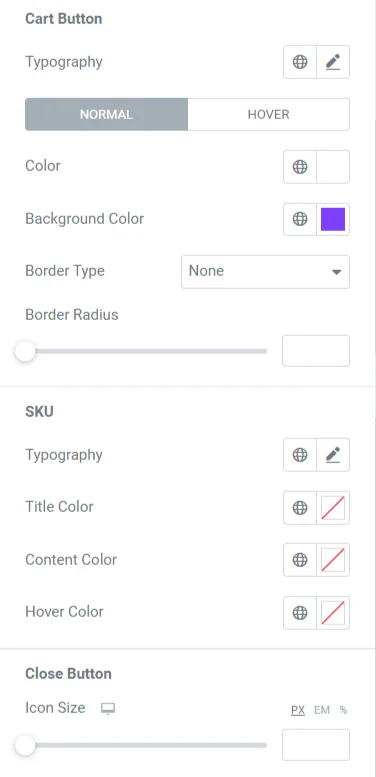
SKU
- Typography – Set typography options for the SKU.
- Title Color – Set the SKU title color.
- Content Color – Set the SKU content color.
- Hover Color – Set the hover color for SKU.
Close Button
- Icon Size – Set the icon size of the close button.
- Button Size – Set the size of the close button.
- Color – Set the close button color.
- Background – Set the close button background color.
- Border Radius – Set the border radius of the close button.
- Box Shadow – Set box shadow properties for the close button.
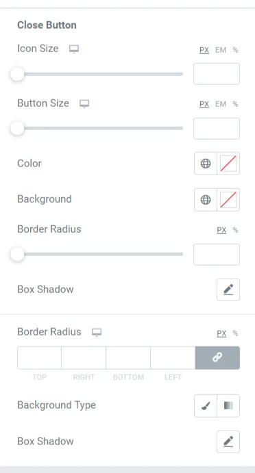
Popup Window
- Border Radius – Set the border radius of the popup window.
- Background Type – Set the popup window background.
- Box Shadow – Set box shadow properties for the popup window.
Dots #
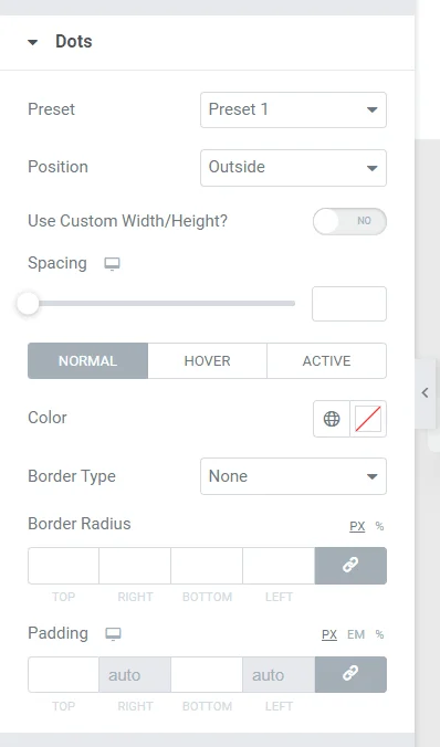
- Preset – Select the preset style for dots.
- Position – Select the position of dots.
- Use Custom Width/Height? – Enable/Disable custom width and height for dots.
Normal State
- Color – Set the dot color.
- Border Type – Set the border settings for dots.
- Border Radius – Set the border radius for dots.
- Padding – Set the padding for dots.
Hover State
- Color – Set the dot color on hover.
- Border Color – Set the border color on hover.
Active State
- Color – Set the dot color when active.
- Width – Set the active dot width.
- Height – Set the active dot height.
- Border Radius – Set the border radius for active dots.
- Shadow – Set shadow properties for active dots.
Arrows #
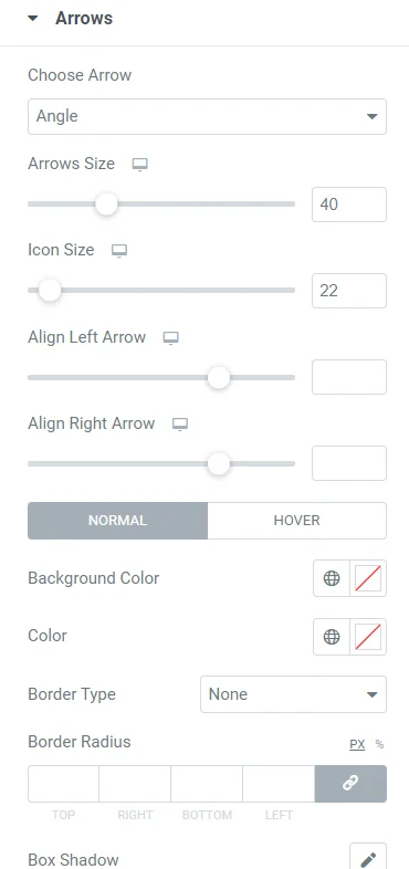
- Choose Arrow – Select the arrow style.
- Arrows Size – Set the size of the arrows.
- Icon Size – Set the icon size.
- Align Left Arrow – Set the alignment of the left arrow.
- Align Right Arrow – Set the alignment of the right arrow.
Normal State
- Background Color – Set the background color of the arrows.
- Color – Set the arrow color.
- Border Type – Set the border settings for arrows.
- Border Radius – Set the border radius of the arrows.
- Box Shadow – Set the box shadow properties for arrows.
Hover State
- Background Color – Set the background color of the arrows on hover.
- Color – Set the arrow color on hover.
- Border Color – Set the border color on hover.
- Box Shadow – Set the box shadow properties on hover.


