Responsive Addons for Elementor (RAE) Product Category Grid is a useful widget that allows the user to display the Product Categories in a grid view. The user can also control the query to fetch the required categories and also can customize the other elements of the widget.

Classic Skin

Minimal Skin
Content #
Layout #
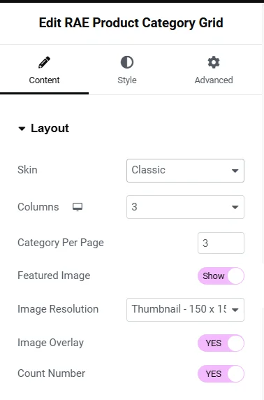
- Skin – Allows the user to choose the skin for the widget. Two skins are available: Classic and Minimal.
- Columns – This is a responsive control that allows the user to control the number of columns of the grid.
- Category Per Page – Allows the user to set the number of categories to be displayed per page.
- Featured Image – Allows the user to choose whether the categories’ featured image will be displayed or not.
- Image Size – Allows the user to select the image size. This setting is available if Featured Image is set to Show.
- Image Overlay – Allows the user to choose whether the image overlay should be displayed or not. This setting is available if Featured Image is set to Show.
- Count Number – Allows the user to show or hide the product count number for every category.
Query #
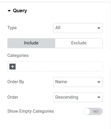
- Type – Allows the user to select the query type. Available options are: All, Only Parents, and Only Child.
- Categories (under Include) – Allows the user to select the categories that should be included in the query. This setting is available if Type is set to All.
- Categories (under Exclude) – Allows the user to select the categories that should be excluded from the query. This setting is available if Type is set to All.
- Child Categories of – Allows the user to select the Parent Category of which the child categories should be displayed. This setting is available if Type is set to Only Child.
- Order By – Allows the user to select the field based on which the categories will be ordered. Available options are Name, Count, and Slug.
- Order – Allows the user to select the order of the categories. Default is Descending.
- Show Empty Categories – Allows the user to show or hide the empty categories.
More… #
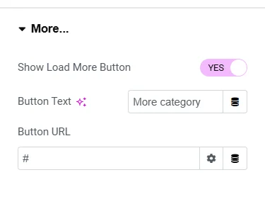

- Show Load More Button – Allows the user to show or hide the More button.
Below settings will be available if Show Load More Button is set to Yes.
- Button Text – Allows the user to add the button text.
- Button URL – Allows the user to add the button URL and its link settings.
Style #
Layout #
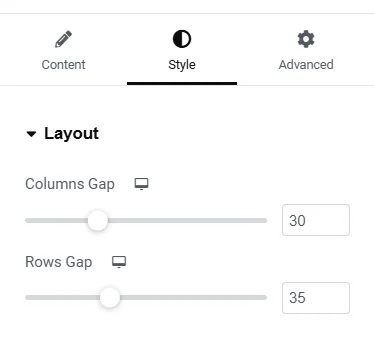
- Columns Gap – This is a responsive control that allows the user to set the gap between the grid columns.
- Rows Gap – This is a responsive control that allows the user to set the gap between the grid rows.
Item Box #
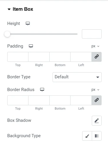
- Height – This is a responsive control that allows the user to set the height of the item box.
- Padding – This is a responsive control that allows the user to set the padding of the item box.
- Border Type – Allows the user to select the border type of the item box.
- Width – This is a responsive control that allows the user to set the border width of the item box. This setting is available if the Border Type is not set to None.
- Color – Allows the user to set the border color of the item box. This setting is available if the Border Type is not set to None.
- Border Radius – This is a responsive control that allows the user to set the border of the item box.
- Box Shadow – Allows the user to configure the settings for the box shadow of the item box.
- Background Type – Allows the user to choose the background type of the item box. There are two options available: Classic and Gradient, each will have its own settings to be configured.
Image #
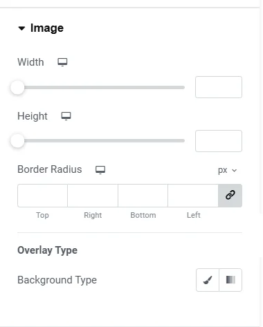

This is section will only be available only if the Content Tab > Layout > Featured Image setting is set to Show.
- Width – This is a responsive control that allows the user to set the width of the featured image of each category.
- Height – This is a responsive control that allows the user to set the height of the featured image of each category.
- Border Radius – This is a responsive control that allows the user to set the border radius of the featured image of each category.
- Overlay Color – Allows the user to set the color of the image overlay. This setting is available if ‘Content Tab > Layout > Image Overlay‘ setting is set to Yes.
Content #
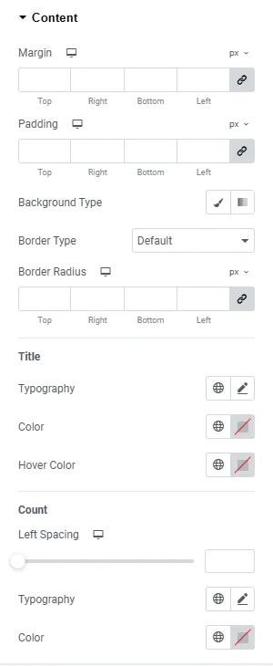
- Alignment – Allows the user to choose the horizontal alignment of the category content. This setting is available if the Skin is set to be Minimal.
- Margin – This is a responsive control that allows the user to set the margin of the content.
- Padding – This is a responsive control that allows the user to set the padding of the content.
- Background Type – Allows the user to choose the background type of the content. There are two options available: Classic and Gradient, each will have its own settings to be configured.
- Border Type – Allows the user to select the border type of the content.
- Width – This is a responsive control that allows the user to set the border width of the content. This setting is available if the Border Type is not set to None.
- Color – Allows the user to set the border color of the content. This setting is available if the Border Type is not set to None.
- Border Radius – This is a responsive control that allows the user to set the border of the content.
Title #
- Typography – Allows the user to set the typography of the content title.
- Color – Allows the user to set the color of the content title.
- Hover Color – Allows the user to set the color of the content title on hover.
Count (available if the Content > Layout > Count Number setting is set to Yes) #
- Left Spacing – This is a responsive control that allows the user to set the left spacing of the product count text. This setting is available with the skin Classic.
- Top Spacing – This is a responsive control that allows the user to set the top spacing of the product count text. This setting is available with the skin Minimal.
- Typography – Allows the user to set the typography of the content product count.
- Color – Allows the user to set the color of the content product count.
Load More Button #
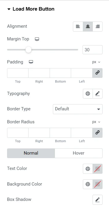

This section will only be available only if the Content > More… > Show Load More Button setting is to Yes.
- Alignment – Allows the user to choose the horizontal alignment of the load more button.
- Margin Top – This is a responsive control that allows the user to set the top margin of the more button.
- Padding – This is a responsive control that allows the user to set the padding of the more button.
- Typography – Allows the user to set the typography of the more button text.
- Border Type – Allows the user to select the border type of the more button.
- Width – This is a responsive control that allows the user to set the border width of the more button. This setting is available if the Border Type is not set to None.
- Color – Allows the user to set the border color of the more button. This setting is available if the Border Type is not set to None.
- Border Radius – This is a responsive control that allows the user to set the border of the more button.
Normal and Hover state tabs have the same settings:
- Text Color – Allows the user to set the text color of the more button for the respective state.
- Background Color – Allows the user to set the background color of the more button for the respective state.
- Box Shadow – Allows the user to set the box shadow of the more button for the respective state.


