↓ Skip to Main Content
Cyberchimps Logo

Main Navigation

  • Templates
  • Features
  • Plugins
    • Responsive Plus
    • Starter Templates
    • Addons for Elementor
    • Responsive Blocks
  • Go Pro
  • Blog
  • Pricing
  • Login

Installation & Updates

1
  • How to Install & Activate the Responsive Addons for Elementor

Widgets

85
  • Image Gallery
  • Advanced Tabs
  • Archive Posts
  • Archive Title
  • Audio Player
  • Author Box
  • Banner
  • Breadcrumbs
  • Business Hour
  • Button
  • Contact Form 7 Styler
  • Call To Action
  • Custom Add To Cart
  • Content Switcher
  • Countdown
  • Facebook Feed
  •  Data Table
  • Divider
  • Dual Color Header
  • FAQ
  • FlipBox
  • Featured Image
  • Feature List
  • Fancy Text
  • Icon Box
  • Gravity Forms Styler
  • Google Map
  • Image Hotspot
  • LearnDash Course List
  • Lottie
  • Logo Carousel
  • Mailchimp Styler
  • Login & Register
  • Media Carousel
  • Menu Cart
  • Modal Popup
  • MultiButton
  • Nav Menu
  • OffCanvas
  • Portfolio
  • Post Comments
  • Post Content
  • Post Excerpt
  • Post Info
  • Post Navigation
  • Post Title
  • Posts
  • Post Carousel
  • Price Box
  • Price List
  •  Pricing Table
  • Product Carousel
  • Product Category Grid
  • Products
  • Progress Bar
  • Reviews
  • Search Form
  • Site Logo
  • Slider
  • Sticky Section
  • Sticky Video
  • Table of Contents
  • Team Member
  • Testimonial Slider
  • Theme Builder
  • Timeline
  • Twitter Feed
  • Video
  • WooCommerce Breadcrumbs
  • WP Forms Styler
  • One Page Navigation
  • Content Ticker
  • Woo Checkout
  • Back to Top
  • Particle Backgrounds for Elementor
  • Product Price
  • Product Image
  • Product Stock
  • Product Upsells
  • Product Meta
  • Product Title
  • Product Rating
  • Product Content
  • Product Short Description
  • Product Additional Information
View Categories
  • Home
  • Docs
  • Responsive Addons For Elementor
  • Widgets
  • Advanced Tabs

Advanced Tabs

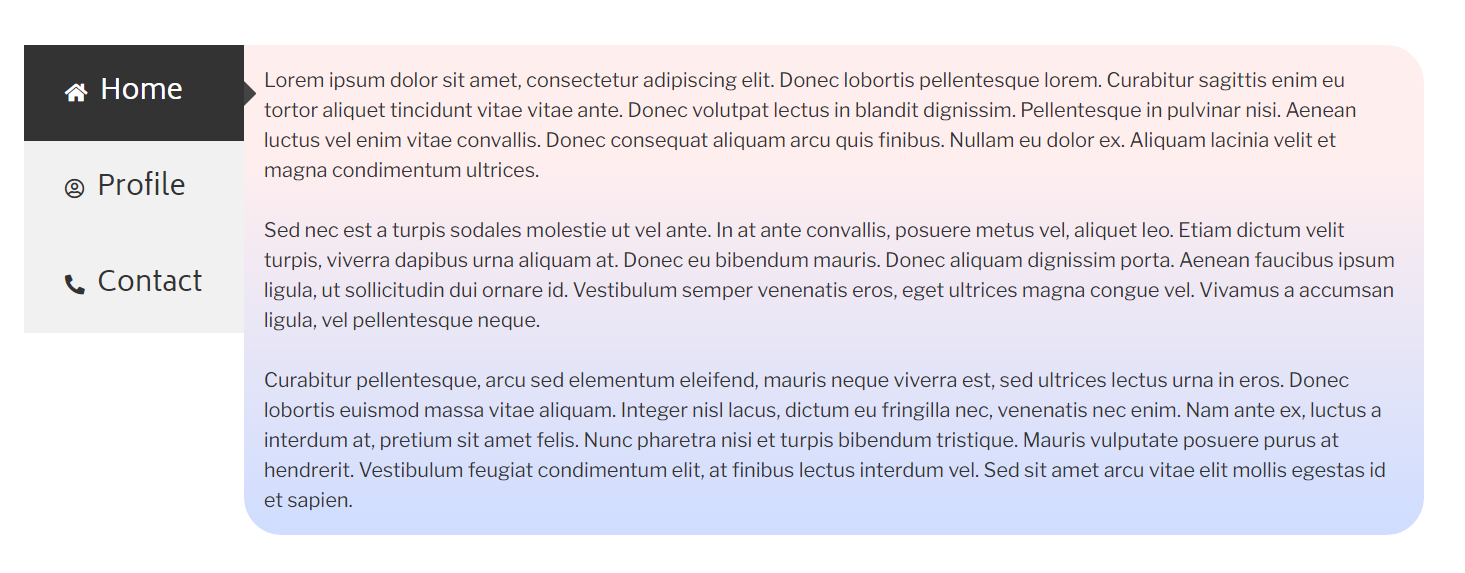
With Responsive Addons for Elementor (RAE) Advanced Tabs widget, you can display a substantial amount of information in an aesthetic and organized way under different tabs.

Advanced tabs example

Content #

General Settings #

Content general settings
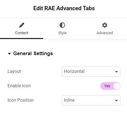
  1. 1.Layout: Select the preferred layout you want to display the content in.
  2. 2.Enable Icon: Check this if you want to display icons next to the tab title.
  3. 3.Icon Position: Choose “Inline” to display the icon in the same line as the title or “Stacked” to display both on separate lines.

Content #

Content settings

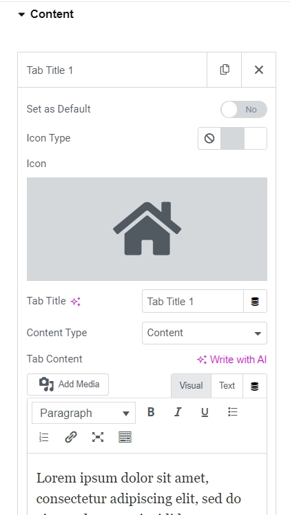
From the content tab, you can add more tabs and add separate content for each of them. The repeater controls are as follows:

  1. 1.Set as Default: This control will set that specific tab as the first tab that shows when the page is loaded.
  2. 2.Icon Type: Gives you the option to show no icon, display an icon or display an image instead.
  3. 3.Tab Title: Change the title of the tab from here.
  4. 4.Content Type: Choose “Content” to input your own custom content or “Saved Templates” to choose the content of a template.
  5. 5.Choose Template: If you select “Saved Templates” then select the template you want to display the content of from this control.

Style #

General #

Style general

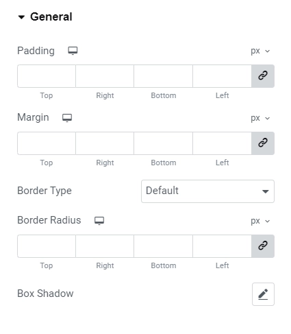
You can change various properties of the entire widget container such as padding and margin. You can also add a border and give it rounded corners. Add a box shadow to give it a cool effect.

Tab Title #

Style tab title
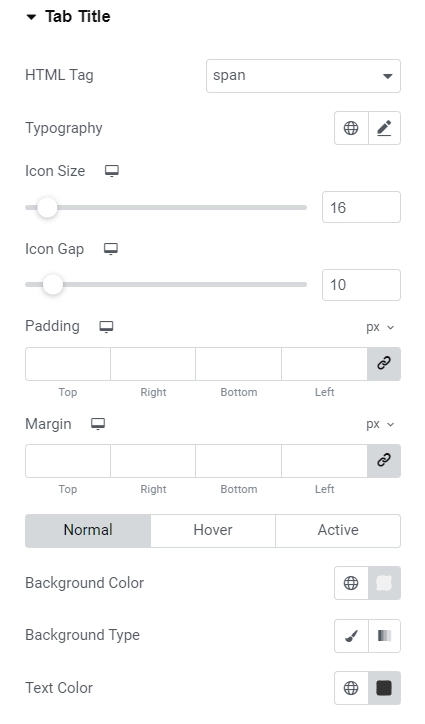
  • Set the HTML tag for the headings.
  • Apart from changing properties such as margin and padding of the tab title container, you can also set a minimum width to it.
  • Adjust the icon size and typography for text separately along with controlling the space between the icon and the title.
  • Change the background color, text and icon color of the title / title container for three different states, that is, normal, hover and active state.
  • Also add a border and customize it with various options such as color, size and radius.

Content #

Style content
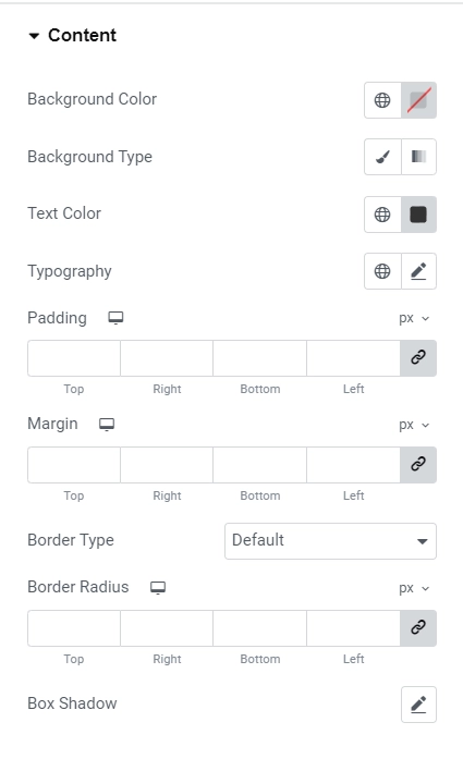
  • Change the background color of the content tab along with adjusting properties for the text within it such as typography and color.
  • Adjust the margin, padding as well as add a border with various options available to style it.
  • Set the box shadow for better appearance.
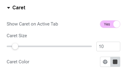
Caret #

Style caret

Display the tiny arrow next to the active tab. Adjust its size and color if you choose to display it.

Responsive Controls #

Responsive controls

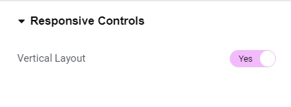
If checked, for smaller screen sizes, horizontal layout will automatically switch to vertical layout to display the tabs without breaking or looking weird.

Updated on February 26, 2025

What are your Feelings

  • Happy
  • Normal
  • Sad
Share This Article :
  • Facebook
  • X
  • LinkedIn
  • Pinterest
Image GalleryArchive Posts

Powered by BetterDocs

Table of Contents
  • Content
    • General Settings
    • Content
  • Style
    • General
    • Tab Title
    • Content
    • Caret
    • Responsive Controls

Our Products

Responsive Paid Plan

Responsive Addons for Elementor

Starter Templates

Responsive Blocks

WP Legal Pages

WP Adcenter

GDPR Cookie Consent

Powered by Responsive WordPress theme

RESOURCES

Responsive Platform

Learn Elementor

Download Free Theme

Brand Assets

Testimonials

Compare Astra/Kadence

TrustPilot

CCPA

Video Tutorials

FEATURES

WooCommerce

Header Footer Builder

Company

About

Pricing

Blog

Affiliate Program

Contact Us

Terms of Service

GDPR Privacy Policy

GDPR Cookie Policy

Support

Login

What’s New

Documentation

Request Support

Video Tutorials

Refund Policy

Service

Discount Coupon

Bug Bounty Program

Copyright © 2010-2025 CyberChimps  

Top
  • Constructive Blocks
    • Advanced Heading Block
    • Section Block
    • Advanced Columns Block
    • Pricing List Block
    • Pricing Table Block
    • Flip Box Block
    • Info Block
    • Image Slider Block
    • Post and Page Grid Block
    • Post Carousel Block
    • Icon List Block
    • Table of Content
    • Team Block
    • Shape Divider Block
    • Masonry Block
    • Portfolio Block
    • Accordion Block
    • Divider Block
    • Video Popup Block
    • Card Block
    • Spacer Block
    • Google Map Block
    • Block Quote
    • Expand
    • Image Hotspot
    • Instagram Feed Block
    • Image Boxes Block
    • Testimonial Block
    • Advanced Text Block
    • Testimonial Slider Block
    • Feature Grid Block
    • Inline Notice Block
    • WP Search Block
    • Social Share Block
    • Tabs Block
    • Progress Bar Block
    • Call/Mail Button
    • Anchor Block
    • Gutenberg Image Block – Responsive Block
    • Contact Form 7 Styler
  • Timelines
    • Count Up
    • Gutenberg Countdown Block
    • Content Timeline
    • Post Timeline Block
  • CRO
    • Multi Buttons Blocks
    • Call To Action Block