The Responsive Addons for Elementor (RAE) Slider widget allows you to quickly create a simple slider that works perfectly for your website.

Content #
REA Slider #
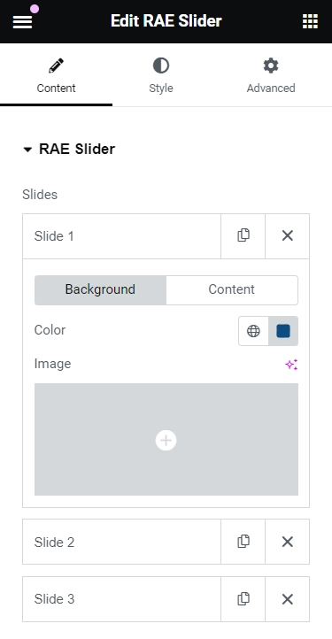
Slides #
Show the list of the total number of slides added in the slider. Drag and drop to change their position, duplicate a slide, delete or add a slide. Upon clicking on a slide, it will open up. You can select the background and content for the slide from here. Each slide has separate settings available.
Background: The background has two options :
- Color: Choose a background Color for the Slide.
- Image: Choose an image as the background for the slide.
If you choose an image as the background option, you will see some additional options:
- Size: Choose whether to display the background image as cover, contain, or auto. The auto image is if you want the exact size of the image, and also if you would want the entire image to appear in the slider. The cover size is to scale the image as large as possible without stretching the image. The ‘Contain’ size is to scale the image as large as possible without cropping or stretching the image.
- Background Overlay: Choose Yes to set a color over another image using the opacity to control the transparency of the overlay color. If set to Yes, you have the option to choose blend mode from 13 options.
- Ken Burns Effect: Choose Yes to enable zooming effect on the background image.
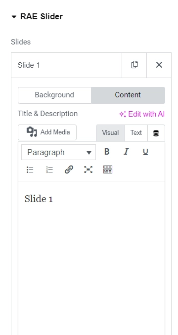
Content: The content has the following options:
- Title & Description: Insert the title and description for the slide.
- Button Text: Set the text for the button.
- Link: Add a URL the slide or button will link to.
- Apply Link On: If a link is set, this option will appear. Choose if the link applies to only the button or to the whole slide.
- Display Image: Choose Yes to add the necessary class and properties to display images next to the slide title and description. Also displays the extra image settings in the editor.
- Image: Choose an image to be displayed next to the slide content.
- Height: Adjust the image height.
- Width: Adjust the image width.
- Size: Adjust the image size within its container. Available options: Auto, Contain, Cover.
- Position: Change the image position within its container. Available options: Left, Center, Right, Bottom, Initial, Revert, Top.
REA Slider Option #
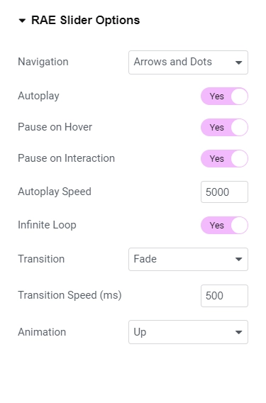
- Navigation: Choose to display arrows, dots, both or none.
- Autoplay: Get the slides to rotate automatically, according to the speed you set.
- Pause on Hover: Make the slide pause when the mouse hovers over it.
- Autoplay Speed: Set the time it takes for the slide to start rotating.
- Infinite Loop: Have the slides rotate in an infinite loop and without stopping.
- Transition: Set the transition of the slides as slide or fade.
- Transition Speed: Set the time it takes for the slides to rotate.
- Animation: Set the animation effect of the content’s display when the slide is shown: None, Down, Up, Right, Left, or Zoom.
Style #
Slides #
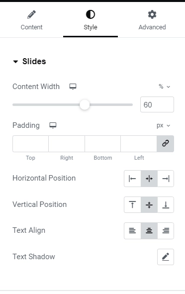
- Content width: Set the width of the content inside the slide.
- Padding: Set the inner spacing between the edge of the content and the edge of the slide.
- Horizontal Position: Set the position of the content as of right, left, or a center from here.
- Vertical Position: Set the position of the content as a top, middle, or bottom from here.
- Text Align: Align the text to the right, left, or center from here.
- Text Shadow: Add a shadow and blur to the text from here.
Title
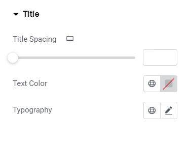
- Title Spacing: Set the spacing between the title and the description.
- Text Color: Set the color of the title from here.
- Typography: Set the typography of the title from here.
Description
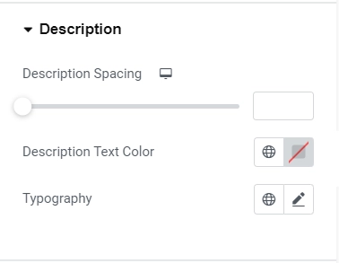
- Spacing: Set the spacing between the description and the button.
- Text Color: Set the color of the description.
- Typography: Set the typography of the description.
Button
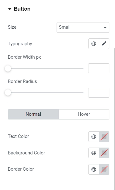
- 1.Size: Set the size of the button, from extra small to extra large.
- 2.Text Color: Set the text color for the button.
- 3.Typography: Set the typography of the button.
- 4.Border Width: Set the border width of the button.
- 5.Border Radius: Set the border-radius, to control corner roundness.
- 6.Normal state / Hover State
- 1.Text Color – Set the text color.
- 2.Background Color – Set the background color of the button.
- 3.Border Color – Set the border color of the button.
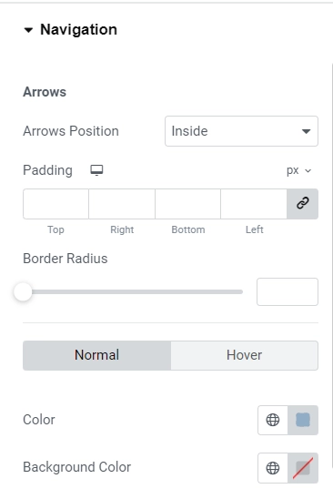
Navigation
The navigation option depends upon what you have selected in the REA Slider Option present under the Content tab.
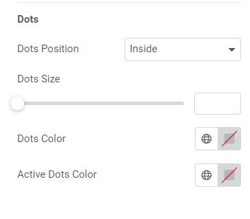
Dots
- Dots Position – Set the position of the dots inside or outside the slider.
- Dots size – Set the exact size of the dots.
- Dots color – Set the color of the dots.


