↓ Skip to Main Content
Cyberchimps Logo

Main Navigation

  • Templates
  • Features
  • Plugins
    • Responsive Plus
    • Starter Templates
    • Addons for Elementor
    • Responsive Blocks
  • Go Pro
  • Blog
  • Pricing
  • Login

Installation & Updates

1
  • How to Install & Activate the Responsive Addons for Elementor

Widgets

85
  • Image Gallery
  • Advanced Tabs
  • Archive Posts
  • Archive Title
  • Audio Player
  • Author Box
  • Banner
  • Breadcrumbs
  • Business Hour
  • Button
  • Contact Form 7 Styler
  • Call To Action
  • Custom Add To Cart
  • Content Switcher
  • Countdown
  • Facebook Feed
  •  Data Table
  • Divider
  • Dual Color Header
  • FAQ
  • FlipBox
  • Featured Image
  • Feature List
  • Fancy Text
  • Icon Box
  • Gravity Forms Styler
  • Google Map
  • Image Hotspot
  • LearnDash Course List
  • Lottie
  • Logo Carousel
  • Mailchimp Styler
  • Login & Register
  • Media Carousel
  • Menu Cart
  • Modal Popup
  • MultiButton
  • Nav Menu
  • OffCanvas
  • Portfolio
  • Post Comments
  • Post Content
  • Post Excerpt
  • Post Info
  • Post Navigation
  • Post Title
  • Posts
  • Post Carousel
  • Price Box
  • Price List
  •  Pricing Table
  • Product Carousel
  • Product Category Grid
  • Products
  • Progress Bar
  • Reviews
  • Search Form
  • Site Logo
  • Slider
  • Sticky Section
  • Sticky Video
  • Table of Contents
  • Team Member
  • Testimonial Slider
  • Theme Builder
  • Timeline
  • Twitter Feed
  • Video
  • WooCommerce Breadcrumbs
  • WP Forms Styler
  • One Page Navigation
  • Content Ticker
  • Woo Checkout
  • Back to Top
  • Particle Backgrounds for Elementor
  • Product Price
  • Product Image
  • Product Stock
  • Product Upsells
  • Product Meta
  • Product Title
  • Product Rating
  • Product Content
  • Product Short Description
  • Product Additional Information
View Categories
  • Home
  • Docs
  • Responsive Addons For Elementor
  • Widgets
  • Team Member

Team Member

The Responsive Addons for Elementor (RAE) Team Member widget gives the option to add your team member details consisting of image, name, designation, description, and social links in a nice UI.

team member widget

Responsive Addons for Elementor (RAE) Team member

Content #

Team member content #

by default team member

1) Style – This option allows you to choose some predefined styles for your team member widget.

2) Choose Member Image – This allows you to choose an image for the team member.

3) Image Size – This allows you to set the image size (predefined or custom).

4) Member Name – This allows you to add the name of your team member.

5) Member Position – This allows you to add the designation of your team member.

6) Show Icon – This allows you to hide/show the icon for the team member.

7) Show Description – This allows you to hide/show the description of the team member.

team member content

Social Profiles #

Editing social profiles

Display Social Profiles – Gives the ability to hide or show the social profile icons.

Add Icons: This option enables you to customize the styles for various social profiles and add links to the icons.

  • Icon – Select the icon.
  • Label – You can add a label to the icon.
  • Link – Add the link to your social profile.
  • Color – Sets the color of the text.
  • Background Color – This allows you to set the background color.
  • Border Type – Select the border from the dropdown menu.
  • Text Shadow – You can add the text-shadow.
  • Box Shadow – This lets you add the box shadow.

Pop Up Details #

Customizing popup details

Show Popup – Gives the ability to enable or disable the popup for showing the information of a team member on a popup.

About Member – You can add the text to be visible on a popup about a team member.

Phone – You can add a phone number that will be visible on a popup about a team member.

Email – You can add an email Id that will be visible on a popup about a team member.

Close Icon – Choose the close icon for the popup.

Close Icon Alignment – Choose between left or right alignment for the close icon.

Style #

Content #

style content
  • Background Type & Box Shadow– This allows you to select the background type such as color or an image and select box shadow for the content of the widget.
  • Alignment – The alignment of the contents can be set to center, left, or right.
  • Padding – Adjust the overall padding of the widget.
  • Content Padding – Adjust the overall padding of the content.
  • Border Style – This Allows you to set the border style type for the image. If the border style is set to any given option other than none then you can specify the border width, border color, and border hover color.

Image #

Styling image
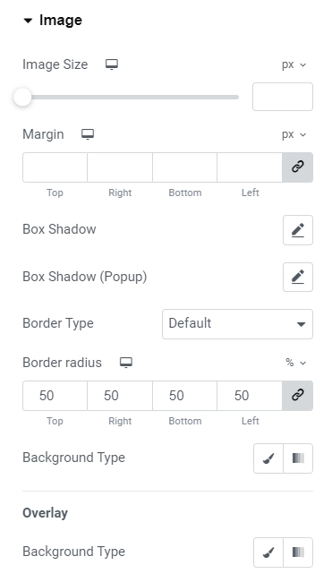
  • Image Size – Adjust the size of the image.
  • Margin – Adjust the margin around the image.
  • Box Shadow – Add box shadow to the image.
  • Border Type – You can set the border style, width and color.
  • Background type – This allows you to select the background type such as color for an image

Name #

Styling Name

Name – This allows you to add typography, color, and margin-bottom to the member name.\

  • Typography: Let you customize the typography of the name.
  • Color: This lets you customize the color of the name 
  • Margin bottom: You can adjust the margin-bottom in px or em.

Position #

Styling position

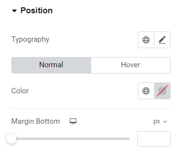
Position – This allows you to add typography, color, and margin-bottom to the member position.

  • Typography: When customizing the typography, you can adjust the appearance of the name. 
  • Color: Customize the color to change the name’s color. 
  • Margin Bottom: Additionally, you can modify the margin-bottom in pixels or ems.

Description #

Styling description

Description – This allows you to add typography, color, and margin-bottom to the member Description.

Social Profiles

Styling social proifiles
  • Alignment – Align the social icons for social profiles to left, center, or right.
  • Display – Choose between display block and inline-block.
  • Border radius – You can set the border radius of social icons.
  • Padding & Margin – Adjust the padding and margin of social icons.
  • Icon Size and typography – You can adjust the icon size and typography.
  • Use height Width – You can enable or disable the toggle for updating the height and width.

Modal Controls #

Styling modal controls

Choose background type for the modal. Customize the color and typography and margin for Name, Position, and Description.

Close Icon #

Styling close icons

Customize the close icon of the modal with color, border type, background color, border-radius, box-shadow, font-size, padding.

Updated on April 14, 2025

What are your Feelings

  • Happy
  • Normal
  • Sad
Share This Article :
  • Facebook
  • X
  • LinkedIn
  • Pinterest
Table of ContentsTestimonial Slider

Powered by BetterDocs

Table of Contents
  • Content
    • Team member content
    • Social Profiles
    • Pop Up Details
  • Style
    • Content
    • Image
    • Name
    • Position
    • Description
    • Modal Controls
    • Close Icon

Our Products

Responsive Paid Plan

Responsive Addons for Elementor

Starter Templates

Responsive Blocks

WP Legal Pages

WP Adcenter

GDPR Cookie Consent

Powered by Responsive WordPress theme

RESOURCES

Responsive Platform

Learn Elementor

Download Free Theme

Brand Assets

Testimonials

Compare Astra/Kadence

TrustPilot

CCPA

Video Tutorials

FEATURES

WooCommerce

Header Footer Builder

Company

About

Pricing

Blog

Affiliate Program

Contact Us

Terms of Service

GDPR Privacy Policy

GDPR Cookie Policy

Support

Login

What’s New

Documentation

Request Support

Video Tutorials

Refund Policy

Service

Discount Coupon

Bug Bounty Program

Copyright © 2010-2025 CyberChimps  

Top
  • Constructive Blocks
    • Advanced Heading Block
    • Section Block
    • Advanced Columns Block
    • Pricing List Block
    • Pricing Table Block
    • Flip Box Block
    • Info Block
    • Image Slider Block
    • Post and Page Grid Block
    • Post Carousel Block
    • Icon List Block
    • Table of Content
    • Team Block
    • Shape Divider Block
    • Masonry Block
    • Portfolio Block
    • Accordion Block
    • Divider Block
    • Video Popup Block
    • Card Block
    • Spacer Block
    • Google Map Block
    • Block Quote
    • Expand
    • Image Hotspot
    • Instagram Feed Block
    • Image Boxes Block
    • Testimonial Block
    • Advanced Text Block
    • Testimonial Slider Block
    • Feature Grid Block
    • Inline Notice Block
    • WP Search Block
    • Social Share Block
    • Tabs Block
    • Progress Bar Block
    • Call/Mail Button
    • Anchor Block
    • Gutenberg Image Block – Responsive Block
    • Contact Form 7 Styler
  • Timelines
    • Count Up
    • Gutenberg Countdown Block
    • Content Timeline
    • Post Timeline Block
  • CRO
    • Multi Buttons Blocks
    • Call To Action Block