The Responsive Addons for Elementor (RAE) Testimonial Slider widget lets you display a slider of customer testimonials in a variety of designs.

Content #
Slides #

The slides customization option shows the list of the total number of slides added in the slider.
You can drag and drop to change their position, duplicate a slide, or delete or add a slide. Upon clicking on a slide, it will open up.
You can select the background and content for the slide from here. Each slide has separate settings available.
Icon: Add an icon to the testimonial
Content: Enter the text you want to add for the testimonial.
Items

- Image: Upload or choose an image from the media library.
- Name: Enter the customer’s name.
- Title: Enter the customer’s title.
- Skin: Select a pre-designed skin from Default or Bubble.
- Layout: Choose from Image Inline, Image Stacked, Image Above, Image Left, Image Right.
- Alignment: Align the testimonial to the left, center or right.
- Slides Per View: Select the number of slides to show at one time, from 1 to 10.
- Slides To Scroll: Select how many slides to scroll per swipe, from 1 to 10.
- Width: Set the width of the widget.
Additional Options: #
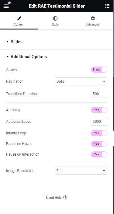
- Arrows: Show or hide the navigation arrows.
- Pagination: Select the carousel pagination style, either None, Dots, Fraction, or Progress.
- Transition Duration: Set the time between slide movement, in milliseconds.
- Autoplay: Slide to YES to have the carousel slide automatically.
- Autoplay Speed: Set the speed at which the carousel will slide, in milliseconds.
- Infinite Loop: Set to YES to have the carousel continue sliding, infinitely.
- Pause on Hover: Make the slide pause when the mouse hovers over it.
- Pause on Interaction: Set to YES to have the autoplay pause when the carousel is hovered over with a mouse or clicked.
- Image Size: Set the size of the image, from thumbnail to full, or enter a custom size.
Style #
Slides #
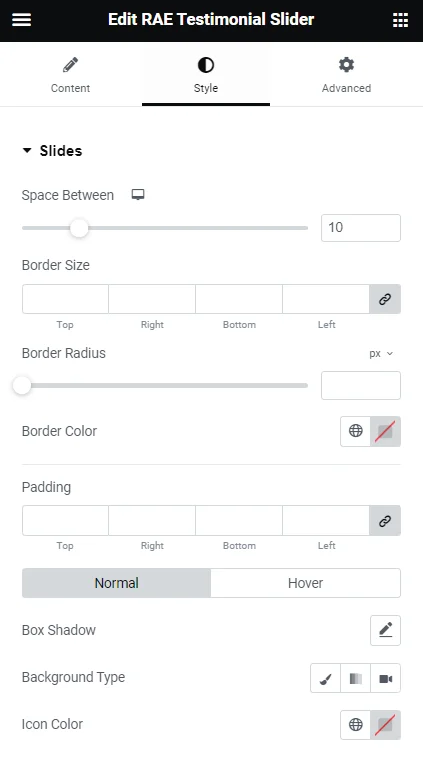
- 1.Space Between: Control the space between the slides.
- 2.Background Color: Choose the background color of the slides.
- 3.Border Size: Set the thickness of the border around each slide.
- 4.Border Radius: Set the border-radius to control corner roundness.
- 5.Border Color: Choose a color for the border.
- 6.Padding: Set the padding within the border of each slide.
Content #

- 1.Gap: Control the space between the image and the testimonial text.
- 2.Text Color: Choose the color of the testimonial text.
- 3.Typography: Change the typography options for the testimonial text.
Name
- 1.Text Color: Choose the color of the name.
- 2.Typography: Change the typography options for the name.
Title
- 1.Text Color: Choose the color of the title.
- 2.Typography: Change the typography options for the title.
Image #
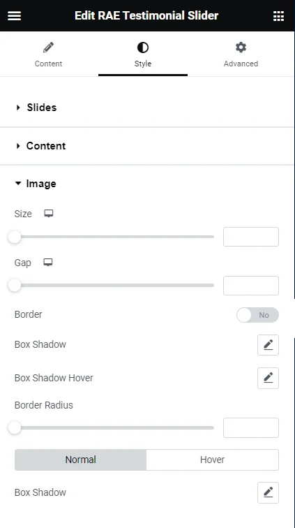
- Size: Adjust the size of the image.
- Gap: If Image Inline is selected, the gap controls the space between the image and the name and title.
- Border: Slide to yes to place a border around the image.
- Border Color: If Border is set to yes, choose the color of the border.
- Border Width: If Border is set to yes, set the thickness of the border around the image.
- Border Radius: Set the border-radius to control corner roundness. This option is available even if Border is set to no.
Navigation #
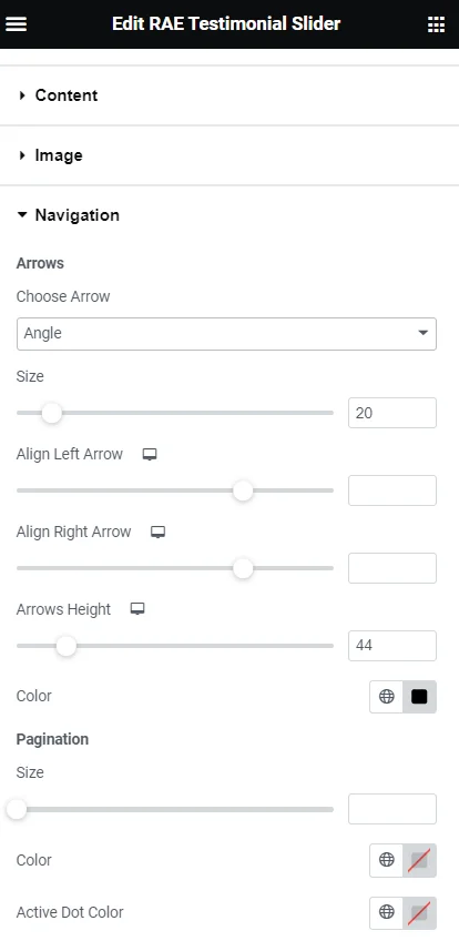
Arrows
- Choose Arrow: Select the type of arrow from the dropdown
- Size: Adjust the size of the navigation arrows
- Align Left Arrow: Set the left arrow’s horizontal position
- Align Right Arrow: Set the right arrow’s horizontal position
- Arrows Height: Set the arrows’ height
- Color: Choose the color of the navigation arrows
Pagination
- Size: Adjust the size of the pagination
- Color: Choose the color of the pagination
Bubble (Options only available if using Bubble skin)
- Background Color: Choose the color of the bubble’s background
- Padding: Set the padding within the bubble
- Border Radius: Set the border-radius to control corner roundness. This option is available even if Border is set to NO.
- Border: Slide to YES to place a border around the bubble
- Border Color: If Border is set to YES, choose the color of the border
- Border Width: If Border is set to YES, set the thickness of the border around the bubble


